Meet Flexible Layout
Custom Positioning
Elementor is a grid-based editor, meaning all layouts are built according to a certain grid, or horizontal and vertical structure. Until now, you could drag in different widgets and they snap into place, according to the column and section you drag them to.
Now, we are expanding our positioning options and offering multiple advanced positioning methods especially for those pixel perfect enthusiasts:
NEW! Inline Elements
Want to place 2 buttons side by side in the same column? Now you can!
Before, each widget took up 100% of the column. Now, you can set the widget to be ‘Inline’, meaning the widget will take up the minimum width it holds.
This allows you, for example, to place an Icon next to a Heading, all within the same column.
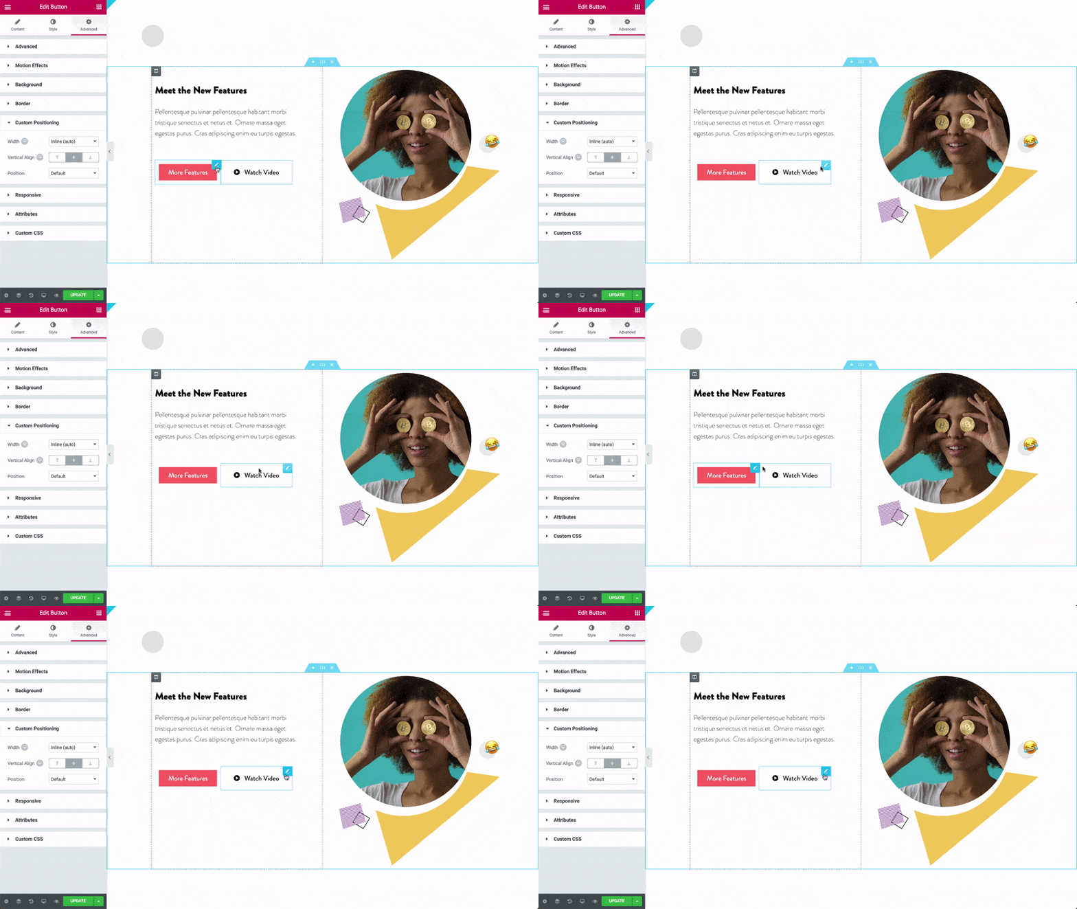
In addition, you also have the option to set any custom width, so the widget fits exactly in place.
Once you choose Inline Width, you’ll also get the option to define a specific vertical alignment per widget.
Note: To set several widgets inline, each widget needs to be defined as inline separately.
NEW! Absolute Position
Go to any widget, choose ‘Position: Absolute’, and you will be able to drag the widget to any location on the page, regardless of the grid. Point anywhere on the screen, and simply drag the widget there.
Note: Absolute positioning is not the recommended method for building web page layouts. Having said that, it does come in handy in many situations where you want to position the various page elements more freely.
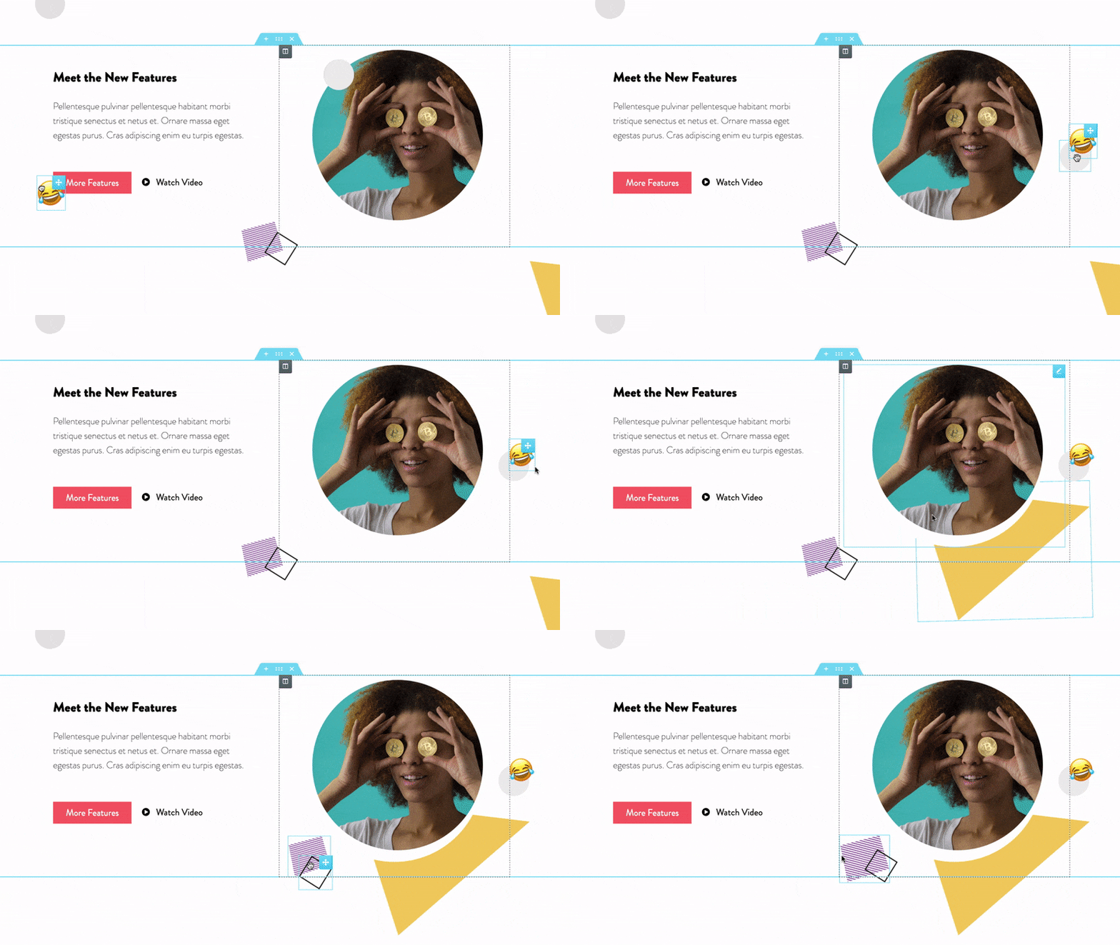
Don’t like dragging? You can also set the absolute position by using the X and Y scales. In the panel, you will find several additional controls: Horizontal Orientation & Vertical Orientation. This sets the reference point for the position absolute.
Absolute positioning can also be set separately for mobile, tablet and desktop devices.
NEW! Fixed Position
Do you enjoy using sticky positioning for widgets? Then you will LOVE this new option.
Set your widget to have a fixed position and place it in a custom position. Now your element will scroll alongside your users’ journey in your website.
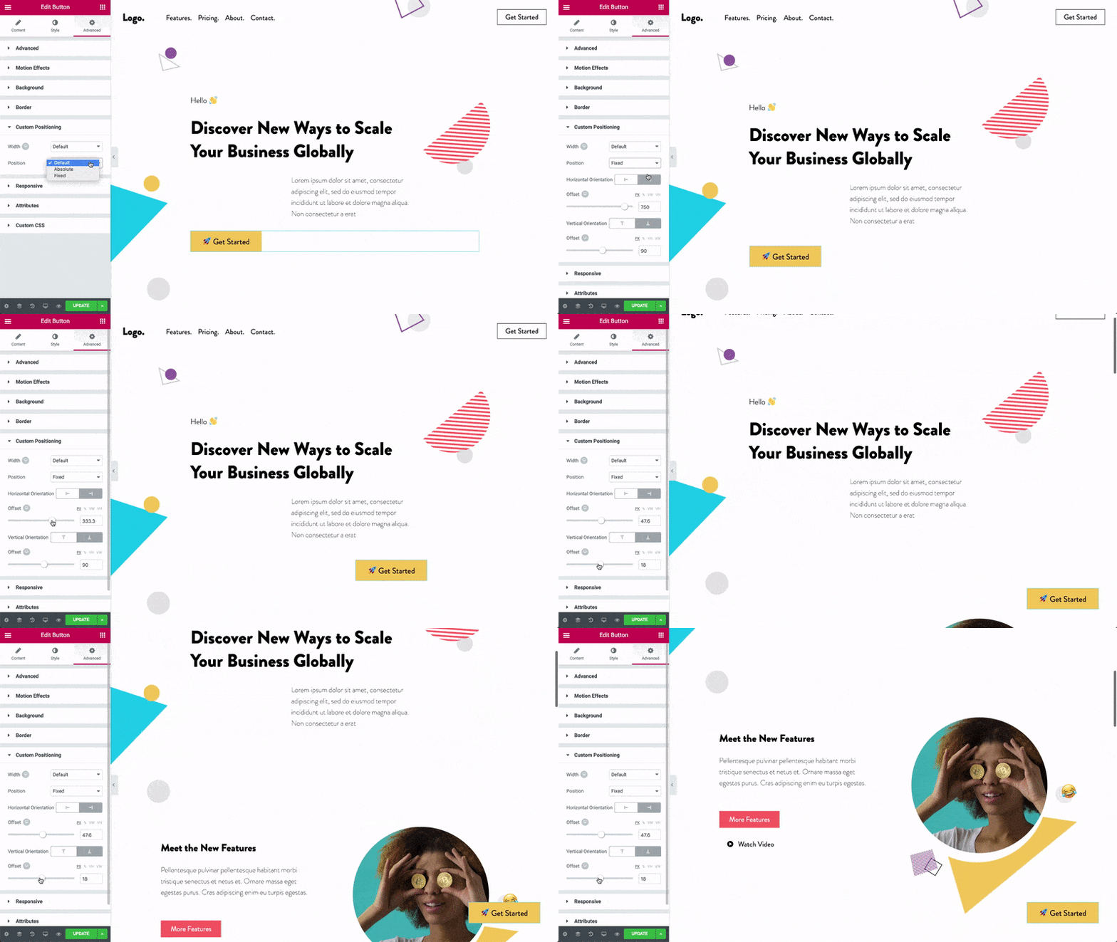
Confused between Sticky and Fixed?
Sticky is a scrolling effect which is relative to the section it’s placed in, Fixed position, however, is relative to the user viewport. That’s it!
Column Vertical & Horizontal Alignment
Have you ever built a services section with different height columns that are not properly aligned?
We have now added several options for vertical and horizontal alignment inside columns.
Vertical Alignment
- Top
- Middle
- Bottom
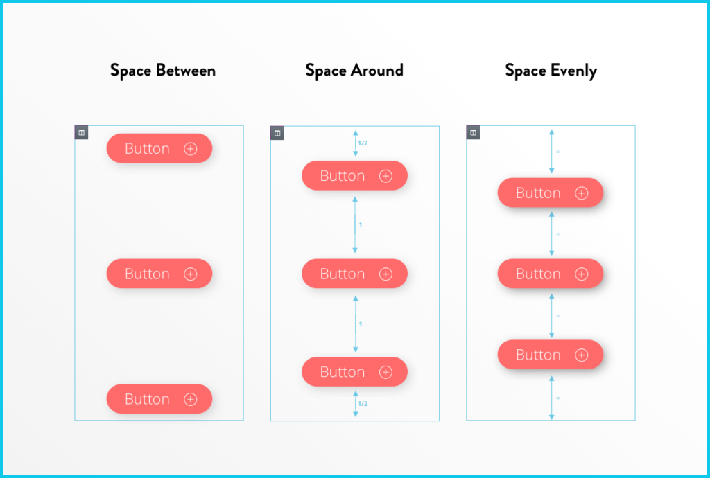
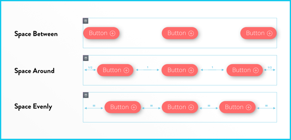
- NEW! Space Between – Widgets start and end at the edge of the column, with equal space between them
- NEW! Space Around – Widgets are spaced equally, and the edges are half the size of the space between widgets.
- NEW! Space Evenly – Widgets have equal space between, before and after them.
Horizontal Alignment
This new feature extends the ability of the inline positioning and lets you horizontally align the inline widgets that are placed in the same row.
- NEW! Start
- NEW! Center
- NEW! End
- NEW! Space Between – Widgets start and end at the edge of the column, with equal space between them
- NEW! Space Around – Widgets are spaced equally, and the edges are half the size of the space between widgets
- NEW! Space Evenly – Widgets have equal space between, before and after them
Responsive Improvements
In Elementor 2.5.0 we added a couple of largely demanded responsive enhancements:
Show/Hide columns per device
Now you can set your responsive behavior not just for sections, but also for columns. Choose on which device to show each of your columns, and get more design flexibility by using this option.
Responsive support for Entrance Animation
Need a slide-in entrance animation on desktop, but a different animation on mobile? No problem!
Simply pick your Entrance animation per device, and fully customize your website animations.
Please note that Entrance animation control moved to a new location, which used to be “Scrolling Effects” and is now called “Motion Effects”. This new section contains the Entrance animation and Sticky controls.
Improved Text Editor Layout
Want to divide your Text Editor widget into columns? In Elementor v2.5.0, you’ll be able to set columns for the text inside the widget.
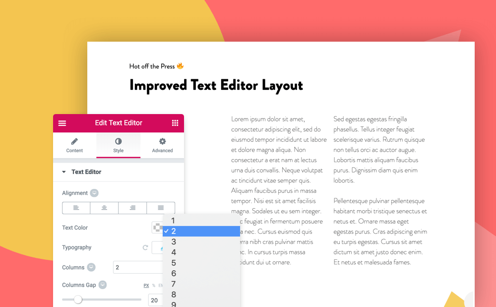
In addition, you can specify the columns per device and set its gap between the columns.
Just another small but significant tweak in this layout dust-shaking release!
More Improvements
Please don’t miss these points:
- We’ve improved our infrastructure for better performance. The editor loading time has been reduced by at least 50%.
- Remember last used tab – When you edit a widget’s tab in the panel, and then switch to a different widget, the editor will remember the tab you used last. Then, when you re-edit the widget, the panel will display the last tab, exactly where you left it.
- You can now add text shadow for the Image widget captions.
- Added access to super admin role in Maintenance Mode (Thanks @GermanKrutov)