Today we are introducing 4 new Pro features: Flip Box, Masonry, Blog Pagination and Ken Burns Effect.
Interactive design is all the rage now. Here in Elementor we have always strived to offer you a wide range of features that add interactivity to your site. Hover and entrance animations, carousels, slides and toggles are just a few examples of widgets that involve visitor interaction. Now, comes a new widget, that adds another level of interactivity – the Flip Box widget.
Forget everything you thought you knew about flipboxes. Elementor Pro’s Flipbox gives you more design possibilities, as you will see in the examples below.
What is a Flip Box?
A flip box is a box that flips over when you hover over it. You can choose from different animations, and customize the look and behavior of each flip box. Flip boxes can help make your content more interesting, improves the user experience and also allow you to accentuate your business features, products and services.
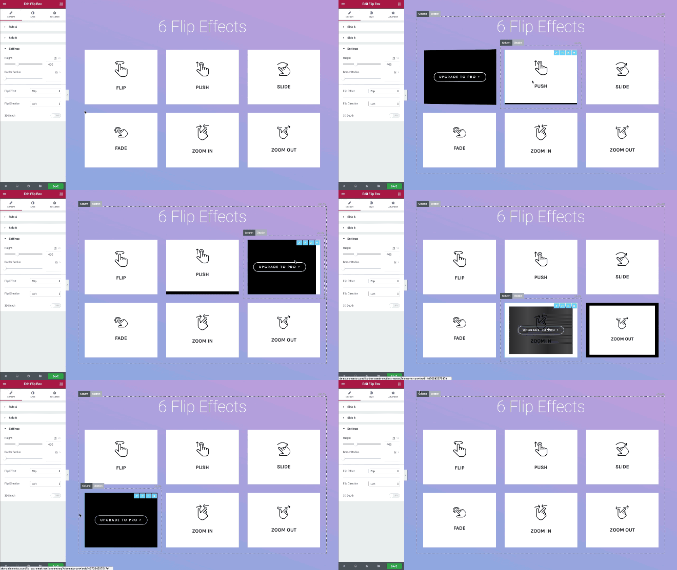
Flip Effects
With Elementor’s new Flip Box widget, you get all the basic flip effects, including flip, push, slide, fade, zoom in and zoom out. The flip animation effects work seamlessly, with no hiccups or stalls.
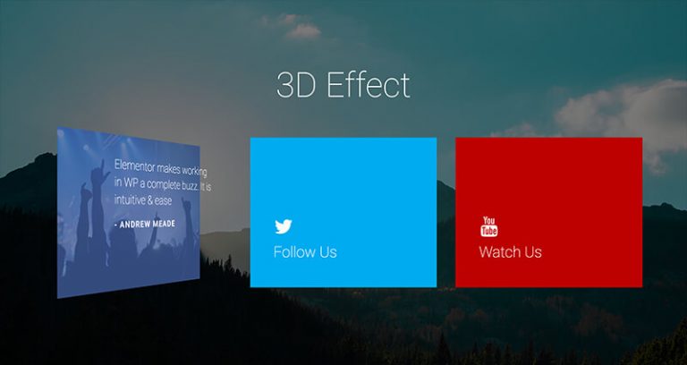
3D Effect
You can add a captivating 3D effect to your content boxes and make them truly unique. The 3D option is available for all the flip directions and can be used to make your flip boxes stand out even more.
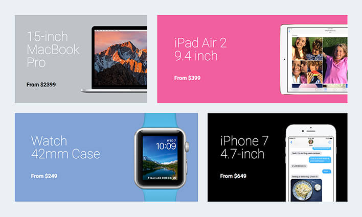
Content Alignment
The content can be separately aligned to the center, right or left for both the front and back of the flip box. The banner boxes above were created entirely using the Flip Box widget, and exemplify aligning the content to the left.
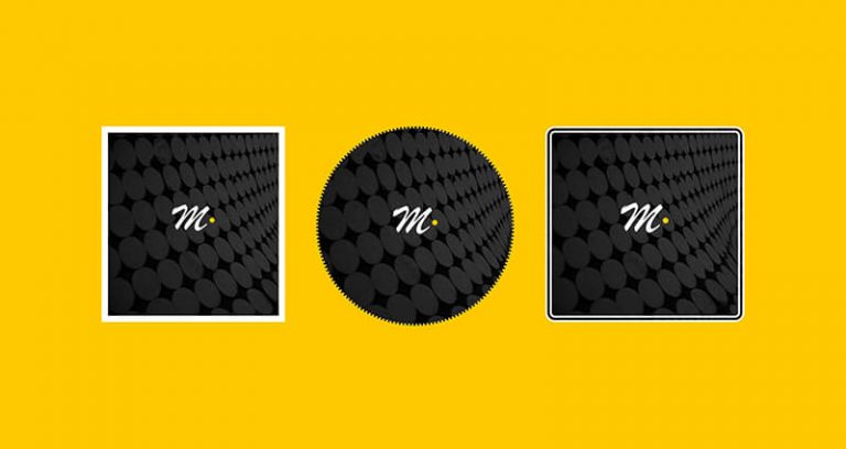
Flip Box Borders
Style your flip boxes with different border options: oval, round edges, rectangles, dotted edge or double edge. You can use borders to reach unique box designs like the ones in the image above.
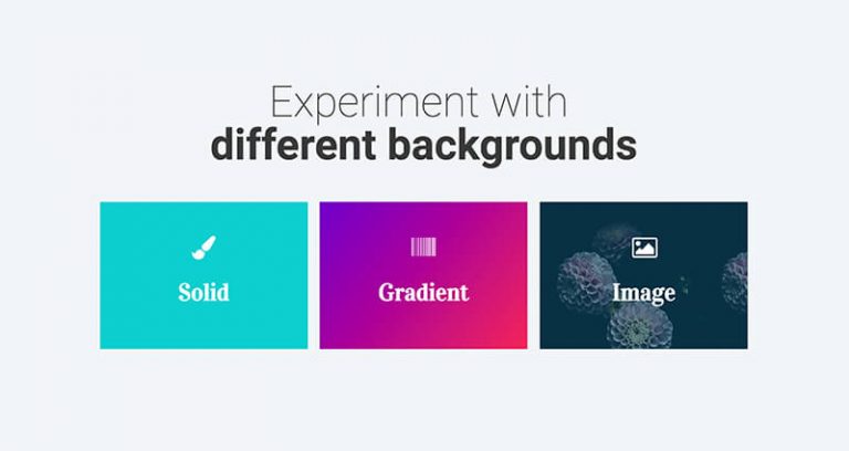
Background Options
Add a solid, gradient or image background to your flip boxes. Separate backgrounds can be added to each sides of the flip box, giving you the option to differentiate between the two sides completely.
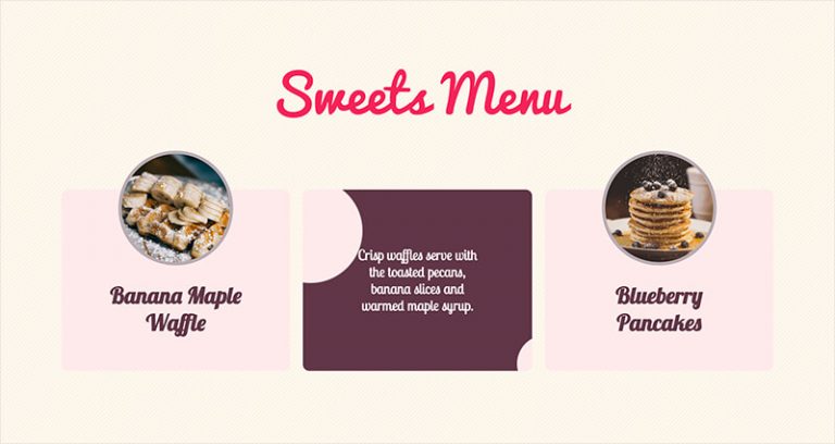
Graphic Element
Make the flip box richer, by incorporating an image or an icon inside the flip box. This can be used to create visual and interactive boxes that link to your posts, or interesting team member boxes. The possibilities are yours to explore.
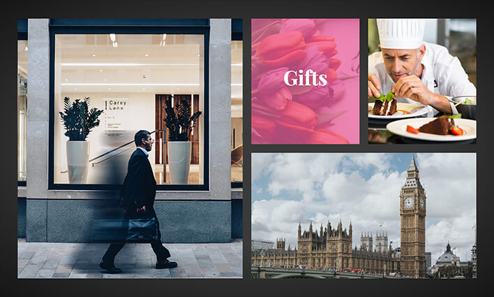
Explore Other Creative Ideas
Experiment with flip boxes to create even more imaginative designs. We have tried to make this widget simple, yet more flexible and robust as to let you create sophisticated flip boxes.
Posts Widget Improvements
How long does it take you to design a blog page, top to bottom?
Today, we are happy to introduce you to a widget improvement that allows you to get the same results in minutes instead of hours. With this improvement, the blog design can be done in a fun, live and visual way.
One of the most amazing features included in Elementor Pro is the Posts widget. The ability to visually design of your blog page, without any coding, is a real game changer. The problem with this widget was that you still couldn’t create blog masonry layouts, and the posts did not include pagination.
Now, we are introducing both Masonry layouts and pagination, making the Posts widget the ultimate visual blog maker for WordPress.
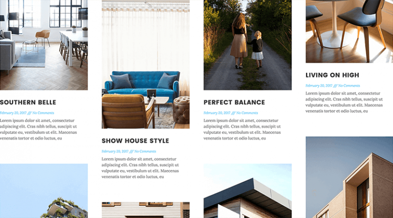
Masonry layout for Elementor Posts widget
You can now display your posts in a masonry grid, using the Posts widget. This means you can showcase your posts with a Pinterest-like grid. In the next release we will be adding the Masonry feature to the Portfolio widget.
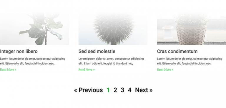
Posts widget Pagination
The Pagination option makes it really easy to play around with your blog design. You now have control over the entire blog design, including pagination elements, such as the prev/next style.
We’ve also made sure our pagination is SEO friendly. Elementor’s pagination works just like the regular WordPress pagination in terms of URLs, so you still get the same SEO friendly links for every pagination link that gets created.
Slides Improvements
Slides is another very useful Pro features. This week we are adding two tweaks to this widget, that come directly from our user requests.
Slides Images Displayed in Full View
Until now, you had two options to display images in our Slides widget:
- Cover – This option makes the image ‘cover’ the entire slider. If you load a vertical image for example, the image’s top and bottom will be cut, and the image will be displayed in zoom.
- Auto – This option shows the actual size of the image.
Now, we are adding another display mode: Contain. This option displays the image contained within the limits of the slide. Let’s say you are using a narrow image on a wide slider, the narrow image will fill 100% of the height of the slider, and the left and right sides of the slider will show the background color.
If, on the other hand, you are using a wide image on a narrow slider, the wide image will fill 100% of the width of the slider, and top and bottom sides of the slider will show the background color.
Ken Burns Effect
The Ken Burns effect, called after the American documentarian, allows you to add a panning and zooming effect to the still images that appear on your slider.
The Ken Burns effect is available only with the Pro Slides Widget. You have to add an image to a specific slide for the option will appear.
Conclusion
Be sure you update both the Elementor and Elementor Pro plugins, to make sure all the new features work properly.
The features added today, Flip box, Masonry, Pagination and Ken Burns effect, all add to our already visually rich page builder. I invite you to try each of them and share your new page creations with us.
If you still haven’t upgraded to Elementor Pro, this is a great chance to do so, and explore the new features we’ve just added to the plugin.
Looking for fresh content?
By entering your email, you agree to receive Elementor emails, including marketing emails,
and agree to our Terms & Conditions and Privacy Policy.
