TEXT PATH WIDGET
Create Unique Text Designs for Your Website
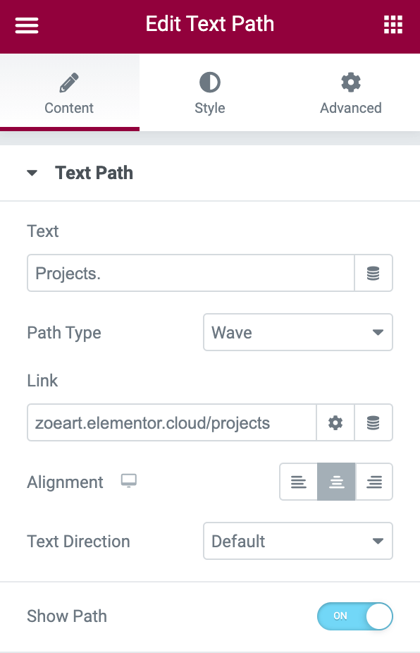
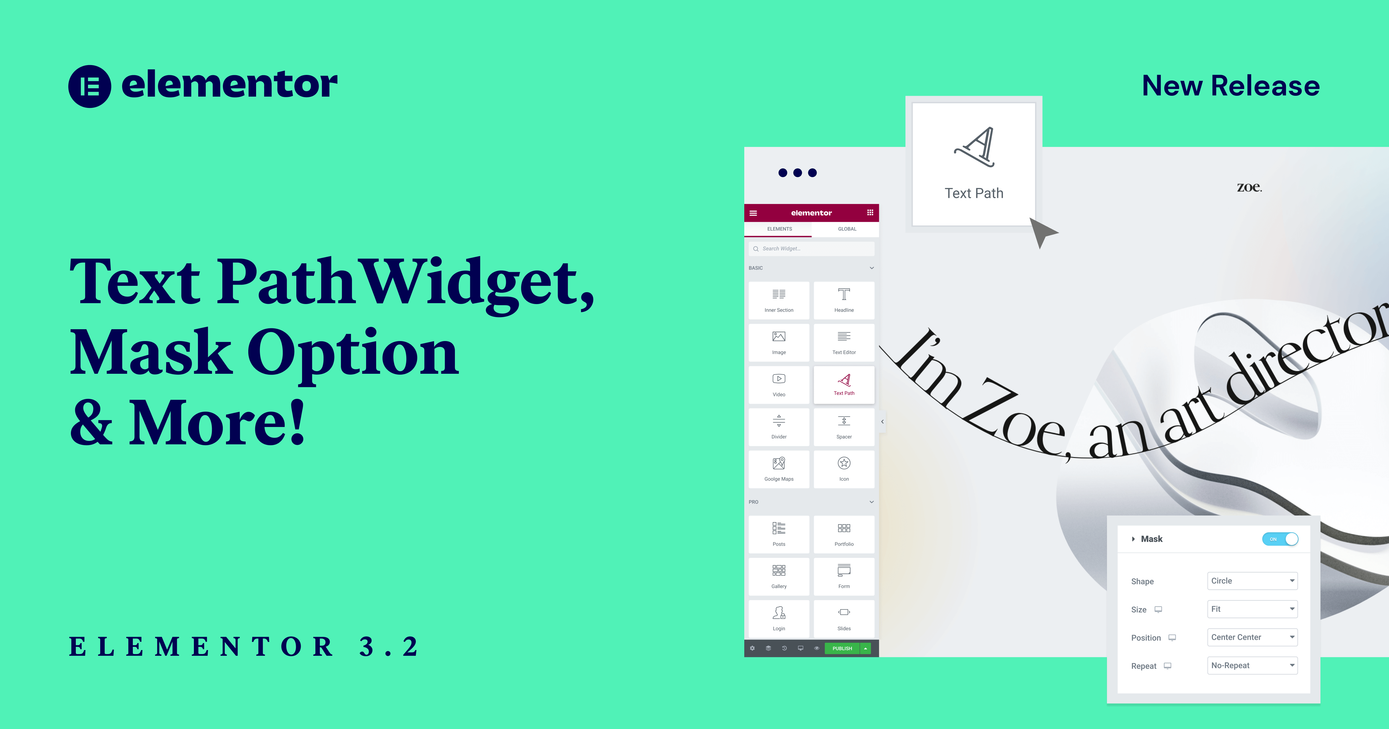
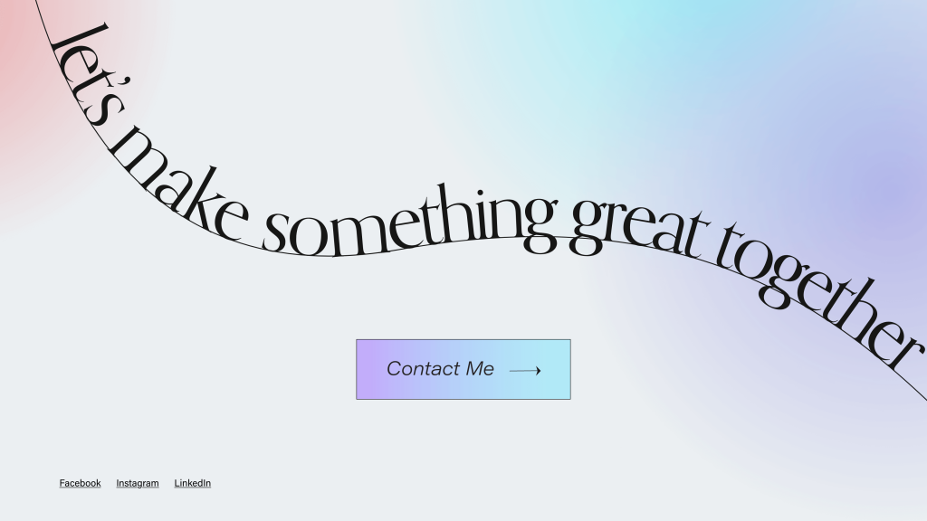
We’re always looking for more ways to help you produce professional, creative, and beautiful designs for your websites. This means adding more design tools that reduce the need for third-party plugins and giving you the power to create pixel-perfect creative designs without a single line of code. With the new Text Path Widget, you’re able to generate unique text designs, like wavy text or swirly slogans, by attaching text to predefined or custom shapes.
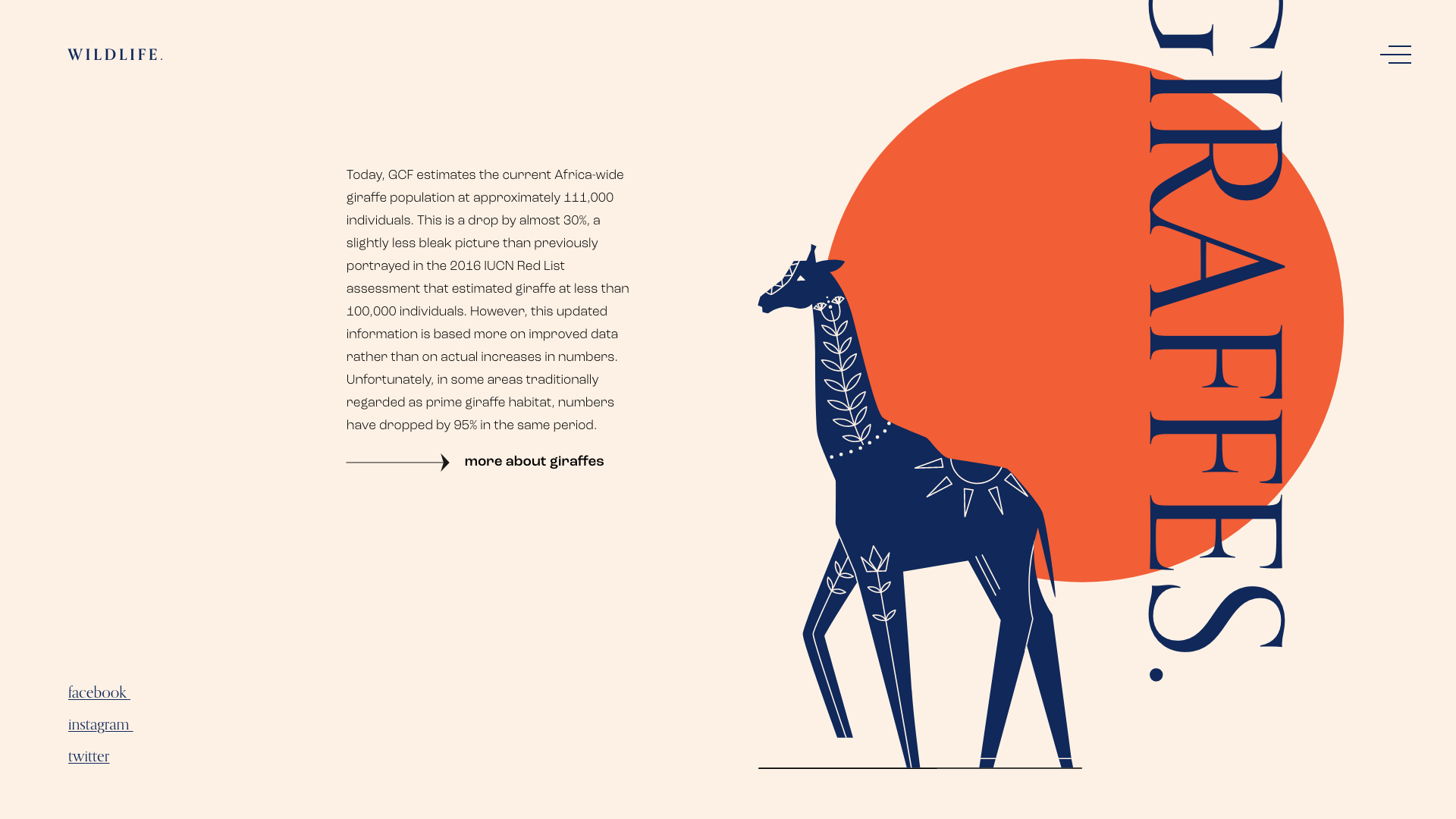
Add New Dimensions to Your Website
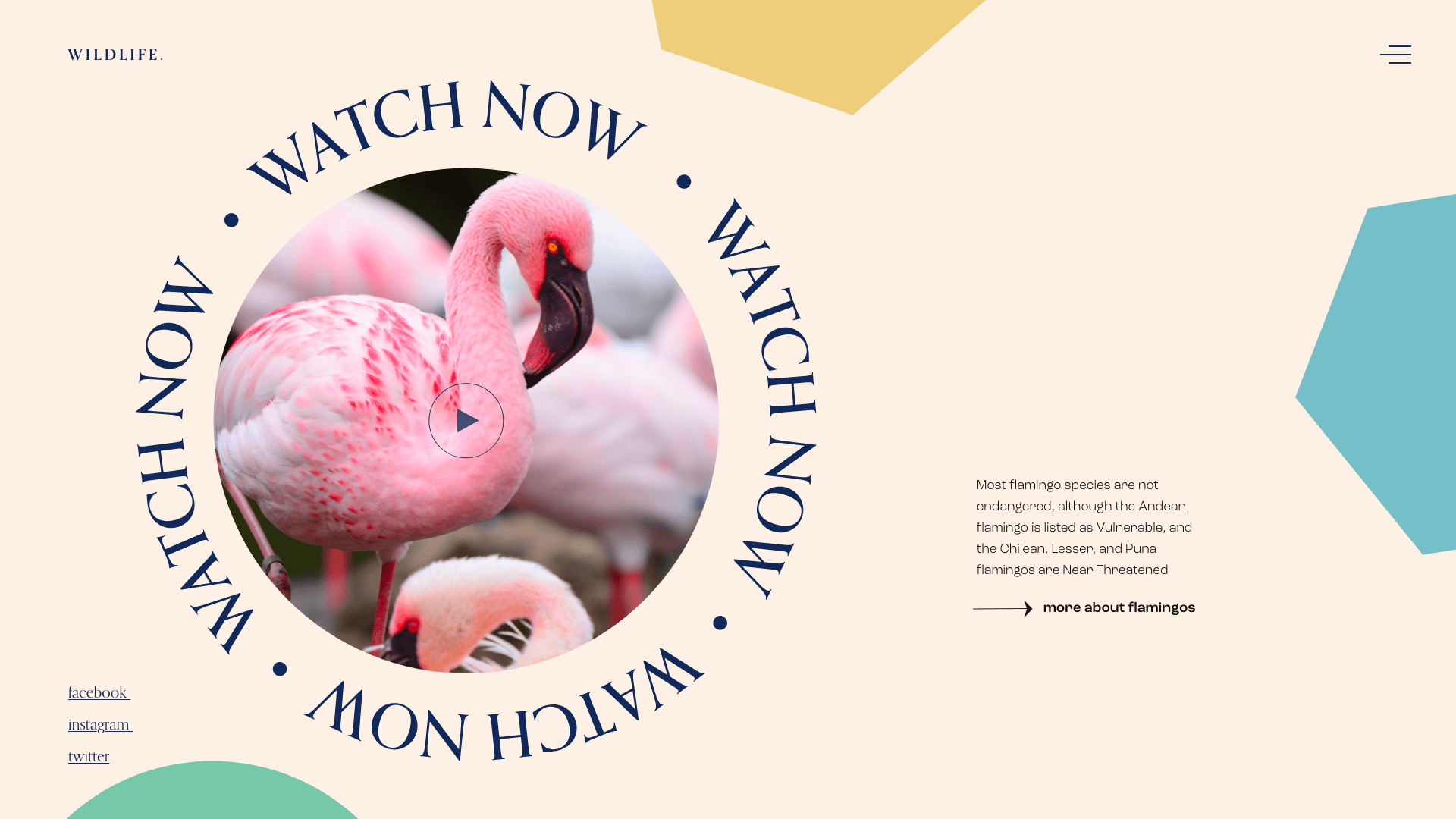
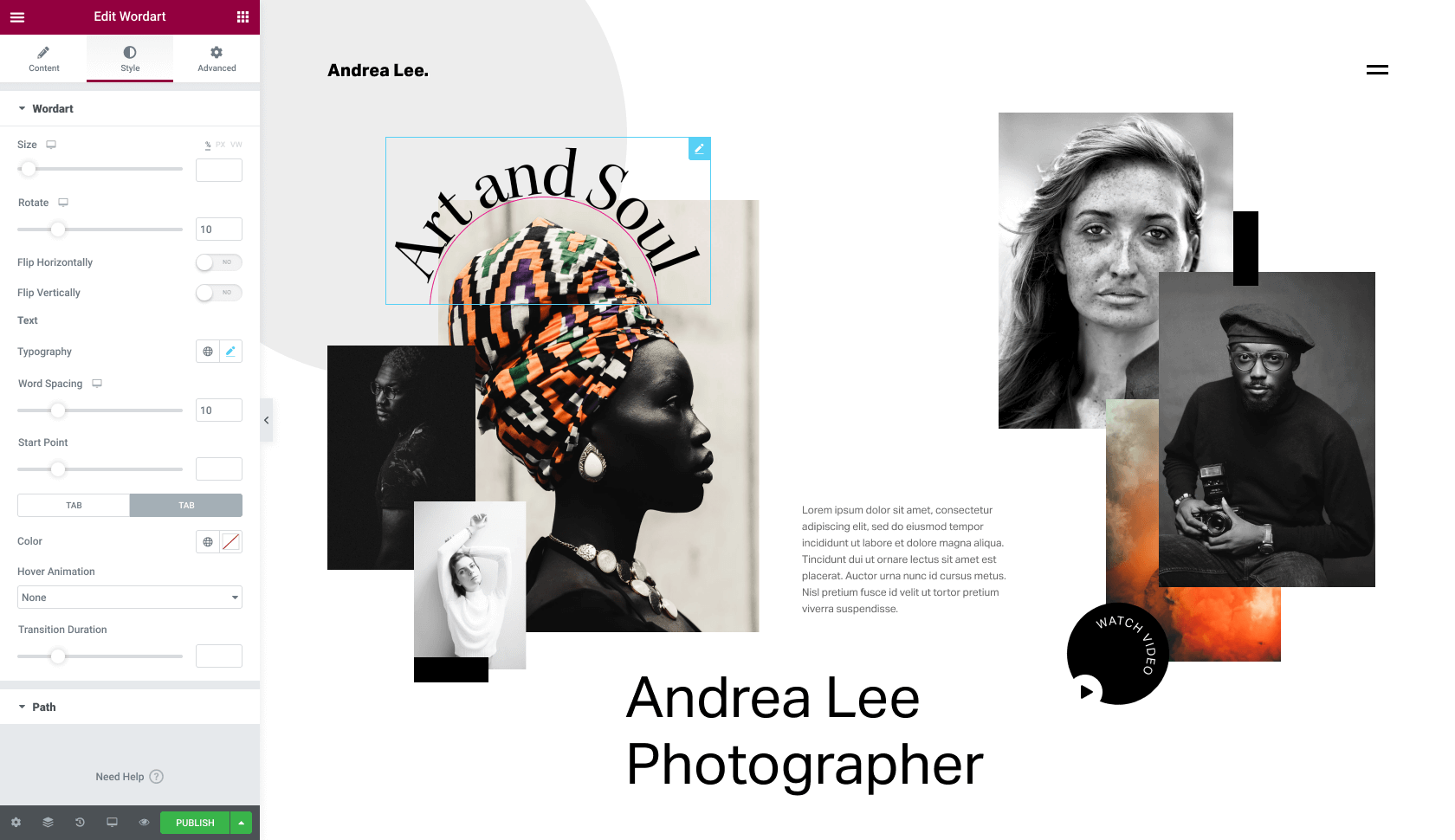
The Text Path Widget lets you seamlessly create one-of-a-kind designs with any text on your website. This tool gives you even more control and flexibility over your creative options, and is completely customizable to fit your design vision.
Regardless of whether or not you’re a professional designer, you can achieve professional-looking designs by simply dragging the Text Path widget onto the editor. Every feature of the text is adjustable so you can reach your perfect result that matches the theme of your website.
Shape Your Text, Your Way
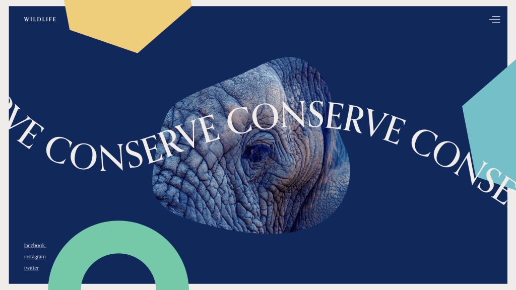
When using the Text Path widget you can choose from our selection of shapes like: Wave, Arc, Oval, Circle, or Spiral. Have a specific vision in mind? Upload your own SVG shape and bring your imagination to life. Send your text along a path that matches your website’s theme, use it to draw attention to specific sections, and so much more. Whether you want your text to be in a star shape to match your astrology website, or appear in an arrow to point to a new product, the Text Path Widget gives you complete creative freedom. Your shape, your way, you decide. We also offer additional customization options to help you stylize your text path.
You can choose to show or hide your text path, and personalize everything including size, shape, color, position, direction and spacing. Adjust your text to match your website’s color theme, highlight certain areas, and use the Text Paths to create depth and dimension to your pages all from within Elementor.
MASK OPTION
Crop Any Element Into Any Shape
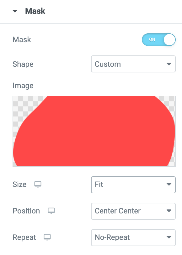
Add a mask to any element on your website with the new Mask Option, and create exciting designs that match your creative vision. Turn any element on your website into a mask-based object and transform objects into the shape of your choosing to create stunning results.
By using the new Masking option, you can hide part of an element based on the shape you choose. Similar to cropping an image, masking allows you to show only the parts of an object you want to be seen. Own a plant shop and want to display different product images in the shape of a flower? No problem! Use a mask to cover the rest of the image, only showing the parts you want within the shape. You can also use masks to add a unique layer on top of your video, picture, etc. creating a unique effect and dimension to your images.
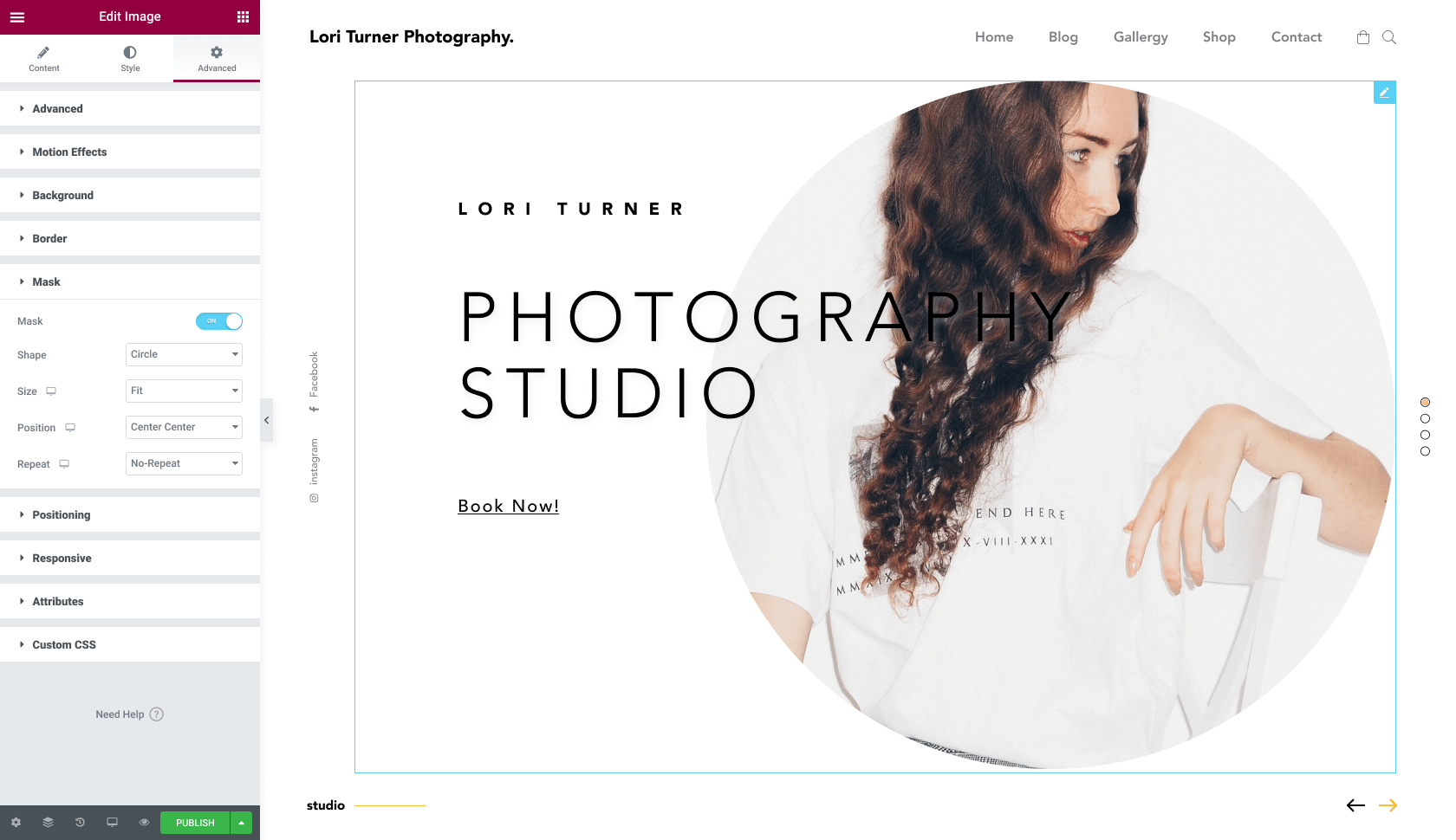
Enjoy Complete Creative Freedom
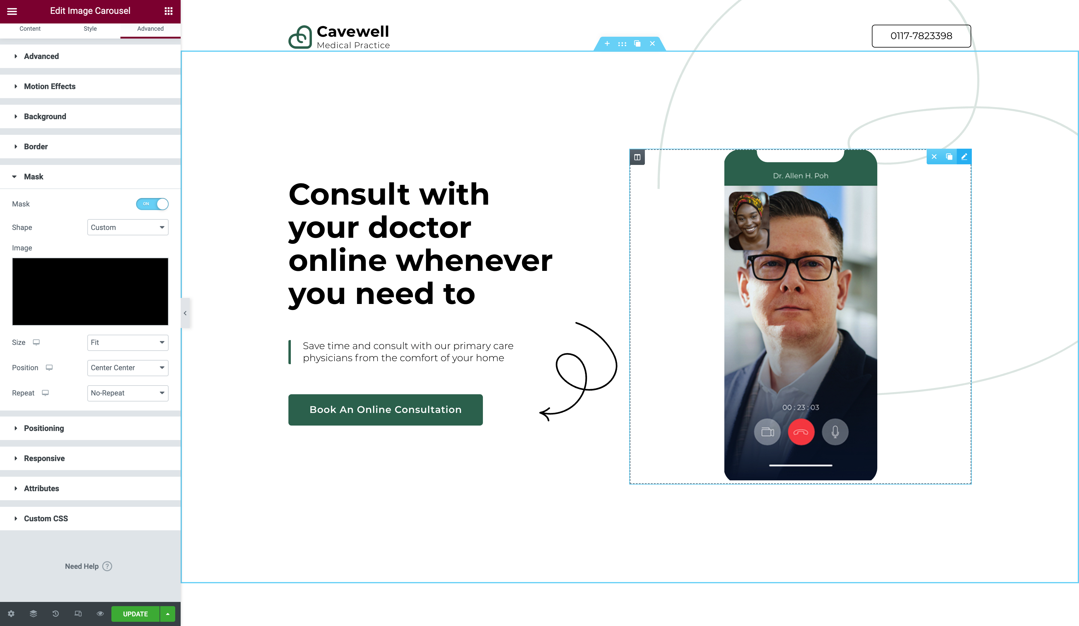
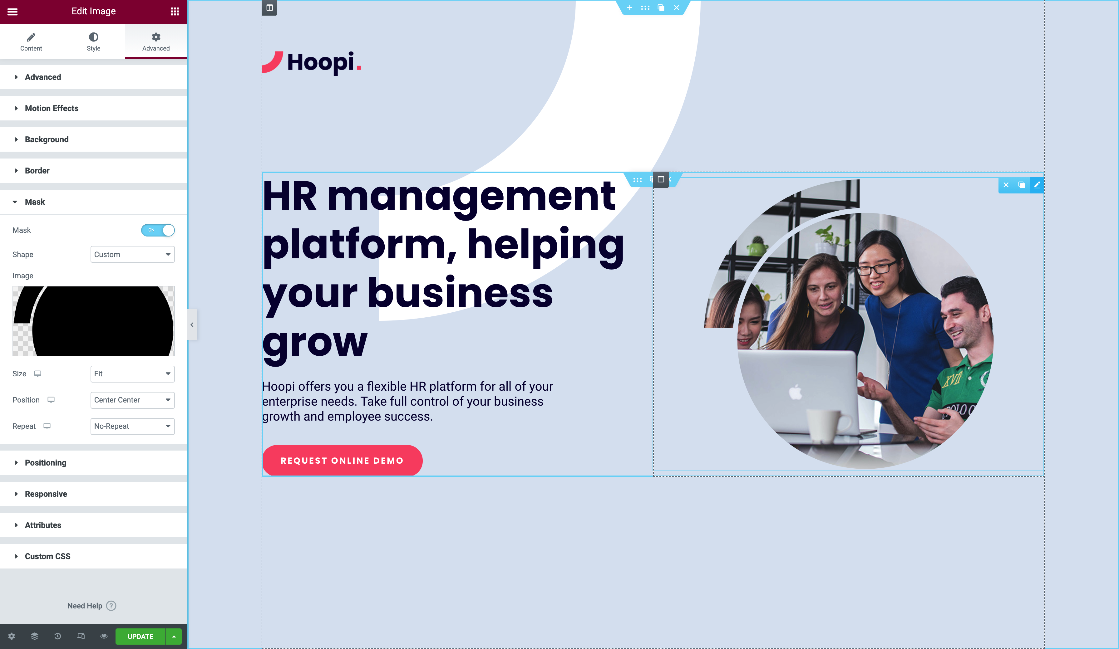
The new Mask Option allows you to create complex designs for any element you want, such as an image, video, Google Maps, and more by using SVG or PNG images.
We offer a selection of shapes to choose from like circle, square, triangle, arrow, and more! The options don’t end there, though. Upload your own shape for a completely original design. Creating a website about wildlife conservation? Upload an animal-shaped image and mask your video to fit that shape, creating a unique design that will capture users’ attention and make your website stand out.
You’ll have complete freedom to customize the design and can define the size, scale, and position of your masked-shape, or create a shape that repeats itself with our Repeat control option. Let your imagination go wild and use this new design functionality to bring your creative ideas to life. We can’t wait to see what you come up with.
GRADIENT BUTTON
Create Eye-Catching Button Designs
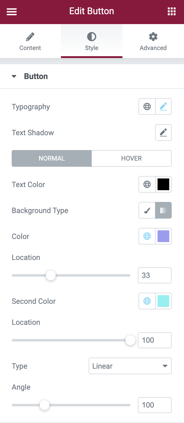
You asked, we answered! Having the ability to add gradient colors to buttons has been a highly requested feature by many of our designers, and we are happy to deliver on that request, giving you, even more, design flexibility.
Now, when adding buttons to your website you’ll have the option to add beautiful, eye-catching gradient colors that match the look and feel of your website and draw your visitors’ attention. No code, workarounds, or third-party plugins needed! Add life to your button designs and make them stand out, your visitors won’t have any other option but to click ;).
PERFORMANCE IMPROVEMENTS
Faster Page Load With Conditional Asset Loading Experiment
We’ve talked about design features, now let’s talk about speed. One of our main goals for 2021 is to double down on performance optimization. In this version, we reduced up to 50KB on every page load by adding to our conditional loading assets experiment. Additionally, we split the e-icons CSS library which reduced it drastically, and added the ability to make font loading adjustments, allowing you to modify the default way Elementor loads Google Fonts.
Want to learn more about optimizing your website’s performance? Watch our course on performance optimization. Make sure to stay tuned for more performance updates in our next releases.
IMPORT/EXPORT EXPERIMENT
Create Websites, Faster
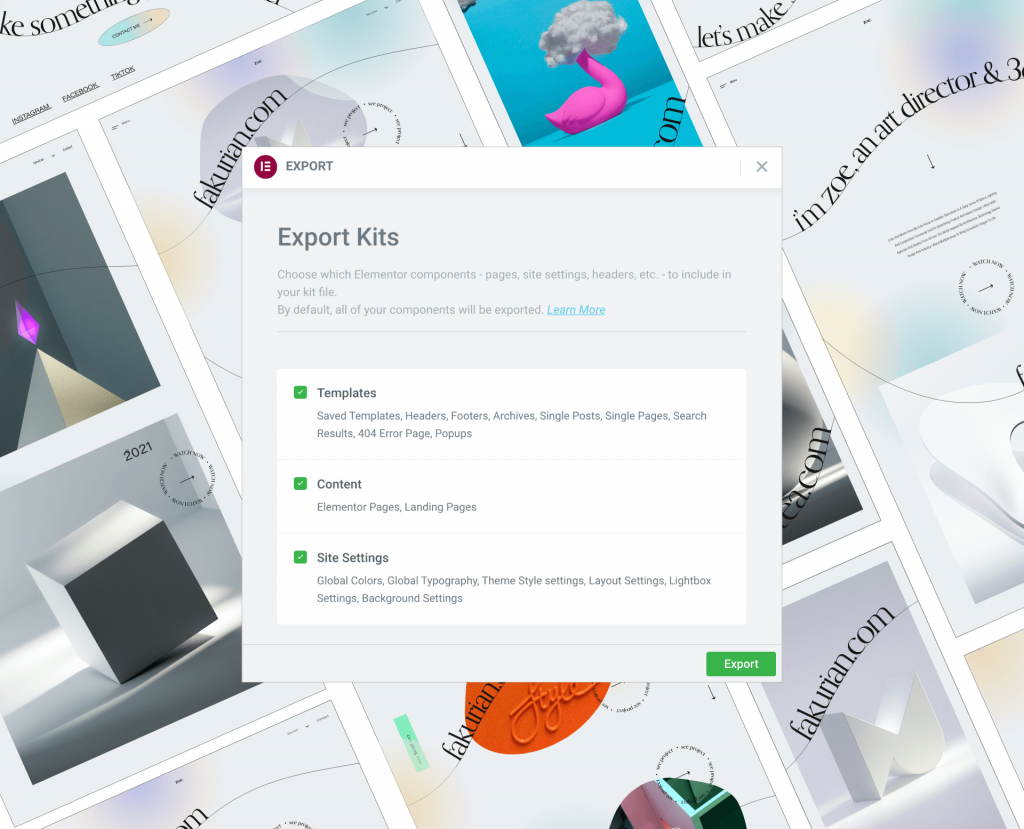
We’re always striving to help make your web creation process seamless and efficient. A big part of that is finding new ways to save you time so you can focus on creating professional websites. Now, you can create websites faster by importing and exporting existing Elementor content from one site to another with our new Import/Export Experiment.
Work Faster, Not Harder
With our new Import/Export experiment, you will be able to design your websites faster and more efficiently. Export Elementor content like global colors and fonts, templates, Theme Builder elements, pop-ups, Landing pages, and Elementor created pages from one website and import them into another. This feature is extremely useful for freelancers and agencies that are working on multiple websites or large-scale projects and need to be able to mobilize and leverage existing designs. Save time by creating “blueprints” of your websites’ essential items, and reuse certain existing Elementor elements in new projects to effortlessly create multiple websites.
RESPONSIVE UI
Visualize Your Web Design on Every Device
We know just how important it is for you to be able to create responsive designs. When designing for several devices, you need a UI that’s simple, friendly, and easy to use. That’s why we’ve given our Responsive UI a makeover. Now, when using our Responsive Mode you’ll be able to instantaneously navigate and browse through your responsive devices, and see what your design will look like. You can also drag and resize your preview based on your breakpoints settings, giving you even more control.
Conclusion
Elementor 3.2 is all about equipping you with the tools you need to create professionally designed websites faster and more efficiently. We hope you enjoy and remember to stay tuned for more updates!
Be sure to continue visiting the blog to stay updated with our latest features and updates. Not a member of Elementor Pro yet? Sign up now to get started.
Looking for fresh content?
By entering your email, you agree to receive Elementor emails, including marketing emails,
and agree to our Terms & Conditions and Privacy Policy.
