No matter what kind of store you have, one thing is sure — you need traffic if you want sales. But once you start getting traffic to your store, the next step is converting visitors into customers.
The percentage of visitors who become customers is your store’s conversion rate. The higher your conversion rate is, the more profit you make in your store. If your conversion rate is low, you can do a few things to improve it.
One of these things is taking measures to prevent high cart abandonment rates.
Cart abandonment occurs when customers put an item into the cart but don’t complete the purchase, and one of the main reasons behind cart abandonment is complicated online checkout processes.
A Baymard Institute study backs that up, showing that 17% of online shoppers cite complicated checkout processes as a reason for abandoning carts. Other reasons included needing to create an account, unexpected costs like shipping and taxes, a slow checkout process, and a lack of trust in the website as a whole.
But here’s the good news — even if your current checkout process is costing you, there are actions you can take to make it better.
To that end, we’re going to give you eight checkout optimization tips to help you streamline your checkout process and increase your conversion rate. Without further ado, let’s dive in.
Discover How To Optimize Your Sales Funnel Conversion Rates
1. Use a Single Page Checkout
The easiest way to add some checkout optimization to your website is to switch to a single page checkout. Let’s face it, a checkout form or process that spans several pages with no end in sight is enough to make even the most engaged buyer give up.
By using a single page checkout, all the information they need to enter is visible right there. There’s no need to wonder what might come next and the information they might have to share.
Some popular WooCommerce themes come with a single-page checkout built-in. But some don’t. However, if you have a theme that doesn’t give you the option to switch to a one-page checkout, not all is lost.
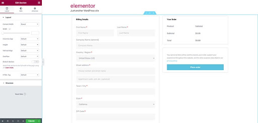
Instead of changing your theme, use Elementor’s Checkout Widget to implement a single page checkout in your store.
2. Offer a Guest Checkout Option
Having a user account on a website where you shop frequently is convenient. But remember, some people might not want to go through the hassle of registering for an account. That is especially true if they’re buying from you for the first time and aren’t sure if they will return.
Instead of forcing everyone to create an account, follow this checkout optimization tip: allow visitors to checkout as guests. You can always invite them to create an account in your post-purchase email sequence.
Alternatively, consider allowing your customers to sign up with an existing account as a social login, like Google, Apple, or Facebook. That eliminates the need to create an account from scratch and remember yet another password and email login combination.
3. Remove Unnecessary Form Fields
Take a look at your checkout form right now and evaluate all the fields there. Are you asking for only the essential information? For example, if you’re selling digital products, do you really need their shipping address or phone number?
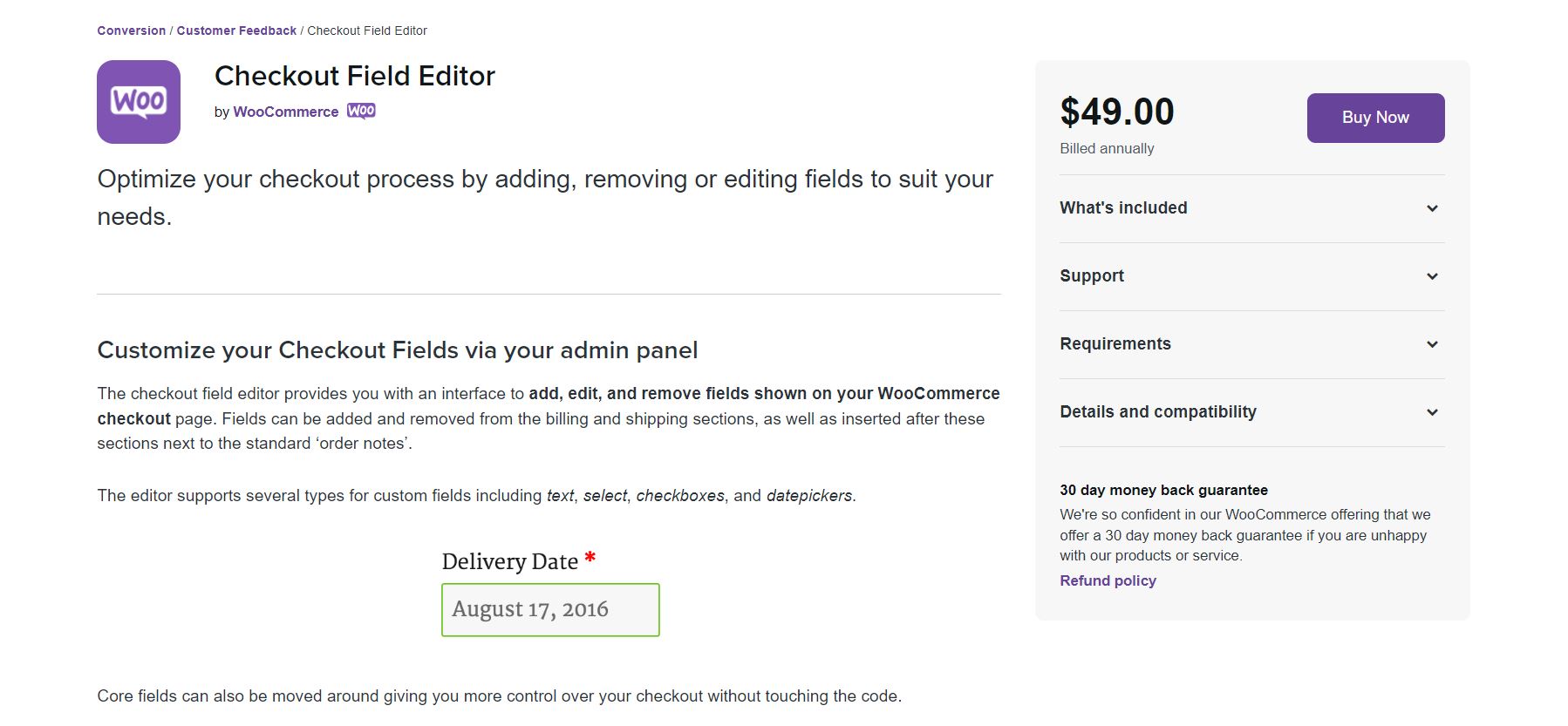
You can use the Checkout Field Editor extension for WooCommerce to add, edit, and remove unnecessary checkout fields. The extension makes it easy to remove and add fields and even move fields around.
4. Show Security Badges
Your customers want to feel safe when they’re shopping on your site. They want to ensure they won’t get hit up with surprise costs and fees and that their sensitive information is in good hands.
How can you make them feel secure? Make your store’s security badges prominent. That includes secure checkout guarantees, links to your shipping costs, shipping options, return policies, and even using SSL trust badges on the ecommerce checkout page.
Adding the above will put their mind at ease and make them feel secure in their buying decision. That can increase not only your conversion rate but also the chances of first-time visitors becoming loyal customers.
You can also add a video that answers some frequently asked questions on your checkout page for additional peace of mind for potential shoppers.
5. Show the Steps in the Checkout Process
As we mentioned before, switching to a single page checkout is a great way to optimize your checkout page and increase your conversion rate. But sometimes, switching to a short, single-page checkout isn’t an option.
In that case, consider adding a progress bar to show how many steps there are in the checkout. You can use the Multi-Step Checkout for WooCommerce plugin to split the checkout into several clearly marked steps on the page.
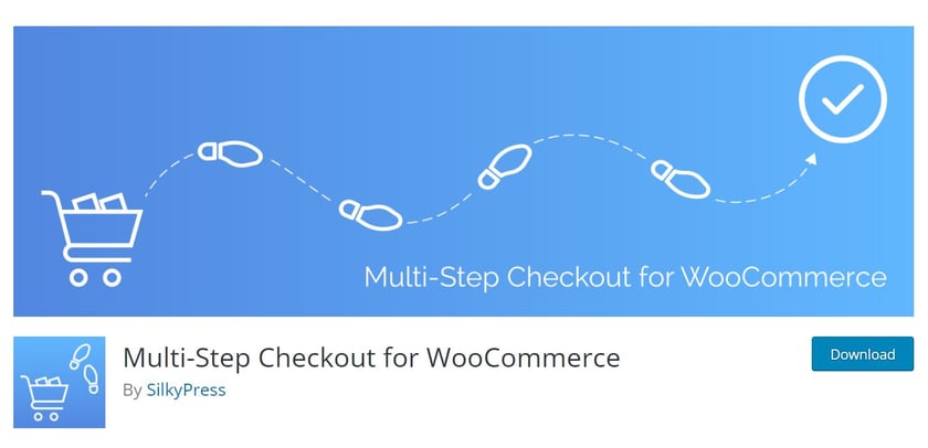
You can download the plugin for free from the official repository. The checkout plugin works with the standard WooCommerce pages and is compatible with most WordPress themes.
Alternatively, take advantage of Elementor and use the Progress Bar widget functionality on your checkout page to show customers their progress.
6. Offer Multiple Payment Options
Imagine this. You’ve been looking for the perfect cast iron skillet, and you’ve finally found it. You add it to your cart, along with some other kitchen knick-knacks, and you proceed to checkout.
But there’s a problem. The ecommerce site doesn’t accept your card, and there is no other way to pay. Disappointed, you abandon your cart checkout and decide to search for different online retailers.
That is not an uncommon scenario. Lack of accepted payment methods (or at the least, stated upfront) is another common reason for cart abandonment. The fix for this particular problem is to offer multiple payment options.
The more payment options you offer, the more customers will pay for your products.
Offer the option to pay with all major credit cards and PayPal. You can use our PayPal button widget to facilitate this, too.
You can even allow them to pay with bank transfers, Apple Pay, or Google Pay.
WooCommerce Payments makes it easy to accept credit and debit card payments in your ecommerce store, but you can also enable PayPal and Stripe. In addition, numerous WooCommerce extensions add even more payment options to your store.
7. Set Up Shopping Cart Abandonment Recovery Emails
Time for some sad news: no matter how much you try, you can never fully eliminate instances of abandoned carts and lost sales. But you can significantly reduce them by setting up cart abandonment emails.
That is a sequence of emails that go out at a specific interval and remind customers to come back and complete the purchase. Typically, the first email goes out within 12-24 hours, and you can configure subsequent emails to go out in 24 or 48-hour periods.
You can use the free WooCommerce Cart Abandonment Recovery plugin to set up the emails and the time intervals for your cart abandonment sequence. Or, you can also opt to configure popups to grab attention at that moment.
8. Eliminate Distractions
Lastly, eliminate distractions when paying mind to checkout page optimization. Nowadays, we’re constantly getting distracted by the next thing. Whether it’s on our desktops, laptops, or mobile devices, we’re bombarded with notifications and updates begging for our attention.
Your checkout page should be a distraction-free zone. A few ideas include:
- Removing links to your social media profiles
- Getting rid of your ecommerce website’s header and footer
- Eliminating email signup forms
- Removing your main navigation menu
When there is nothing to distract them, customers are more likely to complete the checkout journey.
For example, you can change the page layout to Elementor Canvas to remove your header, footer, and navigation on your shop page using the Elementor plugin.
Final Thoughts: 8 Checkout Optimization Tips To Improve Conversion Rate
Optimizing your checkout experience is crucial if you want to increase conversions. There are several ways to improve your checkout, from switching to a single page checkout and offering customers guest checkout to offering multiple payment options and eliminating distractions.
In this guide, we shared checkout optimization tips for improving your checkout flow and tools that can help you implement them.
The only thing left to do now is to put those checkout page optimization tips into practice so you can increase your business bottom line.
Happy selling!
Looking for fresh content?
By entering your email, you agree to receive Elementor emails, including marketing emails,
and agree to our Terms & Conditions and Privacy Policy.
