About the author: Alina Khazanova, Product Designer @ Elementor
Alina is a product designer at Elementor. Her passion is to bring valuable and satisfying product experience to the users.
Web design projects can be complex, requiring many developers, designers, and other stakeholders to chip in over time. In addition, evolving technologies and standards might require numerous modifications over the course of a project. Keeping the overall look and feel of your website consistent regardless of these factors can be difficult.
One way to make this easier on everyone involved is to invest in creating a web design style guide. This, in turn, can increase efficiency and productivity while also acting as a go-to resource for maintaining brand consistency.
In this article, we’ll discuss what a style guide is, as well as why and how you should create one. We’ll also point out existing examples you can emulate when compiling yours. Let’s get started!
Table on Contents
- Style Guide Template
- What Is a Web Design Style Guide?
- Why Should You Create A Style Guide?
- The Benefits of Creating a Style Guide
- How to Create a Web Design Style Guide
- Step 1: Study Your Brand
- Step 2: Determine Your Logo Usage Rules
- Step 3: Define Your Color Palette
- Step 4: Create Rules for Typography
- Step 5: Set Layout and Spacing Rules
- Step 6: Consider Icon Style
- Step 7: Define Guidelines for Illustrations and Imagery
- Step 8: Outline Stylistic Considerations
- Step 9: Develop Your Brand’s Voice
- Step 10: Include Specific Dos and Don’ts
- Step 11: Don’t Forget About Downloadable Assets
Style Guide Template
Need a starting point? Our Style Guide Template will get you started in no time; it includes examples of how to use:
- Logos
- Fonts
- Colors
- Buttons
- Icons
What Is a Web Design Style Guide?
A style guide is a reference source where you collect and present all of the design decisions for your website. This includes its color scheme, typography, spacing, icons, imagery, and all the visual language used on your site.
Style guide vs Design System
As a web designer, you’ve likely heard the terms “style guide” and “design system” a lot. Although they are related concepts, there are also some significant differences.
In a manner of speaking, a style guide is a younger sibling to a design system. In a design system, you would attempt to define every little rule and element involved in your work, taking into consideration all of the possible component states.
On the other hand, a style guide is more of a starting point for defining your brand’s digital image and voice. Here, you’d focus on showcasing only the most important components, possibly with the intention of developing a design system later on.
Why Should You Create A Style Guide?
When you have multiple web professionals working on one site, it’s important to consolidate all your design decisions into a single reference source. This helps to keep your vision consistent across all pages and elements.
As you may already know, website design can be complex. With many people working on a project and so many iterations and changes required, it’s vital that everyone uses the same visual language so that the end result will be consistent and cohesive.
The Benefits of Creating a Style Guide
A well-crafted style guide not only benefits you but your entire web design team. During the design process, this resource helps everyone involved maximize their efficiency and minimize tedious tasks such as finding “this exact color” or “that exact button style” to use for specific elements.
Additionally, a style guide can serve as a reference for making the right decisions for future designs. You won’t need to struggle with choosing how certain features should be approached because you’ve already defined the rules for their usage. This is time-saving and reduces anxiety about whether the result is correct.
Plus, if you make your style guide publicly available, it can be an effective way to increase brand familiarity. Visitors will be able to create an impression of your brand’s values and personality.
They can also enjoy a sneak peek into the working process behind your website. Finally, your style guide can be a smart place to share downloadable brand assets with clients, affiliates, and the press as well.
How to Create a Web Design Style Guide (In 11 Steps)
We’ve discussed what a style guide is and why you should create one for your website. Next, let’s take a look at all the necessary steps to keep in mind when you start compiling this key reference source.
Step 1: Study Your Brand
First, you’ll want to get familiar with your brand and target audience. You might consider creating a mood board as a starting point. Your goal is to review your main values and translate them into a visual language, collecting any assets and components that define it along the way.
It’s smart to incorporate your brand values and mission into your style guide to serve as a reference point.
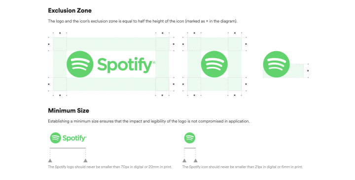
Step 2: Determine Your Logo Usage Rules
The next step is to define rules for using your logo in all its variations. If there is a graphic or brand designer on your team, you’ll want to consult with them about any relevant guidelines that may already exist.
These could include your logo’s grid, font, colors, correct spacing and placement, appearance on different backgrounds, and more.
In addition, make sure to include dos and don’ts for logo usage by third parties such as affiliates.
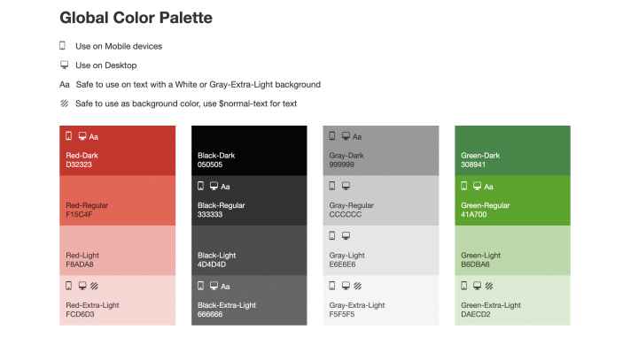
Step 3: Define Your Color Palette
Color plays a vital part in how your website and your brand are perceived and remembered. Therefore, you’ll want to make sure to define your essential primary colors, usually a maximum of three.
To complete your color palette, you’ll also need to include secondary, tertiary,and neutral colors.
Additionally, you’ll need to present these colors in your style guide using both their visual appearance and technical values. For example, when adding ‘blue’, you’ll also include its RGB and Hex number equivalents.
There’s a lot involved in creating the right combination of colors for your brand. You’ll need to familiarize yourself with the essential terms and learn more about Color Theory to be successful in this area.
Step 4: Create Rules for Typography
Just like color, typography is an essential part of web design. To ensure yours is appealing and consistent throughout your website, you’ll need to create a typography hierarchy in your style guide.
First, you’ll need to include the font families and sizes for your main headings, H1-H6:
In addition to headings, you’ll want to include styles for running (body) text as well as forms, alert messages, and more. These styles will include font families — which are sets of fonts such as Roboto, Lato, or Montserrat — and sizes.
Font sizes should be written in pixels (px) and remain consistent across elements. You’ll also want to keep your developers happy by using progressive sizes such as 14px, 16px, 18px, or 20px, and avoiding intermediate sizes such as 15px.
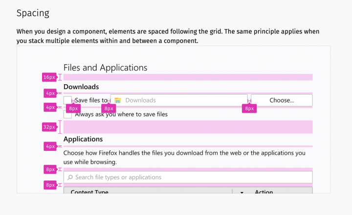
Step 5: Set Layout and Spacing Rules
Other important parts of a style guide are the layout, grid, and spacing rules, most of which might be implemented using HTML and CSS. These will define how your pages are structured. To get started, you can create some basic templates for your main layouts.
This will make it much easier to expand your website and add new pages in the future.
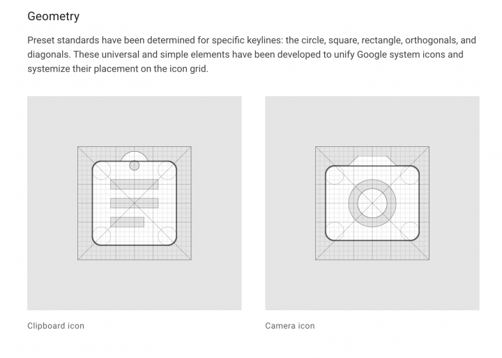
Step 6: Consider Icon Style
Iconography is another important stylistic choice for your website and you’ll want to define some basic rules for its usage. This includes decisions such as whether you’re using a ready-made icon library such as Font Awesome or your own custom icons, as well as the style of the icons — colored vs monochromatic, filled vs outline, etc.
Like with your fonts, you’ll also want to include the main icon sizes that should be used. Keep in mind that with custom icons, it may be necessary to include certain icon grids or rules about how to create the graphics.
Step 7: Define Guidelines for Illustrations and Imagery
To add some uniqueness to your site and its branding, you might feel inclined to create custom illustrations. This can give a singular appearance and voice to your website. You’ll want to make sure to include style and color references for the kind of illustrations you use.
You might also need to create some strict rules and guidelines regarding what kind of images to use on your website. For example, you could include some dos and don’ts for incorporating stock photos.
Additionally, to ensure the images on your website are visually consistent, you might include photo editing preferences for backgrounds, filters, brightness, contrast, and more.
It’s also important to state the overall tone and message images should carry. For instance, your personal taste may skew towards candid photography as opposed to overly-edited images. Or perhaps you like certain backgrounds more than others. Keep in mind your target audience’s preferences during this process as well.
Step 8: Outline Stylistic Considerations for Main Website Components
Once your basic style definitions are in place, it’s time to introduce your main website components into your style guide. These concern the appearance, sizes, and states of buttons, form fields, form elements, navigation menus, notifications and alerts, cards, modals, and more.
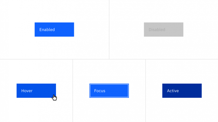
To take things further for each button type, you might include its different states, such as regular, hover, active, or focused. You should also define styles for the various form elements such as radio buttons or checkboxes.
It’s best practice to refer to a components library such as Google’s Material Design or Alibaba’s Ant Design for the purpose of identifying any important elements missing in your own style guide.
Step 9: Develop Your Brand’s Voice
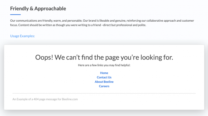
An effective style guide covers not just your site’s appearance, but also its messaging and voice. To pin these down in writing, you might need to consult with marketers and copywriters to create guidelines for your website and other content.
After all, the tone and voice of the copy on your website are how you address your visitors and potential clients, so it’s important to get it right.
Step 10: Include Specific Dos and Don’ts
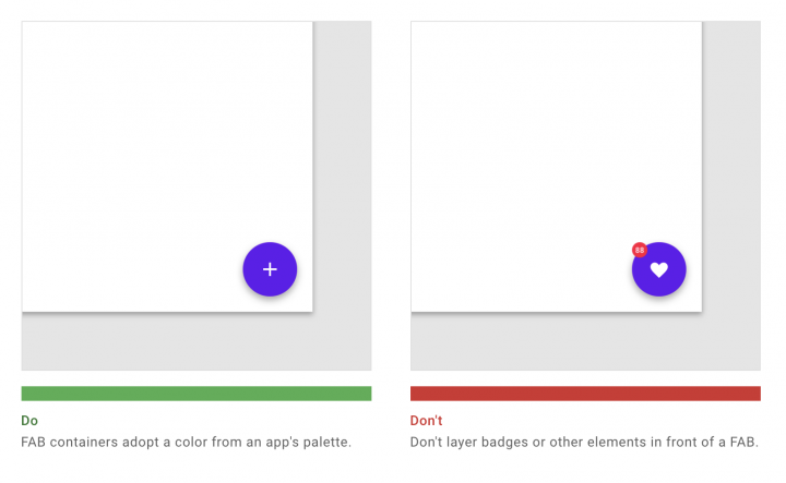
Sometimes the concepts in your style guide may be difficult to explain with text alone. This is why it’s often better to use concrete examples – such as visual dos and don’ts — to illustrate the actual implementation of the rules defined within the document.
Clear examples communicate effectively how the style guide should be used in practice.
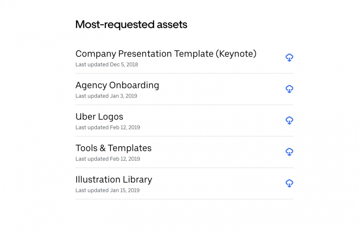
Step 11: Don’t Forget About Downloadable Assets
Aside from the rules in your style guide, it might sometimes be necessary to also incorporate some downloadable assets. This might include:
- Your logo in all its different formats suitable for web and print
- A press kit with necessary brand materials
- A short representation of your brand book
- The style guide in a PDF format
These resources are useful for a variety of purposes, including working with affiliates, converting leads, onboarding new team members, and more.
Although a style guide is essential for internal needs, it is also very important for brand recognition among users, clients, affiliates, press, and the general public. If you think your brand might be represented outside of your website itself — such as in press publications — you’ll want to make sure brand assets are easy to request and reach.
Find Inspiration for Your Style Guide
Research is the best starting point for any design project. This means that before you embark on the journey of creating your style guide, you’ll want to familiarize yourself with best practices, as well as references to inspire your work.
To help you with this, we’ve collected some beautiful examples of style guides to give you an impression of how different brands represent their identities online. Other sources of inspiration could include online directories such as Style Guides.io or Design Systems Repo where you can find various examples of style guides and design systems from leading companies and brands.
Keep Your Style Guide Up-to-Date
Web technologies and design trends are constantly evolving. This applies to businesses, too, so you’ll need to refresh your brand language over time. As a result, your style guide won’t remain static. Rather, you should expect right from its creation that you’ll make changes to it regularly.
This requires flexibility and attention to detail as a designer. You’ll need to keep up with the latest industry trends and be willing to adapt to them.
To help you keep your design language consistent, Elementor 3.0 is introducing Global Site Settings. Now you can manage your entire site within the Editor. The new Site Settings panel provides many configuration tools and gives you a central place to modify all of your site options.
Within any page you edit with Elementor, go to the left-hand panel and click on the top-left icon. This will take you to the Global Settings panel. Here, you can access many of your site’s settings, such as the lightbox settings, as well as layout defaults.
You’ll also find Site Identity options for customizing your cross-site identity with options related to your logo, favicon, title, tagline, and more. In the Design System section of Site Settings, Global Colors and Global Fonts enable you to enforce site-wide design consistency as well.
Layout enables you to define Elementor’s default layout settings, such as content width and page layout. Lightbox lets you set the default styling of Elementor lightboxes. Theme Style provides global settings to define default styling for various non-Elementor related elements, such as headings, buttons, images, and form fields.
With these new features, you can ensure design consistency and brand recognition throughout your website.
Maintain Brand Consistency With a Style Guide
Keeping the design of a large website consistent despite having many hands working on it can be a challenge. This is where a style guide comes in. It’s a central reference point for all your design decisions, serving to keep everyone on the same page. This can increase efficiency as well as aid in brand recognition for your target audience.
In this article, we discussed several steps involved in creating a web design style guide. These include studying your brand, defining your color palette, creating brand guidelines for typography, and more. A practical way to begin is by using Elementor’s Global Settings to set up site-wide design rules.
Do you have any questions about creating a web design style guide? Let us know in the comments section below!
Looking for fresh content?
By entering your email, you agree to receive Elementor emails, including marketing emails,
and agree to our Terms & Conditions and Privacy Policy.


