About the author: Alina Khazanova, Product Designer @ Elementor
Alina is a product designer at Elementor. Her passion is to bring valuable and satisfying product experience to the users.
Color theory is a huge field of knowledge. It includes rules and guidelines about various color combinations and their uses. Apart from the basic terminology and classifications (such as color schemes), it also taps into other considerations such as human perception, cultural associations, color psychology, and more.
Learning about color theory can help you create effective, smart designs. Understanding the basics is a must for any professional in the field.
This article will guide you through the fundamentals of color theory that every web designer should know. We’ll also show you how it works in practice. Let’s jump in!
Table of Contents
- Why Color Matters In Web Design
- A Brief Look Into Color History
- 7 Key Color Theory Terms You Should Know
- How To Apply An Effective Color Scheme
- How to Use Color Psychology and Meaning to Influence Emotions
- Things to Consider When Using Color Psychology
- Introducing Elementor Global Color
- How to Use Color Theory On Your Website
Why Color Matters In Web Design
The most apparent advantage of using the right color combinations in web design is that they help users understand and navigate the site. Colors can improve visitors’ online experiences, enabling them to find the information they need and respond to your Call to Action (CTA).
However, there are other vital benefits of understanding color. When used effectively in web design, it plays a significant role in branding and product messaging. In fact, research has found that color plays a huge role in customers’ decisions about purchasing a product, with a staggering 92.6 percent of viewers putting high importance on the item’s visual factors.
The right color scheme can also make or break the success of a marketing campaign.
According to a study conducted by the University of Loyola, Maryland, colors can increase overall brand recognition by a staggering 80 percent.
This subject fascinates many researchers worldwide who are keen to examine the effect of color on brand recognition, customer satisfaction, and overall product success. Colors are crucial in both physical and digital environments as they help guide the users through your website and improve the overall experience. Therefore, every web designer needs to become fluent in color theory.
A Brief Look Into Color History
Colors have played vital roles in art and culture for centuries. However, the scientific approach to color theory started in the 17th century when Sir Isaac Newton created the first color wheel.
Around that time, colors were considered a mixture of light and dark. Newton believed this approach was flawed, so he examined the properties of white light in his famous prism experiment.
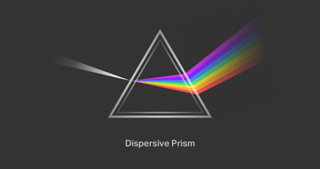
Newton discovered a visible spectrum of light, which consisted of many colors. He mapped them into classifications that became known as the color wheel.
His experiment also led to the discovery that all secondary colors can be created by mixing primary colors. Newton’s discoveries have influenced the work of artists, designers, and scientists up to this day.
7 Key Color Theory Terms You Should Know
With over 16 million colors to choose from when designing a website, it’s easy to become overwhelmed. Having such a vast array of options gives you near-infinite possibilities. Understanding the most basic color characteristics and terms can help you make effective design decisions.
1. Color Wheel
A color wheel is a powerful tool that can help you visualize relationships between colors in a standard, schematic way.

The basic color wheel consists of 12 colors. Primary colors form the basis of all others. Although traditional theory lists these as Red, Blue, and Yellow, recent research suggests that Magenta, Cyan, and Yellow are more accurate descriptors of how we perceive these colors.
Mixing primary colors gives you Orange, Green, and Purple. These are known as secondary colors. You can also combine primary and secondary colors to create tertiary colors such as yellow-green, blue-green, and so on.
2. Color Relationships
When working on a project, designers often rely on fundamental color relationships, also known as color schemes. The four main types include:
- Monochrome: Consisting of various tints, shades, and saturation of the same color.
- Complementary: Based on two colors from opposite sides of the color wheel.
- Analogous: Featuring three colors that are next to each other on the color wheel.
- Triadic: Using three colors that are at the points of a triangle drawn within the color wheel.
Complementary and analogous color schemes are the easiest to work with for many designers.

The first is excellent if you want to achieve a high contrast effect, while the latter produces more subtle results.
3. Color Warmth
In a nutshell, colors can be either “cool” or “warm.”
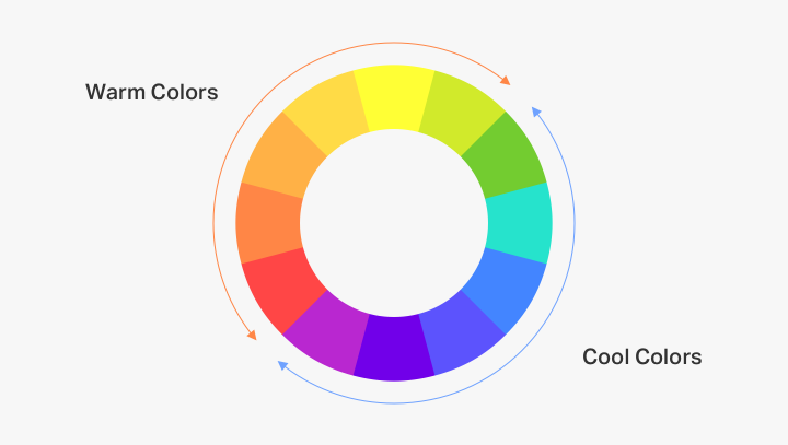
Hues that contain higher amounts of yellow and red are considered warm colors. They evoke a sense of passion, happiness, and heat, but can also seem aggressive and bring feelings of danger. That’s why they’re often used in alert messages.
Cool colors, on the other hand, contain higher amounts of blue and purple. These colors are reminiscent of chilly climates, crystal clear waters, or the sky. They are considered more soothing and relaxing than warm colors. However, they can also carry connotations of formality and sadness.
Adding neutral colors such as white, black, and gray can help you achieve a harmonious palette. They can balance out your color scheme and add contrast to your designs.
4. Color Systems: RGB, CMYK, and HEX
The three standard color systems are RGB (Red, Green, Blue), CMYK (Cyan, Magenta, Yellow, Black), and HEX.
The RGB color system is based on light. All colors in this system are a combination of Red, Green, and Blue. Each value is represented by a number from 0 (black) to 255 (white). It’s easy to understand once you remember Newton’s experiments: the maximum value of all basic colored lights produces white light, and zero color (or zero light) is black or darkness.

CMYK is used in print design. These are also the standard cartridges for most color printers. Unlike RGB, the zero value of all colors in the CMYK system (0,0,0,0) will produce white, while the maximum value (100,100,100,100) will be black. However, the standard black used in print is defined as (0, 0, 0, 100).
Finally, the HEX color system uses a six-digit, three-byte, hexadecimal description of each color, such as #000000 (black) or #ffffff (white). Every two characters represent a color value. For instance, the famous Facebook blue (#3b5998) includes a red hue described as 3b.
5. Tints and Shades
You can create tints by adding white to a color. Higher levels of white will produce lighter tints. Similarly, if you add black, you will produce a different shade. The darker the shade, the more black it contains.

You can combine tints and shades of a base color to achieve a monochromatic color scheme. However, it can be more difficult to make important elements stand out in such a design.
6. Hue, Saturation, and Lightness
Hue describes the degree of similarity between colors. The point of reference is usually a color such as red, green, blue, or yellow. For instance, when you describe a color as yellow-green, you’re thinking of it as having two hues.
Saturation, on the other hand, refers to color intensity. Increasing it will make the color more vibrant and darker while decreasing it will make the color appear faded and pale.
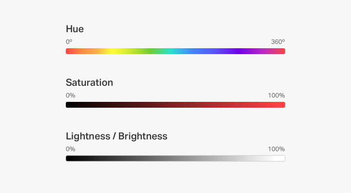
Finally, lightness defines how bright a color is compared to pure white. Changing only the lightness parameter in graphic editing software will produce different tints and shades.
7. Contrast
Contrast is a crucial element of any website, especially when it comes to background color and text. If the contrast is too low, users are more likely to have trouble differentiating between elements.
For the sake of readability, it’s best to use a white background and dark text color to keep pages clean and organized. On the flip side, you can also experiment with reversing the colors and using a light text over a dark background.
These two combinations have become a trend in web design, with many templates and apps offering a “Dark Theme” or a “Light Theme.”

Contrast is vital not only for readability but content hierarchy as well. A prime example is Aviaja Dance, which uses high contrast elements on its website to showcase essential details.
How To Apply An Effective Color Scheme
A well-selected color scheme will help you achieve a balanced design. Colors that work well together create harmony and contribute to a pleasant User Experience (UX).
However, clashing colors can cause negative impressions, with feelings of chaos and disharmony resonating from the design. This is why it’s crucial to develop your ability to craft effective color schemes that won’t put off your visitors.
Below are a few examples of different color schemes that are visually pleasing. We Are OSMs excellent monochromatic color scheme uses different tints and shades of green for its About section:

Our own color scheme applies analogous hues for the main banner on the home page. Using colors that stand next to each other on the color wheel creates a soothing gradient effect:

Instinct Studio boasts vibrant elements in orange and turquoise, which are complementary colors:
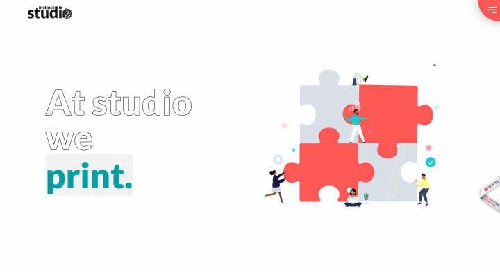
These colors stand on opposite sides of the color wheel and produce a sharp contrast when used together. However, note that this technique can start to feel aggressive if used excessively.
How to Use Color Psychology and Meaning to Influence Emotions
Color psychology is a fascinating field of study that examines the influence of colors on people’s behaviors and moods. Different colors are often associated with particular meanings or senses they provide to a perceiving person. To create a successful design, you need to be aware of the color meanings, and understand how a color choice can influence your users by generating a specific emotional response.
Many industries benefit from color psychology, especially marketing and design. Well-selected colors can convince users to take action and purchase products or sign up for your mailing list. In other words, the knowledge of color theory can help improve your conversion rate.
Below are examples of Elementor-based websites and templates that successfully employ color meaning in their designs.
Red
Red is a strong, energetic color. It can symbolize many emotions and ideas, both positive and negative. Users can associate it with love and passion, but it can also signal danger or anger.
Elementor’s Portfolio kit uses an inviting tint of red, which resonates energy and confidence:

Red can be a bold statement color if you want to draw users’ immediate attention. In fact, many food and beverage companies use red to evoke feelings of hunger and desire.
Orange
Orange is a warm and happy color that reminds many users of friendliness, enthusiasm, and motivation. As seen in Suited & Booted, using a bold orange background for your website’s navigation screen can give off a creative and adventurous vibe:
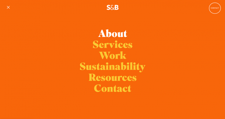
Using orange as a key player in your color scheme can result in a highly memorable site that leaves visitors with positive first impressions.
Yellow
Yellow is another warm color that symbolizes joy, happiness, and sunlight. When used strategically on your website, you can easily inject confidence and inspiration in your design.
Lùleka Experience has used this color particularly well, strategically adding bits of yellow to create a happy feeling on its homepage:

That said, too much yellow can tire the eyes and even create anxiety, so it’s best to keep it as an accent color.
Green
Green is a positive and calm color widely associated with nature, ecology, and renewing energy. Elementor’s Travel kit employs beautiful, dark green elements to compliment the images of greenery:

This color is pleasant and refreshing to look at, and it’s often used for environmentally-conscious brands.
Blue
Blue is a popular choice for many corporate brands as it symbolizes trust and reliability. It’s a calm, soothing color that can easily create a sense of freshness when highly saturated.
Elementor’s Digital Agency kit is a classic example of blue used in a business context. It’s vibrant and energetic, and evokes trust and confidence:

Blue can also look distant and sad when pale, so it’s essential to strike a thoughtful balance with this color.
Purple
Purple has long been associated with royalty, luxury, and wealth, but it’s also a mysterious and magical color. Combining the energy of red and blue, it can be an excellent option if you want to convey a message of power and trustworthiness.
For example, Proxy employs a stunning purple palette to create a sophisticated and mystical nighttime look:

Purple can be relaxing as it reminds many people of the dream sphere. However, a high concentration may also distract users.
Pink
Pink is a youthful and romantic color, reminding users of everlasting love. It’s widely associated with sensitivity and femininity, and it can also be a bold statement color.
As seen in this striking design by the Komini agency, you can use pink typography to create strong accents on your website:
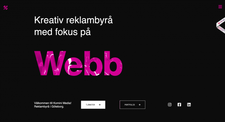
It can take a fair bit of confidence to pull off a pink-heavy color scheme. However, when used wisely, it makes for striking and memorable designs.
Black
Black has many meanings and can evoke different feelings when used in combination with other colors. Western cultures will sometimes associate it with evil and death, while in the East, it symbolizes strength and wisdom.
Elementor’s Photography kit employs a rich black background to emphasize the stunning imagery and create an elegant look:

Black can be tragic and mysterious, or serious and modern. It’s excellent for website backgrounds as it sets a sharp contrast with lighter typography.
White
White is a popular choice for modern, minimalist websites as it increases readability and pairs well with any color. The use of white space creates a feeling of cleanliness and light.
In this example, Jason Blackeye uses crisp white and light grey to make his portfolio projects stand out:

White can inspire new ideas as it reminds users of a blank page, so it’s not surprising it’s such a popular choice for a background color. However, too much white can also look empty and isolated.
Things to Consider When Using Color Psychology
As seen in our examples, colors can have many meanings that resonate differently with each user. Therefore, it’s crucial to have your target audience in mind when choosing color palettes for web design.
A user’s perception of color depends on factors such as their age, gender, culture, and even religious beliefs. The same color can have opposite effects in different parts of the world. For instance, white is considered a pure and positive color in the U.S. and Western Europe. However, Asian cultures associate it with death and sadness.
Color psychology is a complex subject, so make sure to study your target audience and learn about their preferences. Rely on the power of user testing, ask the right questions, and gather as much relevant data as possible so you can make informed decisions.
Introducing Elementor Global Color
Once you’ve created an effective color scheme, it’s smart to apply it across the entire website for brand consistency. Manually copying and pasting HEX codes to implement your chosen palette can be time-consuming.
Using tools such as the Elementor Color Picker enables you to save your preferred color combinations and apply them to your projects faster. However, If you want to manage a color scheme globally throughout your website, our new Global Color functionality will make your life easier:
Global color comes with the launch of Elementor Core 3.0 and is an additional layer of Theme Style. It helps you build your design with useful blocks that you can place where appropriate. This feature is perfect for making changes to a website’s color scheme without having to touch any code or CSS files, all from one place within the editor.
How to Use Color Theory On Your Website
Now we’ve covered the basics of color theory, you should be able to implement it in your next project. To recap, here are the main points to consider:
- Color choices are vital for satisfactory user experience. An effective color scheme can make a massive difference to your customers and contribute to your website’s success.
- Rely on color theory to come up with harmonious palettes and find the right color combinations.
- Color psychology is a powerful technique that can convey a variety of messages to users.
- You should always research your target audience and test their color preferences.
- Don’t be afraid to perform additional testing to establish whether your choice of color scheme is optimal on all devices.
Finally, you can use the Elementor Global Color feature to ensure consistency and harmony throughout your website’s design.
Enhance Your Web Design Skills With Color Theory
Color theory is a broad subject, offering insight into the science of color and the depths of human emotion. While it’s a complex field, getting a grasp on the basics can significantly boost your success as a web designer.
In this article, we’ve given you an overview of the fundamentals of color theory for web designers. From basic terminology and classifications to color psychology and cultural considerations, you should now have the tools to put this strategy into practice.
Do you have any questions about Color Theory and how to apply it in web design? Let us know in the comments section below!
Looking for fresh content?
By entering your email, you agree to receive Elementor emails, including marketing emails,
and agree to our Terms & Conditions and Privacy Policy.


