The scent of fresh cinnamon, pine, and peppermint are finally in the air, and your customers are starting to sniff out holiday deals.
As we transition from Black Friday marketing, now it’s time to get your website into the holiday spirit and focus on the Christmas selling season.
This year is expected to be exceptionally strong, especially for ecommerce retailers, where 11-15% growth is predicted compared to last year. As a result, many web creators are going to invest time and money in adapting their websites for the Christmas sales frenzy.
The good news is, we have created everything you need to help you maximize your sales with as little effort as possible.
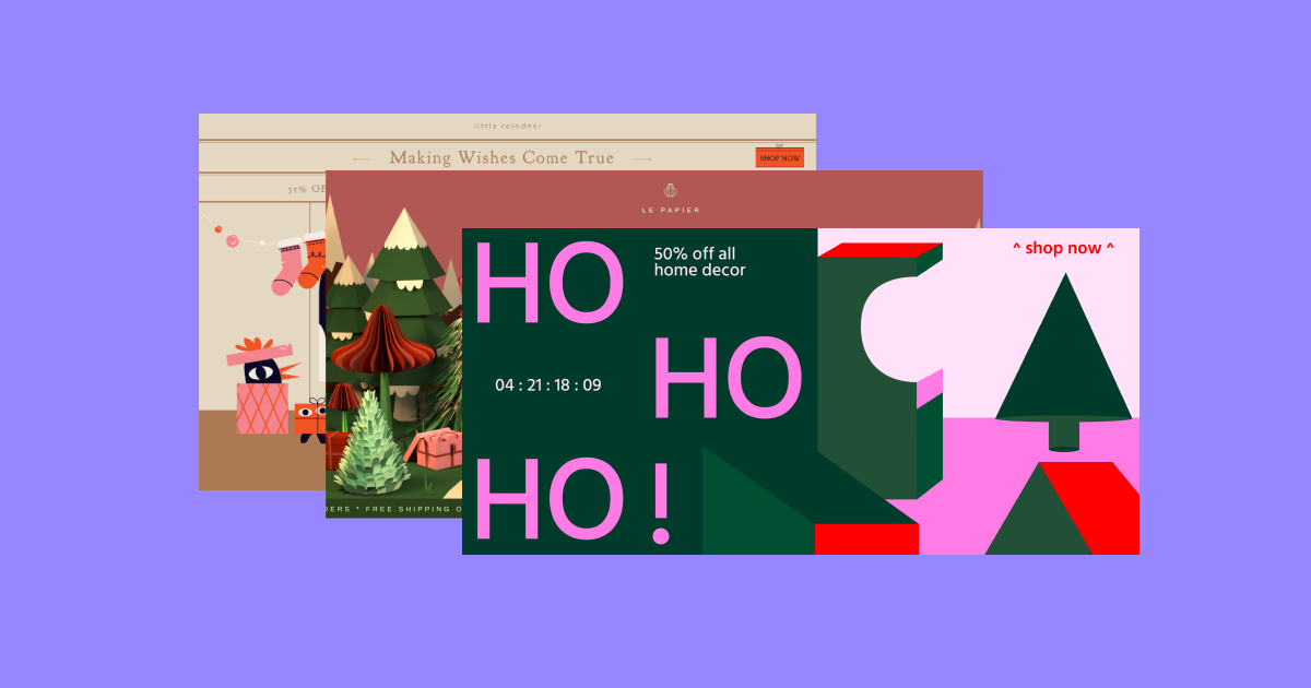
Introducing our Christmas Seasonal Kit for Pro users — a diverse collection of marketing-focused web assets that you can use to make your website festive and motivate your visitors to buy their Christmas gifts from you.
Our Christmas Kit includes:
- 3 super creative landing pages
- 5 unique sets of sections
- 5 eye-catching popups
- A collection of imaginative stickers & Lottie animations
Ready to see the Kit up close?
Landing Pages
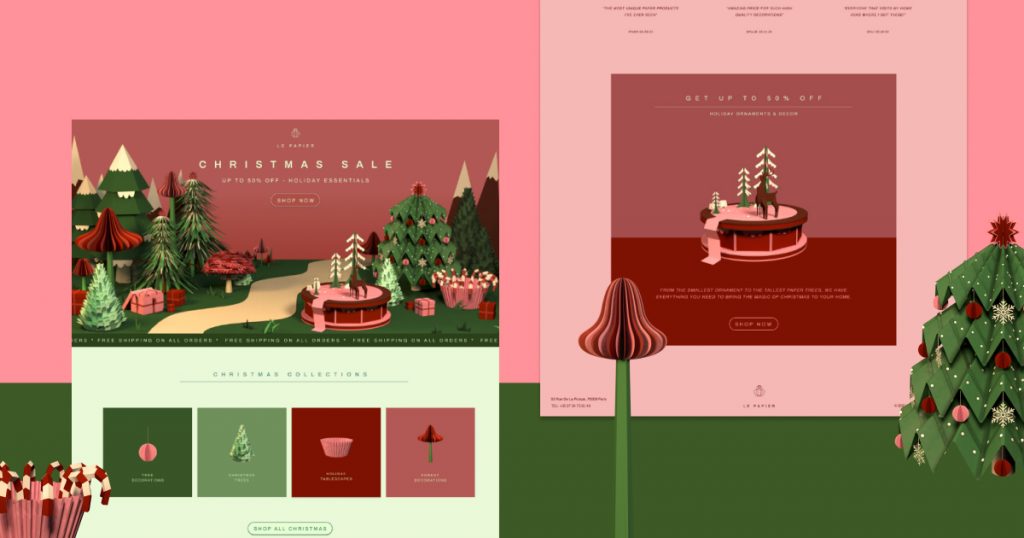
1. The 3D Christmas Delight Landing Page
This landing page is designed for any ecommerce brand that wants to encapsulate the traditional seasonal joy of Christmas. Inspired by Christmas window displays, the centerpiece of this page is the 3D graphic element that fills the hero section.
The custom-made Christmas wonderland visual includes moving parts to really make the page come alive. It’s built simply with a video file in the background, so it can be easily adapted to any existing website.
The rest of the landing page offers a clean and professional ecommerce shopping experience, with sections for product categories, individual items, and customer reviews. All of this is executed with a soft red and green color scheme, adding a sophisticated tone to the typical Christmas colors.
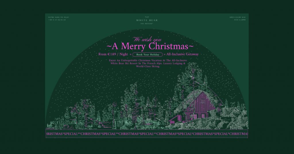
2. The Snow Globe Mania Landing Page
Shake up your website and transport your visitors to a magical world with this snow globe-inspired landing page. This page is a perfect fit for any hotel or service-oriented company that doesn’t require a lot of product images to be displayed.
The page purposely doesn’t include many photos in an effort to keep the emphasis on the feeling of a holiday experience, rather than on tangible products. In the hero section, you’ll find a large moving illustration that seamlessly blends with luxurious text fonts in the heading, which together create an enticing CTA in the center.
As you scroll down the rest of the page, you are greeted by all the necessary sections to help convert your users, such as benefits and features — each presented in its own special way. You can’t miss the falling snowflakes or the photos with unique masks.
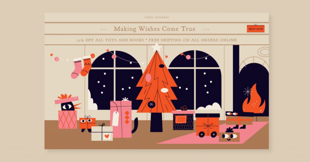
3. The Big Reveal Landing Page
This charming ecommerce landing page is designed to embody the excitement everyone feels when giving and receiving holiday gifts. The page is full of lively illustrations, all nested inside the look and feel of a holiday greeting card, which evokes nostalgic and cozy vibes.
One of the coolest parts of this page is the product images themselves. Using the flip box widget, every product is covered with ‘wrapping paper’ until the visitor hovers over it to reveal the product behind. The product images are also quite large to make sure the details of the items are clearly visible.
The page also uses the text path widget, motion effects, and multiple Lottie animations to make every part of the page more captivating and fit the gift-giving vibe.
Sections
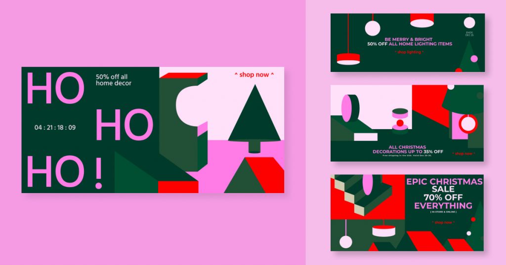
Section Selection 1 — “Shapes of Christmas”
Ho Ho Ho! These sections are perfect for any brand that wants to bring attention to their Christmas sales and make sure not a single visitor misses it! Designed with vibrant colors and abstract Christmas-related elements, every section offers a very eye-catching style to promote your sales.
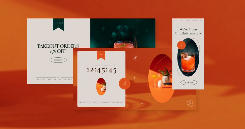
Section Selection 2 — “Snowflake Elegance”
This section set allows you to showcase your product images while keeping your Christmas promotions feeling elegant. The concept of the design is for you to develop your own look and feel by using the imagery you have. Both the background photo and main image are meant to be the same product photo, producing a combination that is a fun and trendy way to display your product.
In addition, the sections feature a subtle stamp decoration, Serif font to keep the text looking classy, and sparkling snowflakes to add a gentle graphic element.
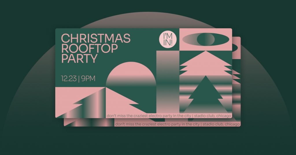
Section Selection 3 — “A Gradient Holiday”
Looking for a hip, trendy design that doesn’t require any customizations except for the copy? These sections are for you! The main feature of the sections is the gradient designs that are made even more engaging with motion by using Lottie animations. With shapes of Christmas trees and colors that give a spin on the classic Christmas red and green, these sections let you express the holiday vibe in a fashionable way.
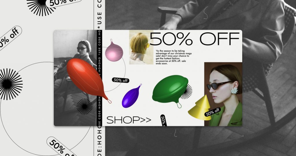
Section Selection 4 — “Ornament Blowout”
This set of sections feature an inventive design, with 3D Christmas tree ornaments bursting out of the page. The white background keeps the page clean and sterile while allowing the colorful shapes, along with your product images, to really pop out and capture your visitors’ attention.
With huge typography in the headlines and a countdown timer to create urgency, these sections are bold and marketing-oriented.
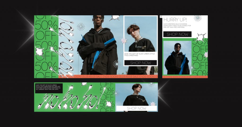
Section Selection 5 — “Metallic Madness”
These sections offer a shiny and exciting Christmas vibe. The most prominent aspects are the bright neon green color, the metallic text, and snowflake elements that add a cool ambiance to the page.
Huge images take up most of the space, making it perfect for ecommerce stores selling products like fashion items. From a sales perspective, the sections have countdown timers to create urgency and large CTA buttons to make sure the visitor can quickly click through to start shopping.
Popups (5 total)
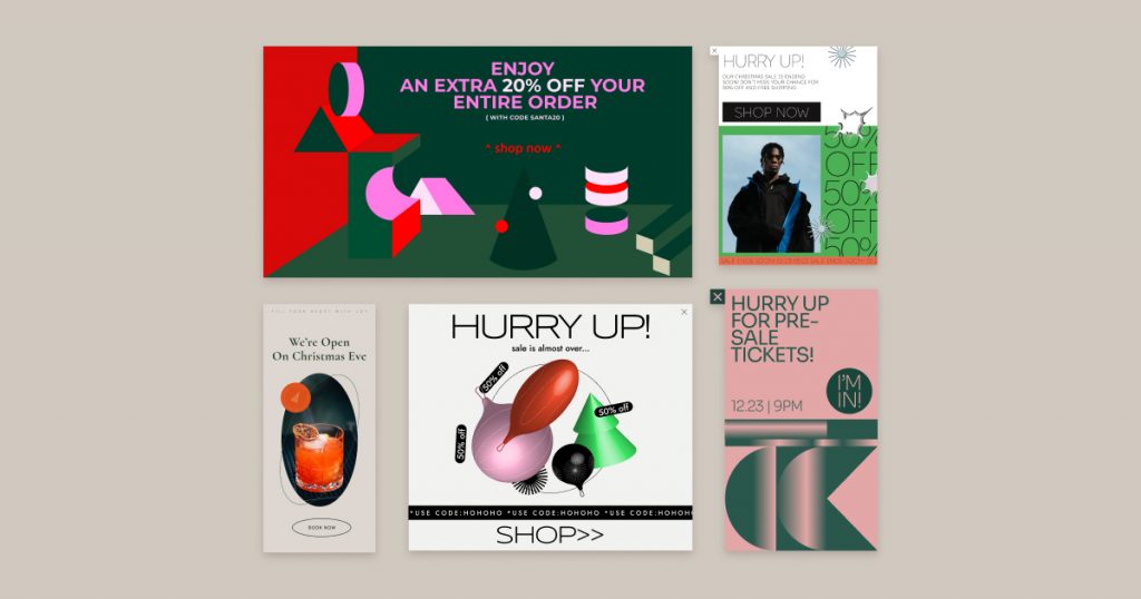
It looks like Christmas came early! For every set of sections, we made a matching popup to go along with it. When used properly, popups can be an extremely effective way to elevate conversions, especially for seasonal sales like this.
These creative eye-catching popups were designed with large CTAs and bold arrangements, all with the goal of making sure every site visitor sees your Christmas promotion.
All I Want For Christmas Is… Stickers!
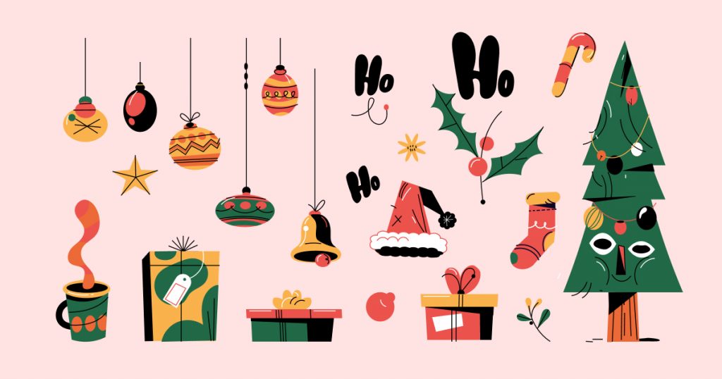
If you’re looking for a quick way to spruce up your existing site for Christmas, get ready to let out a cheer. With this collection of out-of-the-box Lottie animations and stickers, it’s never been easier to get your website looking festive for the holidays.
Whether your website is for a more formal brand or a young, hip brand, these stickers were specifically designed to fit any type of site. You can even create your own custom sections or popups using just the stickers and typography.
How do you use them? Simply copy any of these stickers and paste them onto your site and boom — just like that, your website is in the holiday spirit.
Let It Sale! Let It Sale! Let It Sale!
While Santa prepares his workshop for Christmas, now is the time for you to prepare your website to maximize your holiday sales. Just like the elves, we’ve worked hard to gift you a set of professional and creative marketing-oriented assets that you could quickly implement on your website.
Download the new Christmas Kit now and share a link to what you do with it! We would love to see the inventive web creations you come up with.
How to Install the Christmas Seasonal Kit
It’s very easy to get started! All you need to do is open the kit library by navigating to the WordPress Panel > Templates > Kit library. From there, you can choose the Christmas kit and start playing!
For more details about how to use the kits library, see this article
Looking for fresh content?
By entering your email, you agree to receive Elementor emails, including marketing emails,
and agree to our Terms & Conditions and Privacy Policy.
