Email lists are one of the most important assets for your business. When you have a list of engaged subscribers, you don’t have to rely on ever-changing social media algorithms to reach your audience.
Instead, you can regularly create email campaigns to convert new subscribers into paying customers. A study by Campaign Monitor shows that 64% of businesses use email to reach their customers.
In this way, businesses can effectively engage leads and warm up their audiences for future launches, sales, and other promotions. In addition, email marketing strategies can help decrease cart abandonment rates and recover lost revenue.
However, growing your email list isn’t easy. You’ll need email signup forms that empower you to capture the emails of those who visit your webpage.
To help you achieve that, we’ll discuss the benefits of email signup forms, share strategies for increasing email signups and show you practical examples of highly effective email signup forms to use as an inspiration.
Table Of Contents
Why You Should Use an Email Signup Form
For starters, a well-designed form paired with compelling copy and strategic placement provides visitors with an efficient way to sign up for your email list.
Email marketing remains a top-notch digital marketing strategy, yielding $42 for every $1 spent, a 4200% return on investment. That means you can tap into potential sources of revenue by simply having an email signup form on your website.
Moreover, when someone willingly gives you their email address, you have a standing invitation to their inbox.
Not only does that mean you get to reach people who are genuinely interested in what you have to offer, but it also means you get to use one of the most persuasive marketing tools available — email newsletters.
According to the Content Marketing Institute, 31% of B2B marketers state email newsletters are the best way to nurture lead generation. Through constant, personalized content, you can convert leads into long-lasting customers.
Lastly, highly targeted email signup forms can help you segment subscribers based on what they sign up for. That way, you can send them email campaigns that are more relevant to their interests and wants, improving your open, clickthrough, and conversion rates.
To ensure you can avail yourself of what email signup forms have to offer, make sure to follow the best practices listed below.
How to Boost the Effectiveness of Your Email Signup Forms
Although increasing email signups may seem complicated, you can grow your email list quickly and ensure it attracts the intended audience with the right tactics.
Here are 13 excellent ways to boost email signups:
- Spend Some Time on Form Design
- Place Opt-in Forms on Multiple Pages
- Use Compelling Copy
- Add a Shortcut to the Main Menu
- Use an Enticing Call-to-Action
- Offer Something in Return
- Don’t Go Overboard With Form Fields
- Create a Landing Page
- Promote Your List on Social Media Accounts
- Use Exit-Intent Popups
- Split Test Your Forms
- Create a Quiz
- Host a Giveaway
1. Spend Some Time on Form Design
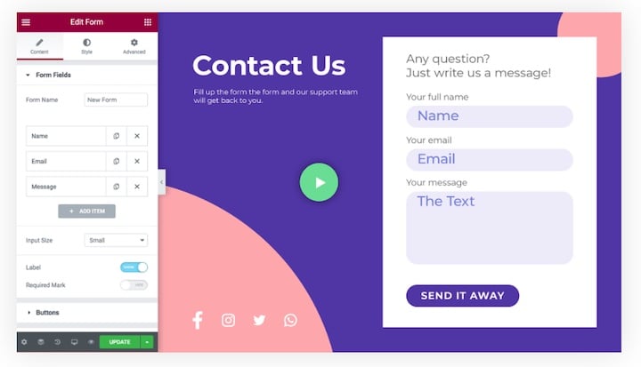
First and foremost, the design of your form matters. It should fit your brand but stand out from the rest of your website so it’s easily noticeable.
Using the secondary colors in your brand palette is a great way to ensure that the design of your form doesn’t blend in with the rest of your website.
2. Place Opt-In Forms on Multiple Pages
If you’re serious about growing your email list, you can’t add just one opt-in email signup form and expect magical results. Instead, you should add forms to multiple pages on your website.
Fizzle recommends you add opt-in forms to:
- The feature box on your homepage
- The middle or bottom of your about page
- Individual blog posts
- The blog sidebar
- Your website’s footer
- One or more pages as popups that appear after visitors spend time on your website or scroll down
Don’t forget to monitor your conversion rates for each online form so you can see which forms are working well and which aren’t. That lets you tweak and optimize where necessary.
3. Use Compelling Copy
“Sign up for our email list” doesn’t feel very exciting. Instead of generic copy, use action verbs and highlight the benefits of filling out your newsletter signup form.
A few examples include:
- “Keep up with the latest news.”
- “Get special offers and discounts.”
- “We won’t spam you.”
- “Get exclusive content.”
It’s even better if you can include how often they can expect to receive your newsletter. For example, adding “weekly,” “twice a month,” and similar wording is a great way to set the expectation from the beginning.
4. Add a Shortcut to the Main Menu
The horizontal bar is the most common type of website navigation menu. Take advantage of that by including a shortcut to an email signup form at the top.
Ensure it stands out from the rest of the menu by giving it a different background color.
5. Use an Enticing Call-to-Action
Even if you design a great-looking form and use a compelling copy, your hard work can go to waste by using a generic call-to-action (CTA) such as “Submit” or “Sign up.”
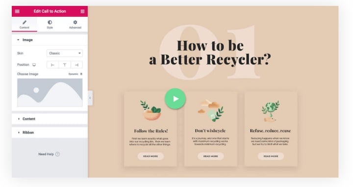
Instead, get creative with your CTAs and use action-oriented language to make visitors feel excited about signing up.
For example:
- Join the club
- Become a VIP/insider
- Send me my discount/gift
- Get your download
- Claim your gift
- Download your copy
These CTAs are all conversational, compelling, and direct. They encourage visitors to sign up without using generic language.
6. Offer Something in Return
The average person receives 121 emails per day. The last thing anyone wants is yet another email in their inbox.
If you want to increase email signups on your website, consider offering something in return.
That can be a lead magnet in the form of a content upgrade or a free guide. It can also be a video training session, an exclusive audio recording, or a coupon code.
The most important thing to remember is that the lead magnet has to be related to what you have to offer. Otherwise, you’ll have a hard time converting those subscribers into paying customers.
Pro tip: some people might try to abuse your sign-up form, and use invalid or temporary emails to subscribe and get your free offer. Simple solution: use real-time email verification in your forms! Verify emails at the moment of entry and don’t allow any invalid, disposable, or mistyped email to get through your form.
7. Don’t Go Overboard With Form Fields
Although many studies state that less is more when it comes to form fields, it isn’t that simple.
For instance, HubSpot found conversion rates decreased as the number of fields increased, but the drop wasn’t as steep as you would expect, with 10 fields performing slightly worse than a single field.
Conversely, an Unbounce study showed that reducing form length led to fewer email signups.
So, what does that mean for you?
Ultimately, it comes down to how much information you need from visitors. In most cases, a name and an email field are more than enough. Having two fields removes friction and makes the signup process easy.
However, there might be instances where you need more. In that case, ask yourself the following questions:
- Is the form easy to understand and fill?
- Is the data you’re gathering sufficient to convert leads into customers?
- Does the value of your offer outweigh the value of the information visitors will provide you?
- Does every single field serve a purpose?
- Will additional fields truly help you find high-quality leads?
8. Create a Landing Page
Create a dedicated landing page on your website for the email list. The landing page should make it as easy as possible to sign up for your email newsletter and be free of any distractions.
You can easily create it with the help of Elementor by choosing the Elementor Canvas for the Page Layout.
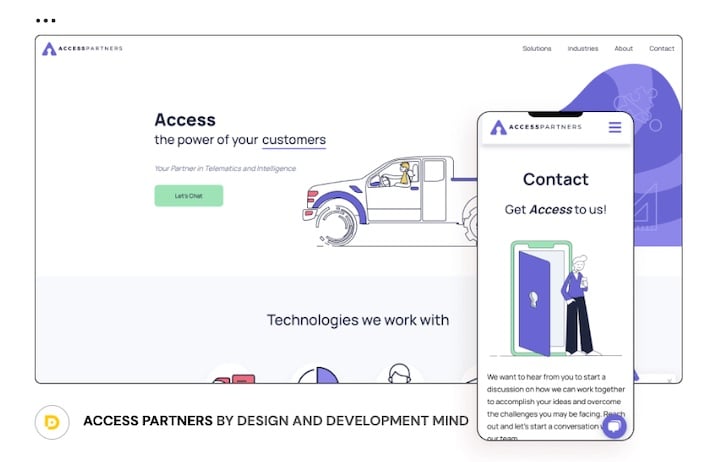
Doing so also makes the landing page easy to share on social media or to include as a link in your bio.
9. Promote Your List on Social Media
You can’t add an email signup form to your social media platforms, but that doesn’t mean you can’t use social media to grow your email list. Like we mentioned above, you can share the link to your landing page or include it as a link in your bio.
You can also talk about the benefits visitors get once they subscribe to your email list to get them to click through to your landing page.
Another way to promote your email list is to give visitors a snippet of email campaigns you’ve sent out previously so they can get a taste of what they can expect.
If you have email subscribers who replied to your emails and said positive things about your newsletter or campaigns, share it as social proof and turn followers into subscribers.
10. Use Exit-Intent Popups
An exit-intent is a technology that detects when users intend to leave your website and shows them a popup email signup form in response. It gives the visitors another chance to engage with your content and encourages them to sign up even if they’re not ready to make a purchase.
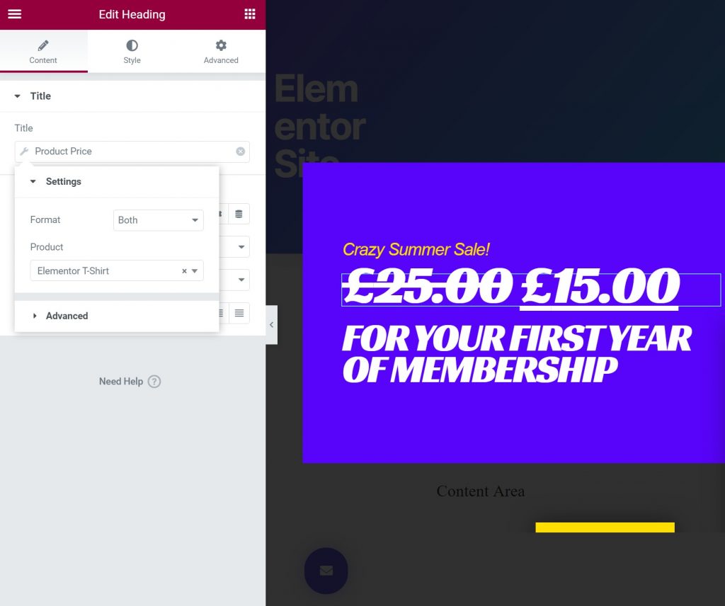
According to a RocketFuel study, between 26-70% of website visitors will abandon your website and never return. A form with exit-intent technology can help convert additional visitors leaving your website into email subscribers.
11. Split Test Your Forms
A split or A/B test lets you test two or more versions of your forms to see which versions perform better. The way it works is simple.
You create different versions of your form and set up a split test. One portion of your website visitors will see one version of the form, while others will see the alternative versions.
Once the A/B testing process is complete, you’ll know which form converts better and can continue showing it to your audience.
Keep in mind that split testing isn’t exclusive to forms. You can also split test your landing pages.
12. Create a Quiz
If you want an engaging way to increase email signups, consider creating a quiz. According to Ion Interactive, interactive content, such as quizzes, converts moderately or very well 70% of the time.
Quizzes are fun for your visitors as nobody can resist learning more about themselves or testing their knowledge.
Additionally, a quiz is a great way to segment your audience and create highly targeted email campaigns.
13. Host a Giveaway
A giveaway is another great way to increase email signups. However, don’t make the mistake of offering a generic item like an iPad for your giveaway. Doing so will result in everyone entering your giveaway because they want an iPad and not because they’re interested in your offers.
Instead, offer a lower-priced product or, if you sell services, a consultation session or a lower-tiered service as a prize.
That ensures only people who are likely to buy from you enter the giveaway. That way, you’ll have an easier time converting them from leads to paying customers.
Great Examples of Email Signup Forms
Now that you know how to increase your email signup rate, let’s look at four effective email signup form examples. Use them as an inspiration when designing your next form.
1. Anthropologie

Anthropologie has a simple email signup form with an email address field and a button. However, the header and the subhead make it clear why you should subscribe — you’ll be the first to know about new products and special offers.
If you love the brand and want first dibs on exclusive content and promotions, it’s hard to resist signing up for their emails.
2. Intelligent Change

Intelligent Change is the company behind Five Minute Journal and Productivity Planner. Its signup form is relatively minimal in design but uses powerful copy.
For starters, it gives you an immediate value and a clear benefit of why you should subscribe. After all, who doesn’t want a boost of inspiration in their inbox?
Secondly, the subhead language offers social proof in the form of how many subscribers they have and makes you feel like you’re joining a large, albeit exclusive, club.
3. West Elm
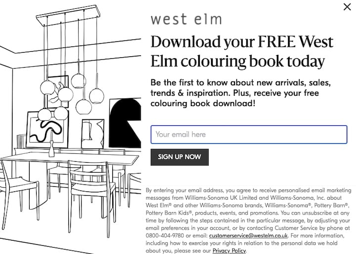
West Elm is a well-known furniture retail store that opted for a minimal but highly effective popup form. The popup form has a main headline that offers a free coloring book and a smaller subhead that elaborates on the benefits of an email subscription.
What makes this form effective is the picture on the right that shows you what a page from the coloring book looks like, so you know exactly what you’re getting.
4. James Clear
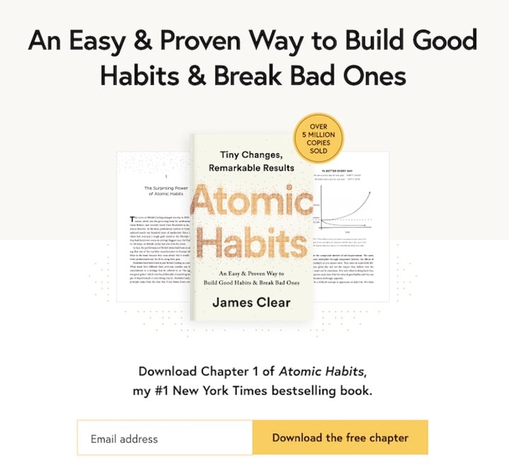
James Clear is the author of the best-selling book Atomic Habits. As soon as you land on his homepage, you’ll notice a large headline that highlights the most significant benefit of his book, accompanied by a simple email signup form.
The form prompts you to download the book’s first chapter for free and includes a single email address field.
That is an excellent example of a benefit-packed headline with a form that removes friction and makes it easy to subscribe to his list as a first-time visitor.
5. BH Cosmetics
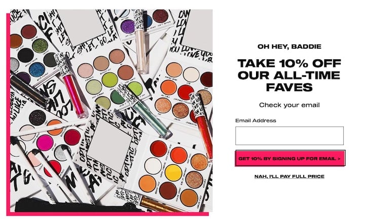
BH Cosmetics is a popular makeup brand that offers a wide range of products. A large display with its latest release greets you when you visit the company’s website.
When you scroll or try to leave the website, a popup appears. The popup offers a 10% discount for signing up for the company’s email list, and you can apply the discount to your order immediately.
The cosmetics company does an excellent job of making the most of its exit-intent popup.
Grow Your Subscribers List With These effective Practices
Getting more email signups for your list has many benefits. It empowers you to nurture and engage subscribers to convert them into paying customers for your ecommerce store.
An active email list is a warmed-up target audience ready to buy when you launch a product or a service.
Increasing email signups seems daunting, but if you follow the tips and best practices we outlined, you’ll be well on your way towards growing your subscriber list.
Good luck!
Looking for fresh content?
By entering your email, you agree to receive Elementor emails, including marketing emails,
and agree to our Terms & Conditions and Privacy Policy.
