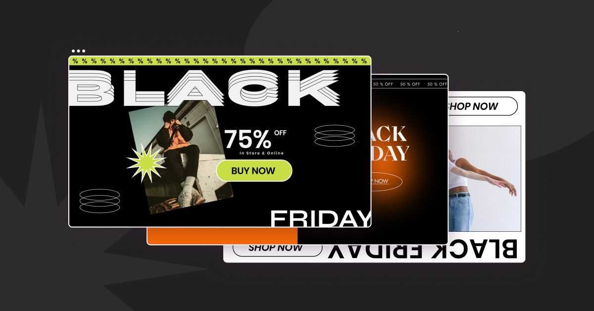
Are you ready for Black Friday?
No, I don’t mean camping outside of the Apple store…
I am referring to updating your (or your client’s) online store, so visitors properly notice your discounts and get the visual encouragement they often need to get into the holiday atmosphere and buy from you.
Black Friday is not just for big retailers like Walmart and Target. In fact, SMBs experienced a bigger boost than large retailers, which came down to a +107% revenue boost over the holiday season.
It’s not too late to give a quick Black Friday refresh to your websites! To help you do just that, we’ve just released our first-ever Seasonal Kit for Pro users, made up of several beautiful marketing assets specifically designed to help you drive more sales for Black Friday and Cyber Monday sales. (Hint: stay tuned for more Seasonal Kits!)
Our Black Friday kit includes:
- 3 landing pages
- 6 sections
- 6 popups
- A collection of stickers & animations
Want to see what’s inside?
Landing Pages
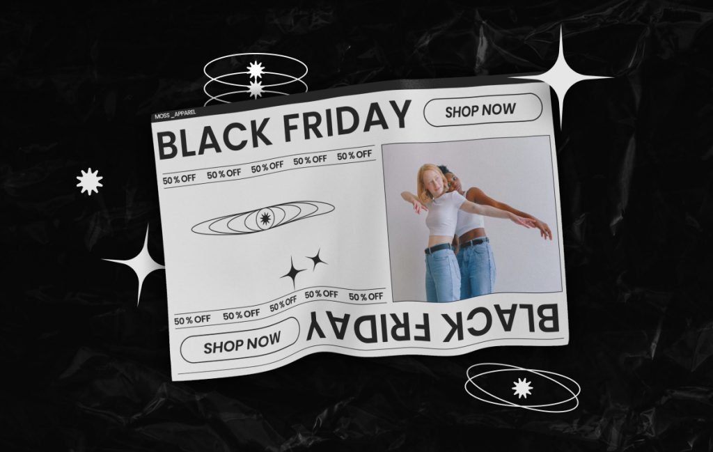
This landing page variation was made for ecommerce brands who are looking for a clean, simple, and minimalistic design. In our example, we featured a fashion brand to showcase how this design could be a great fit for sleek & trendy products.
A few things to know about this page. It’s highly image-focused. The simple design of the page is meant to put images of the product front and center. This lets the product speak for itself (and basically sell itself).
Also, this page is very marketing-focused. We included large Call To Action buttons, countdown timers, and Sale Strips across the page. This creates a ton of urgency and meets all the marketing requirements for this type of seasonal campaign.
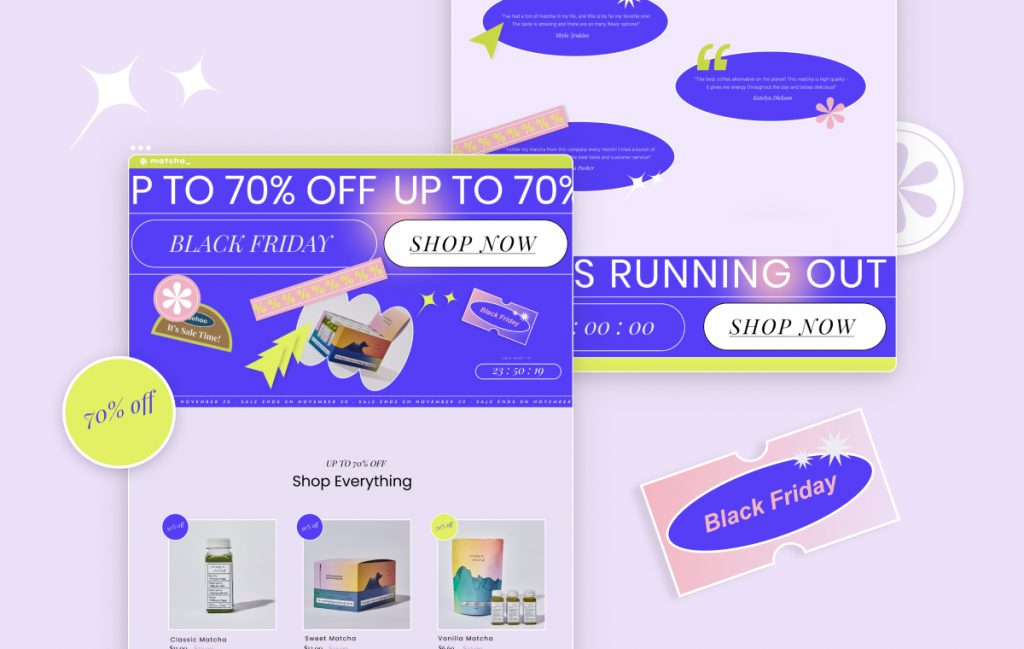
Once you visit this page, you’ll notice its unique design right away. The entire landing page was built to draw attention and be outspoken. This page really encapsulates the excitement and buzz around the Black Friday sale and incorporates both the designer and marketer perspectives to create a design that is both visually appealing and conversion-oriented.
The features of this landing page include:
- A vibrant and bright color scheme
- Lottie animations to make the page come alive
- Big headlines, CTA buttons, and countdown timers, all with the main purpose of driving conversions
There are several elements on this page that make it easy for you to customize it. For instance, we used a mask on some of the main images on the page, in order to create unique image shapes. We also included many stickers to make it easy for you to play with them.
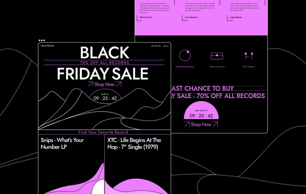
If you wanted something different and stylish — this is the template for you! The design is built with an ecommerce site in mind, but the style takes a more abstract and avant-garde direction.
The color scheme of black & purple was chosen to emphasize the Black Friday sale by being in the classic black color.
The neon vibe is used to make the page more unique and eye-catching. Neon colors add a sense of celebration and excitement to the Black Friday campaign.
Widgets such as the flip box, in addition to animations, add an interactive approach to the page. This page is also very customizable for many different types of websites. Created in the more traditional branding of a Black Friday sale, the page can easily fit almost any kind of product.
Sections
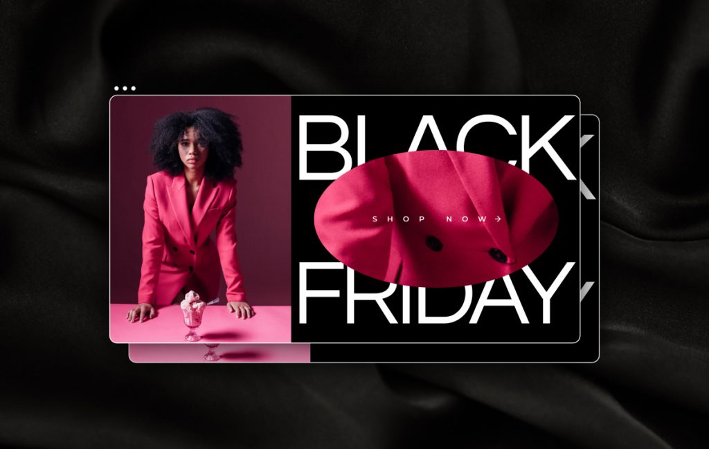
These sections are a strong fit for fashion-oriented products, with a strong emphasis on putting the product at the front and center of the design. The sections include bold images on the left, and a unique zoom-in on the image to the right. It also features a big countdown timer that emphasizes the limited-time offer.
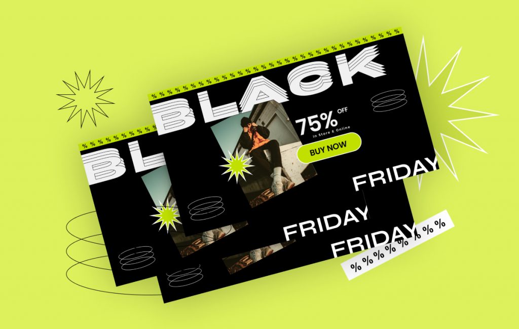
Here is a highly striking set of templates, with bold text that features a contrasting yellow color. This will make sure your visitors do not miss the sales offer. With its cool stickers and animations, this is a sure-fire way to make any page pop out.
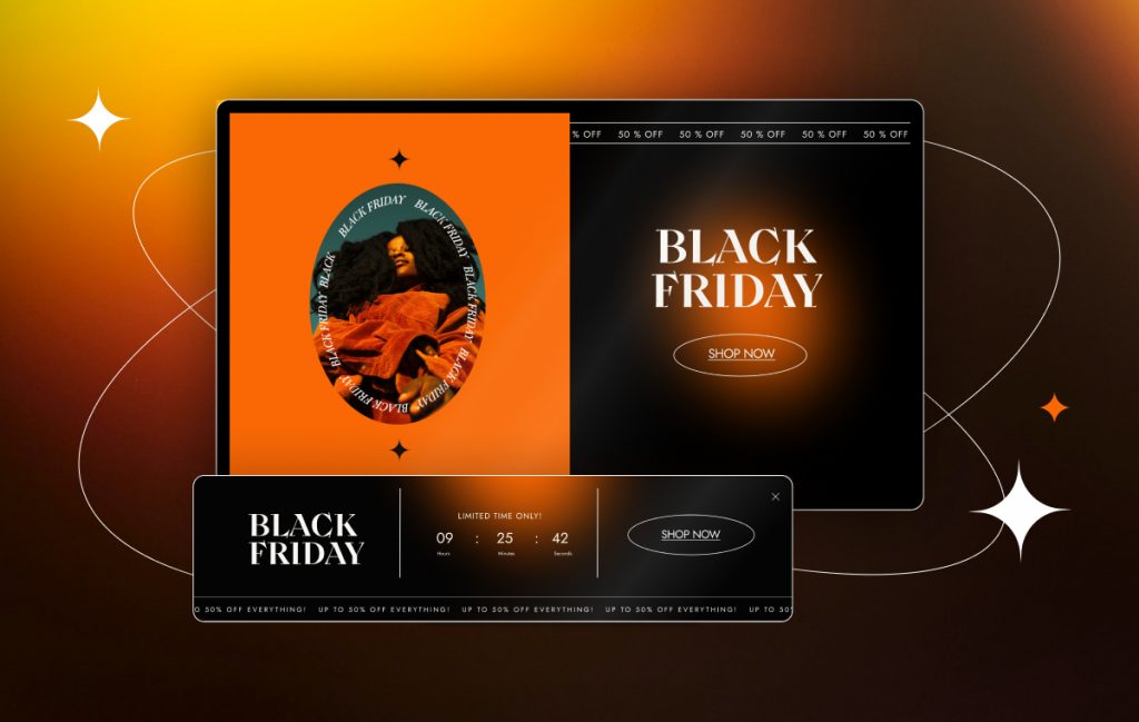
Section Selection 3 — “Orange Chic”
This set is for web creators looking for no-fluff sales sections that show a big and conspicuous call to action. The big contrast between the black and orange colors helps draw attention to the product on the left.
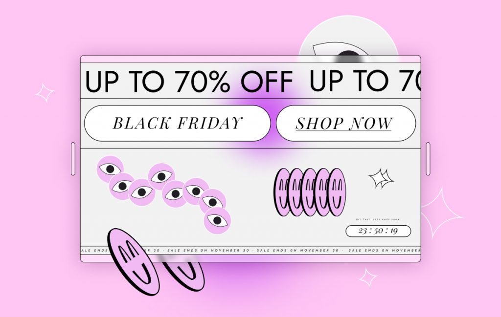
In this set, Lottie animations and cool stickers contribute to a unique look and feel. These are small additions that make the Black Friday sale more friendly and playful. In addition, you have bright pink colors that give the sections even more playfulness and a sense of fun. These design touches do not detract from the sections’ ability to drive conversions. This is done using large CTAs and a prominent sale strip.
A lovely section set that is all about glamour, glitter, and glory. The sections feature a top countdown timer with an image and big seasonal messaging with a CTA. The use of gradients with soft colors can be easily adapted to fit any of your brand colors. If you have a certain product offer you wish to promote and feature, this section can give it the right framing and attention.
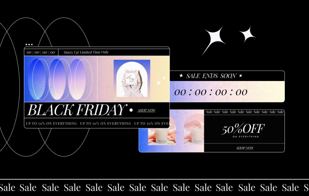
Section Selection 6 — “Bouncy Planets”
With its vivid colors and use of round shapes, this set of Black Friday sections features deals for an online vintage clothing store.
Among the sections, you’ll discover large CTA buttons, a big countdown timer, and moving sales strips. The unique style is achieved by contrasting two kinds of typography: the classic old font for the ‘Black Friday’ heading, contrasted with the newer font in the CTA. This contrast is further enhanced by the use of circles and spheres with two colors, which form an abstract metaphor of the new world VS the old world.
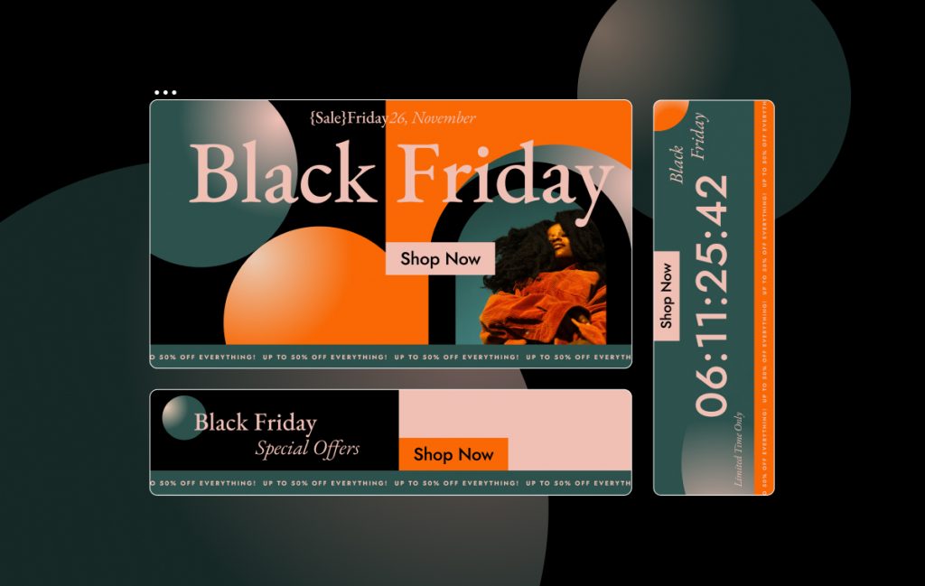
Popups (6 total)
If you scroll through the above sections, you’ll discover 5 popups that correspond to each section selection design. Use these pop-ups in conjunction with the other sections to create the ultimate conversion boost for your upcoming Black Friday and seasonal sales. The popups are highly customizable and similar to the sections, they have been created with a big focus on boosting conversions.
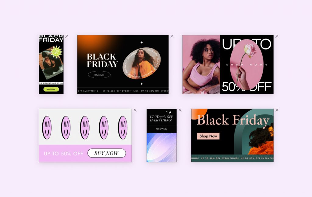
The real icing on the cake is the lively bundle of stickers and Lottie animations we included in this kit. It’s an easy way to make any website more unique and engaging.
You don’t have to be an experienced web creator to take advantage of these animations. In fact, you don’t have to have any experience at all. These stickers will save you time because instead of creating them on your own, you can simply copy them and insert them in any section on your website. They all relate to seasonal sales and feature dancing shopping baskets, hip shopping bags, and other goodies.
Ladies and Gentlemen, Start Your Shopping!
Our aim with this kit is that you have all the tools you need to make this upcoming seasonal sales more profitable for your business or your clients. Now it’s your turn to put in the work and incorporate these sales-boosters into your marketing stack.
Our team is really curious about what you will do with this kit, so we’d love it if you could send us samples of your new Black Friday optimized websites.
Looking for fresh content?
By entering your email, you agree to receive Elementor emails, including marketing emails,
and agree to our Terms & Conditions and Privacy Policy.
