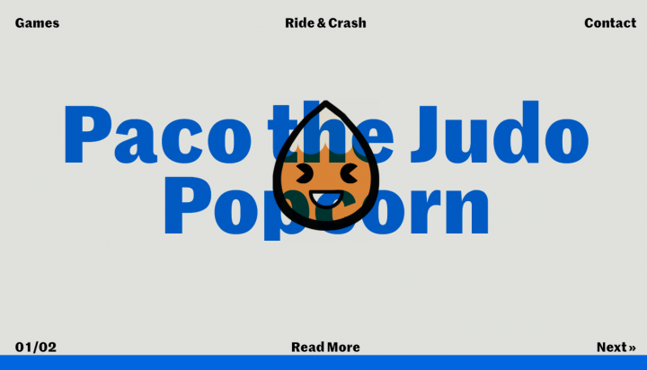
Design is communication. Writers use words to communicate the message, and designers, designers use words and visuals to do the same. In this era of short attention spans and constant distractions, designers have to use techniques that allow communicating as succinctly as possible. And this technique is minimalism. Applied wisely, minimalism helps designers make user journeys intuitive and purposeful.
In this article, we will discuss the roots of minimalism, its role in digital design, key principles of minimalism, and best practices of minimalism in digital design.
The Brief History of Minimalism
While minimalism might be a new trend in digital design, the core ideas of minimalism have been around for much longer. The roots of what we call ‘minimalistic design’ can be found in traditional Japanese culture. Japanese culture values balance and simplicity. Japanese architecture, interior design, art, and graphic design have long employed minimalist aspects.

As a Western movement, minimalism began early in the 20th century. Influenced by the Bauhaus movement, many architects began to employ minimalist designs in their buildings. Ludwig Mies Van der Rohe, the German-American architect, was one of the pioneers of the minimalist movement. He is credited as being the first to apply the phrase “less is more” to architectural design.
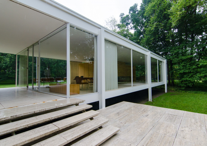
The less-is-more approach to creativity quickly moved from architecture to other fields: interior and industrial design, painting, and music. But no matter the field, a key principle of minimalism remained the same — leaving only the essential part of a feature, in order to focus the recipient’s attention and enhance the overall elegance.
The Role of Minimalism in Digital Design
The more elements we add to products, the more complex the products become. Minimalism is a natural reaction to a trend of increasing complexity in digital products. Minimalism helps improve the efficiency of communicating information, on the web and in mobile apps, by focussing on creating a high signal-to-noise ratio.
The signal-to-noise ratio represents the relationship of relevant to irrelevant information. The information could be anything — text sections, visuals, and animation. Anything that the user has to process could be either a signal or noise. Applied correctly, minimalism can help us create highly-focused user journeys, for visitors to know where to look and what to do at every step on the way.
Minimalism brought a few additional benefits to digital design, such as:
- Good aesthetics. Well-designed minimalist products have a modern progressive look.
- Faster-loading times. Minimalist websites and apps feature fewer objects, and thus, load faster.
- Better compatibility between screen sizes. No need to conduct a dramatic redesign to adapt a layout to different screen sizes.
Key Principles of Minimalist Web Design
Leave Only Essentials
To create a truly minimalist interface, a designer has to understand the user (their wants and needs) and carefully prioritize elements. The design must only show elements of the highest importance and strip away everything that would distract users from what’s important (such as unnecessary decorative elements).
Don’t Hide Important Elements
The key idea of minimalism is to make the message more clear, not more hidden. Thus, be careful with elements like key information and primary navigation options because users often get confused when they cannot find vital information or navigation options.
Master Negative Space
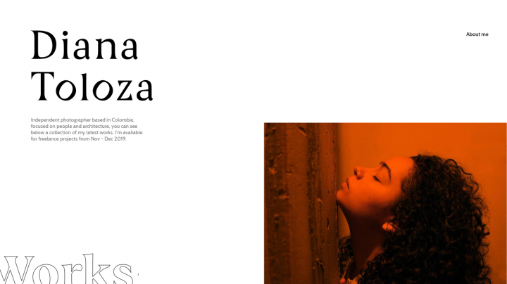
The most important element in minimalism is the lack of elements. Negative space, the empty space between visual elements, is the backbone of the minimalism. You can use negative space as a tool to direct users’ attention and allow them to digest content more easily.
More empty space means more emphasis on existing elements. In Japanese culture, it’s known as the Ma principle: treating the space between objects as a means to emphasize the value of those objects.
Visual Characteristics of Minimalism
Below are the most common visual design characteristics that are associated with minimalism.
Limited Color Scheme
Color is one of the most powerful tools in a designer’s toolkit. It can both inform users and set a particular mood. When designers work on a minimalist website or app, they tend to get the maximum from just a few selected colors (usually, a maximum of three colors used simultaneously). In fact, using only a single color (a monochrome color scheme) is not uncommon.
Dramatic Typography
If 95% of the information on the web is written language, it’s not surprising that along with colors, typography plays a critical role in web design. Directing the user’s attention to a message is easier using bold typography.
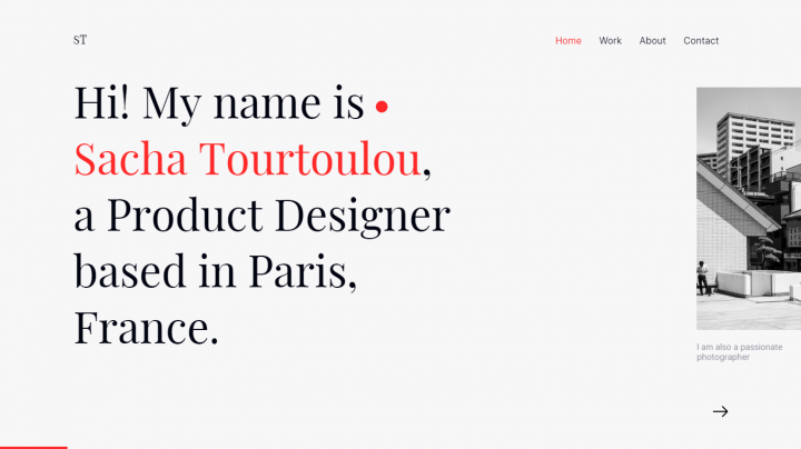
When it comes to font selection, designers tend to limit the number of fonts to one or two font families. It’s always possible to use variations of font size, weight, and style to create the right visual hierarchy.
Flat Textures
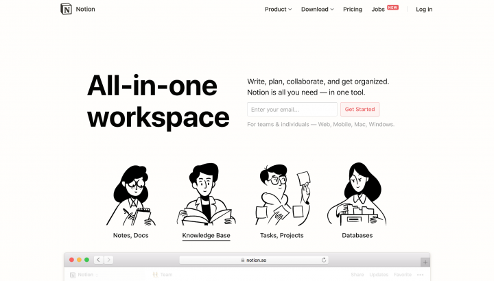
Flat design has become a great ally of minimalism in modern digital products. It doesn’t employ any of the obvious graphic manipulations (such as highlights, shadows, gradients or other textures) that would make UI elements look glossy or 3-dimensional. As a result, the objects look neat in different resolutions and sizes. Some of the most notable examples that use this plain 2-dimensional design are buttons, icons, patterns, illustrations that completely contrast the highly realistic and detailed versions of the same elements.
When Minimalism Works the Best
While the minimalist philosophy behind content-driven design applies to every product, a minimalist aesthetic might not always be appropriate. Applying minimalism effectively to a more complex digital product can be challenging because it’s usually hard to achieve a balance when you have a lot of content and features. That’s why minimalism works best for projects that have fairly simple goals and relatively little content (like portfolio websites or promo pages).
Best Practices of Minimalism in Digital Design
Minimalist design can create a false impression of a design that is easy to create. But in reality, it’s really hard to achieve a minimalist project that will have good usability. A minimalist design demands the same level of clarity and functionality as a regular design, but with fewer elements, and that can be extremely challenging.
Minimalism also requires having solid design skills. The line which divides simple and primitive is thin, and without proper skills, it’s way too easy to create a primitive design.
Review Your Content and UI Elements
“Less is more” is the foundational principle of minimalism. But what does it mean exactly? Joshua Becker perfectly summarized the meaning of the principle in his book “The More of Less”:
“You don’t need more space. You need less stuff.”
It means that before creating a page or screen, you need to think about what content you want to place on the page. For every content and UI element, ask the following questions:
- Is it essential? Does it serve a purpose?
- What is the role of the element? Is it functional or decorative? If it’s a decorative element should it be a part of this design?
A minimalist designer’s rule of thumb is, “subtract until it breaks.” Edit your copy and visuals to include only the bare minimum information required to explain your message adequately.
Have a Single Point of Focus per Screen
The minimalist philosophy centers upon the idea of designing around the content: Content is king, and the visual layout should place the king in the spotlight. The aim is to make the message clearer, not just by stripping away distractions, but also by directing the user’s attention towards what’s important. Some minimalist designers recommend following the “one concept per page,” rule and design each page or screen to focus on one concept at a time.
Set Great Initial Expectations With the Top Area of the Screen
The content visible on the page without requiring any action is what will encourage users to explore the website. To increase the chance for engaging visitors, you need to provide content tailored to the needs of your target audience right from the start.
For content-heavy web pages, it’s recommended to place high-level content with ample negative space at the top of the screen, and then increase the content density as the user scrolls.
Use Color to Guide Users
Color is a multi-purpose tool that can benefit minimalism in two ways: by making the design more consistent, and by making the experience more focussed. To achieve the former, you’ll need to select one color to be used consistently across all your pages. This color should match the message and the mood you want to convey (for example, your brand’s primary color), creating a connection between sections of the page and the different screens.
Colors can also help designers to create focal points — areas that have more visual weight and attract visitor’s attention. High contrast areas (i.e. graphics or text) can draw the user’s attention to the crucial elements of your design.

Experiment With Fonts
Font selection is vastly important for any project, even more so for minimalist design. Since you don’t have too many elements in your layout, every element will draw more attention. Clean and readable typography is essential for any minimalist design.
Ideally, you should rely on one font family, two at the most. If you decide to use two fonts, you will need to create a visual hierarchy for them. For example, one font could be used for headings while the other could be used for body (paragraph) text. You should also make sure that your two font families work together. Fontjoy is a great tool for doing just that.
Design Intuitive Navigation
When designers create a minimalist design, they have to rigorously prioritize all elements, including navigation options, to show only the details of the highest importance. Navigation design in minimalist interfaces can be challenging. Incorrect prioritization and bad discoverability are two of the most common problems of navigation. Remember that when visitors cannot find the navigation elements, they won’t be able to use your product. Thus, it’s vital to ensure that the navigation options for critical user experience are either clearly visible or, if hidden (collapsed), easily discoverable.
Vivid Images and Illustrations
Imagery content is one of the things that designers often neglect when working with a minimalistic design. Of course, not all digital products need imagery, but imagery can spice a design with an element that brings visual interest.
When working with imagery, it’s vital to achieve a balance with other visual design decisions. Photos and illustrations should blend with the rest of the elements of your minimalist interface, and accurately depict the product or service you provide.
Functional Animation
Like every other element we described above, as a graphic element, animation should follow the principles of minimalism, by being both subtle and meaningful. For example, you could use animation to save screen space (revealing hidden details on hover) or direct the user’s gaze to a particular element (e.g., have a content object move as the user reaches it).
When it comes to designing actual animated effects, it’s recommended that you keep them simple. Simple micro animations and transitions won’t distract your visitors and will serve their purpose.
Minimalism — a Powerful Tool for Users
All great examples of minimalist design have one thing in common — they combine excellent usability and great aesthetics. Minimalist products simplify interfaces by removing unnecessary content and features — anything that does not support the user’s tasks. As a result, these easily navigable, beautiful digital products become a powerful tool for users.
Looking for fresh content?
By entering your email, you agree to receive Elementor emails, including marketing emails,
and agree to our Terms & Conditions and Privacy Policy.
