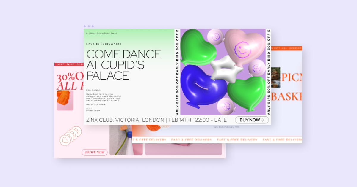
Do you believe in love at first site?
Well, in the world of web creation, all you need to do is add some sweet Valentine’s Day designs to your website to make your customers fall in love and get in the shopping mood!
Valentine’s Day is a huge spending holiday, and ever since the pandemic started, more of those dollars are going towards online stores. Last year, online was the most popular destination for Valentine’s Day shoppers and there’s no reason to expect this year to be any different given the current state of the world.
To help you quickly get your website into the romantic vibe of this unique holiday, we prepared a collection of marketing-focused assets for you in our new Seasonal Kit for Pro Users!
Our Valentine’s Day Kit includes everything you need:
- 2 heartwarming landing pages
- 3 lovable sets of sections
- 3 precious popups
- A collection of sweet stickers & Lottie animations
Ready to dive in?
Valentine’s Day Seasonal Kit Demo
Landing Pages
1. The Retro Romance Landing Page
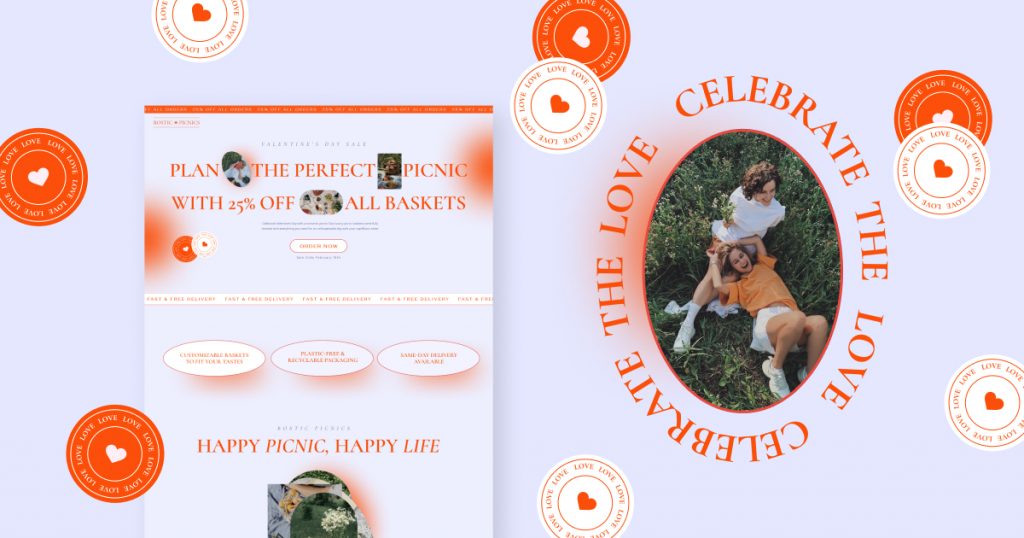
Inspired by retro style, this landing page successfully creates a romantic atmosphere through the careful selection of classic-style fonts, reddish colors, and casual stickers.
The page is full of images, especially in the gallery section where multiple photos pile up on top of each other using a scrolling effect. This creates the perfect opportunity to show off your product or service visually.
From a marketing perspective, this landing page comes equipped with a top bar emphasizing the main discount promoted on the page, a huge typographical headline in the hero, along multiple text strips accentuating other benefits related to the sale. To add a more playful, fun, and dreamy element to the design, there are stylish stamps scattered throughout the page.
2. Cupid’s Getaway Landing Page
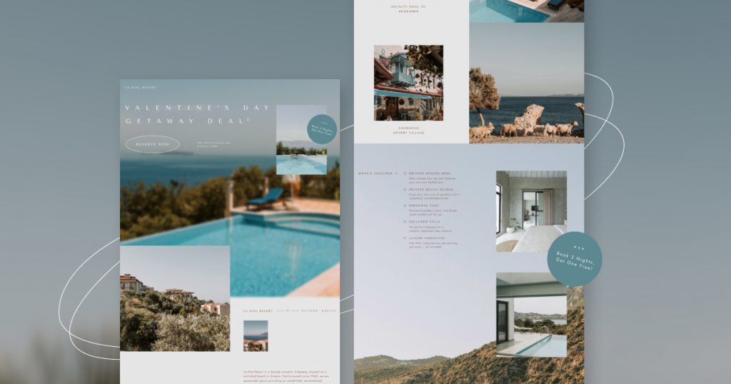
Sit back, relax, and enjoy the calming ride through this image-based landing page. This page is a match made in heaven for any hotel, travel, or other service-oriented company.
From the header to the footer, the layout is designed to bring your visitors into the world of your service by letting photos take center stage. Simply swap the photos for your own images and you’ll instantly have a full-page beautiful gallery to help visitors understand your company’s offerings.
The page utilizes minimalistic graphic elements to help give the extra Valentine’s Day vibe. You can see this with the small hearts and the thin oval shapes that add another dimension to the images.
Sections
1. Pastel Love
The ‘Pastel Love’ sections let you express the feeling of love through colors! Each section in this set uses a different pastel color to provide a variety of vibrant and fresh options to showcase your Valentine’s Day sales.
The sections come fully equipped with all the attention-grabbing elements you could need to capture your visitor’s attention. Countdown timers create urgency, top bar headlines highlight the V-Day sale you are promoting, and stickers make the atmosphere more lively, engaging, and fun.
2. Balloon Bash
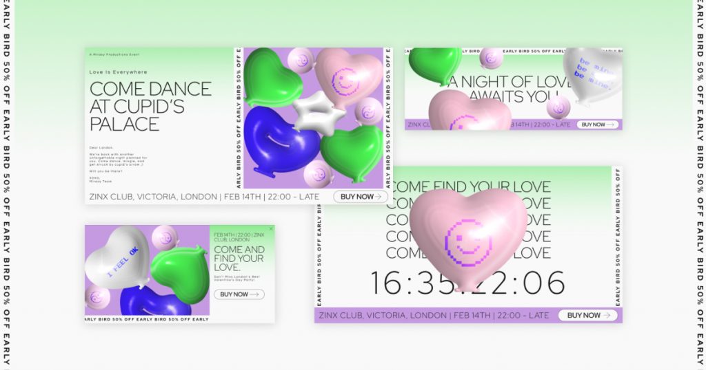
Wink wink, don’t blink. This set of sections was designed to subtly tease the standard Valentine’s Day style of roses and hearts.
The sections feature bold colors that are not traditionally associated with Valentine’s Day, along with huge 3D-inspired balloons that bring a joyful and captivating element to the page. On the balloons, you’ll find smiley and yin & yang icons, adding to the lighthearted and somewhat cynical attitude of the visual.
With all the colorful action in these sections, they’re perfect for promoting any type of event, webinar, podcast, or essentially anything that doesn’t require showing product images.
3. Spinning Hearts
Get ready to feel dizzy in love with these remarkable sections. Featuring animated 3D hearts as the centerpiece, along with a red, black, and white color scheme, the ‘Spinning Hearts’ sections are filled with all the Valentine’s Day symbols you could want.
The abstract elements certainly capture the visitor’s initial attention, but these sections were designed to help any online store showcase products in an elegant manner. The design is easily adaptable to any product images, whether you want to display them in color or black & white. In the demo, the images are displayed in black & white to add an edgy touch, and then change to show in color upon hover.
With large titles and big CTA buttons, these sections are perfect for promoting any ecommerce sale.
Popups (3 total)
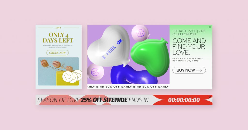
If there’s one thing in this world that’s sweeter than a box of chocolates, it has to be this selection of website popups! For each of the three-section sets, we’ve included a matching popup to make it even easier to get your Valentine’s sale up and running. Of course, the popups were designed with conversion in mind, so they include elements like large titles, CTAs, and countdown timers!
For guidance on editing and using popups in general, check out the Elementor Academy.
Today We Celebrate Love, and Stickers!
One of the easiest ways to quickly add the romantic feeling of Valentine’s Day to your website is by adding fun graphic elements! That’s why we have created dozens of unique illustrations and Lottie animations for you to pick from.
With variety in mind, these assets are suitable for every type of website! It doesn’t matter if your site is for a more formal brand or a casual brand, a service business, or an ecommerce store – these stickers will help you add Valentine’s vibe in a matter of seconds.
To use the stickers, simply download the Valentine’s Day kit, then copy & paste any of the graphics to your site!
How To Install the Valentine’s Day Seasonal Kit
Love is just around the corner! To get started, you just need to open the kit library by navigating to the WordPress Panel > Templates > Kit library. From there, you can choose the Valentine’s Day kit and start playing!
For more details about how to use the kits library, see this article.
Looking for fresh content?
By entering your email, you agree to receive Elementor emails, including marketing emails,
and agree to our Terms & Conditions and Privacy Policy.
