It takes 50 milliseconds for users to form an opinion about your website (That is only 0.05 of a second!) . We all want that impression to be something like: “Nice lookin’ site!” and not: “Yikes! that’s ugly.”
You can find an endless list of blog posts on the subject of improving the visitor’s first impression, advising you with tips like: create an emotional reaction, or: play around with colors… That kind of advice doesn’t work! Luckily for you, this article is not that sort of marketing dribble.
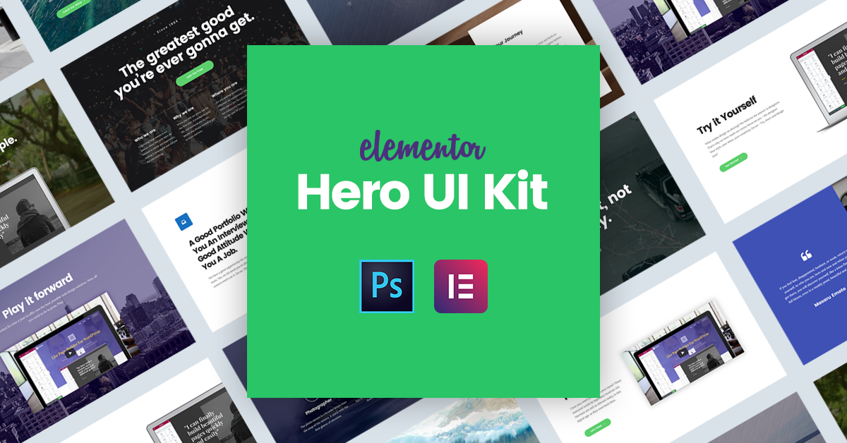
Instead, we’ve got 12 free winning examples of hero images and headers that you can replicate to create the right immediate impression on your visitor. In this article we will explain how we created these templates, so you too will be able to create such hero headers on your own.
One Thing Before We Start…
The UI kit is available for free, for a limited time, in Elementor’s template library right now.
If you don’t already see it in your predesigned templates, go to Elementor’s Settings Dashboard, and press the ‘Sync Library’ button. After doing this, edit any page with Elementor, press the ‘Add Template’ button and insert the Hero image Kit template that was added.
You are invited to log in, and add the hero template to your page. The link at the top of this page includes the PSD version of the templates, so you can open it and see exactly how our prototype looked like.
We want this guide to be as actionable as possible, so before we start, we suggest you create a new full width page with Elementor, and add the Hero template. Adding the template will allow you to edit each of the 12 hero headers. If you see a template you might want to customize and use, simply save that section to your library and use it on any other page.
What Is an Hero Image and an Image Header?
You might not be familiar with the name, but you are certainly familiar with them.
A hero image is a large image, usually a wide-screen image, that is placed above the fold at the top of the page. It’s goal is often to draw the attention of the visitor and intrigue the visitor to keep reading.
Website headers are the sections that appear above the fold of the page. These are essentially prominent blocks that reside in the most important area of every page. This is why the tips in this article can be so useful, and why you should keep them in mind as best practices whenever you create a new page design.
I am certain that each and every one of you can find at least one new thing you didn’t know how to do before.
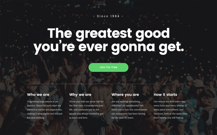
1. Columns Widget: Create a Hero Image that Offers More Information
The Columns widget lets you add several columns that are positioned below a single colum, and inside the same section. This is perfect for the hero header, if you want to create one that describes the site’s service more elaborately.
Even though it’s hard to understand the use of the Columns widget at first, it actually comes in very handy in the day to day tasks. As you can see, it let us create a set of 4 columns under a single column, in one section that shares the same background image. We use this widget a lot in our own designs, and we recommend deciding on using it in the early stage when you plan out the pages layout.
How to do it: Drag the Columns widget onto the section, and use it as regular columns.
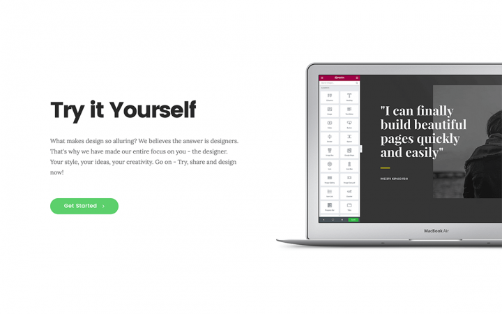
2. Percentage Sizing: Get The Right Fit for All Devices
Most WordPress design is done using pixels. Designers don’t give it much thought, until their client switches to mobile and sees padding and margin that are too large.
True, we’ve added Mobile Editing, letting you set different sizes per device, but there are still variants for computer screen sizes. The difference between an iMac screen and a small laptop is huge. This is why we set the left padding for this hero header to 20%, so it is always calculated as 20% and looks perfect no matter which computer you are viewing it with.
How to do it: Go to Column > Advanced > Padding and change the scale to the percentage icon.
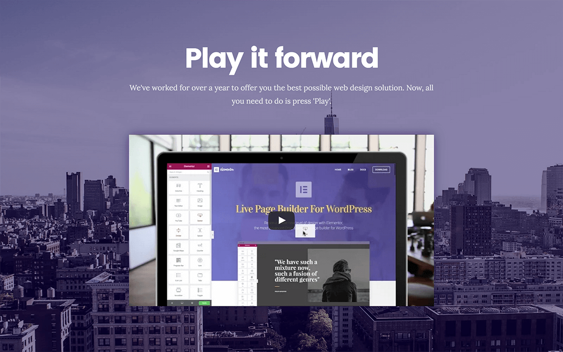
3. Color Overlay: Correlate Any Image to Your Brand Colors
One rule of thumb that helps create a much more consistent and professional looking design is the proper use of brand colors. With tints and shadows, you are able to use practically any background image for the hero header, and transform it to be aligned with your brand colors by adding a background overlay.
With this hero section, we’ve streamlined the city image by adding a purple color overlay that is set at 50% opacity. This matches our own purple brand color, that also appears in the video screenshot.
How to do it: Go to Section > Style > Background Overlay and choose a color and opacity.
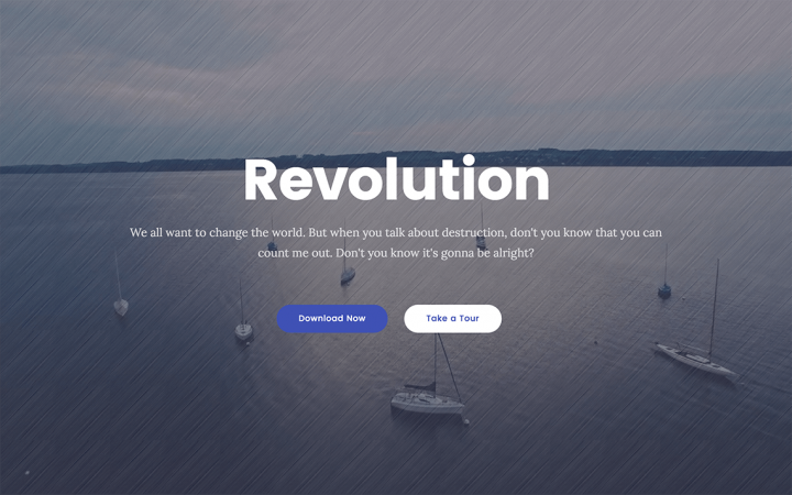
4. Image Overlay: Add Texture to the Background
In this hero header, apart from using a dark blue overlay, we have also added an image overlay with a texture image. This gives a unique washed effect to the whole section. You can experiment with various textures, available for free download at Transparent Textures.
How to do it: Go (again) to Section > Style > Background Overlay and choose a color, the texture image and opacity.
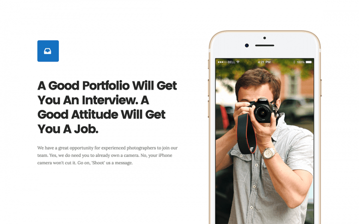
5. Mockup Image: Display Your Product Inside a Mockup
You can use mockups to display your product differently. For apps, software or plugins, the right way to go is usually mobile and desktop mockups. For other products, you can use picture frames, books, boxes etc. After choosing and downloading the relevant mockups, customize it and add your own product to the image. I recommend using a mockup from Pixeden, that update their collection frequently and have recently added mockups for iPhone 7.
Cut the image and have it appear as if it is popping up from the bottom of the screen (or from the side). This trick is most notably used by Apple, as in this page where the TV screen is cut at the top.
How to do it: To get this effect, you have to make sure there is no space beneath the image. Go to Section > Layout > Columns Gap > No Gap. Below this setting go to Column Position > Bottom. Make sure all padding and margin settings are set to zero.
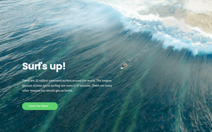
6. Bottom Column Position: Play Around With the Text Position
Whereas beginner designers tend to overuse effects, and embellish their designs with tedious elements such as flying cat animations, top notch designers know that there are many possibilities to be original and creative simply by playing around with the layout. Aligning the column to the bottom of the section is one example where you can create a really original looking hero image easily.
How to do it: Go to Section > Layout > Column Position > Bottom
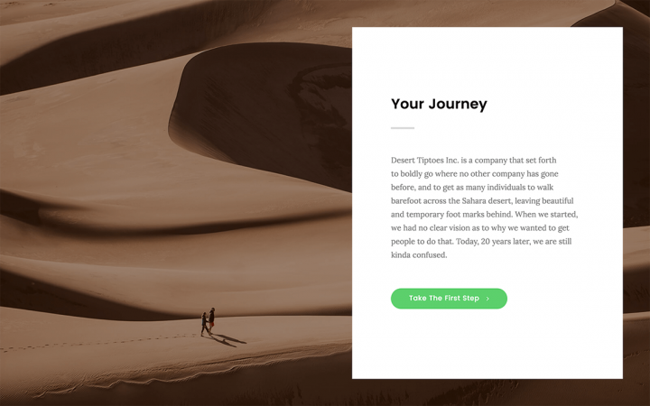
7. Postcard Column: Make Your Offer Stand Out
This is a simple trick, but a powerful one. By setting a margin on all sides of the column margin, and centering the content, we focus the attention of the visitor on our product. The eyes of your visitor get intuitively drawn to the protruding postcard column, so make sure the copy in that column is well written.
How to do it: Go to Column > Advanced > Margin and set the margin for the column. You should also center the content by going to Section > Content Position > Middle.
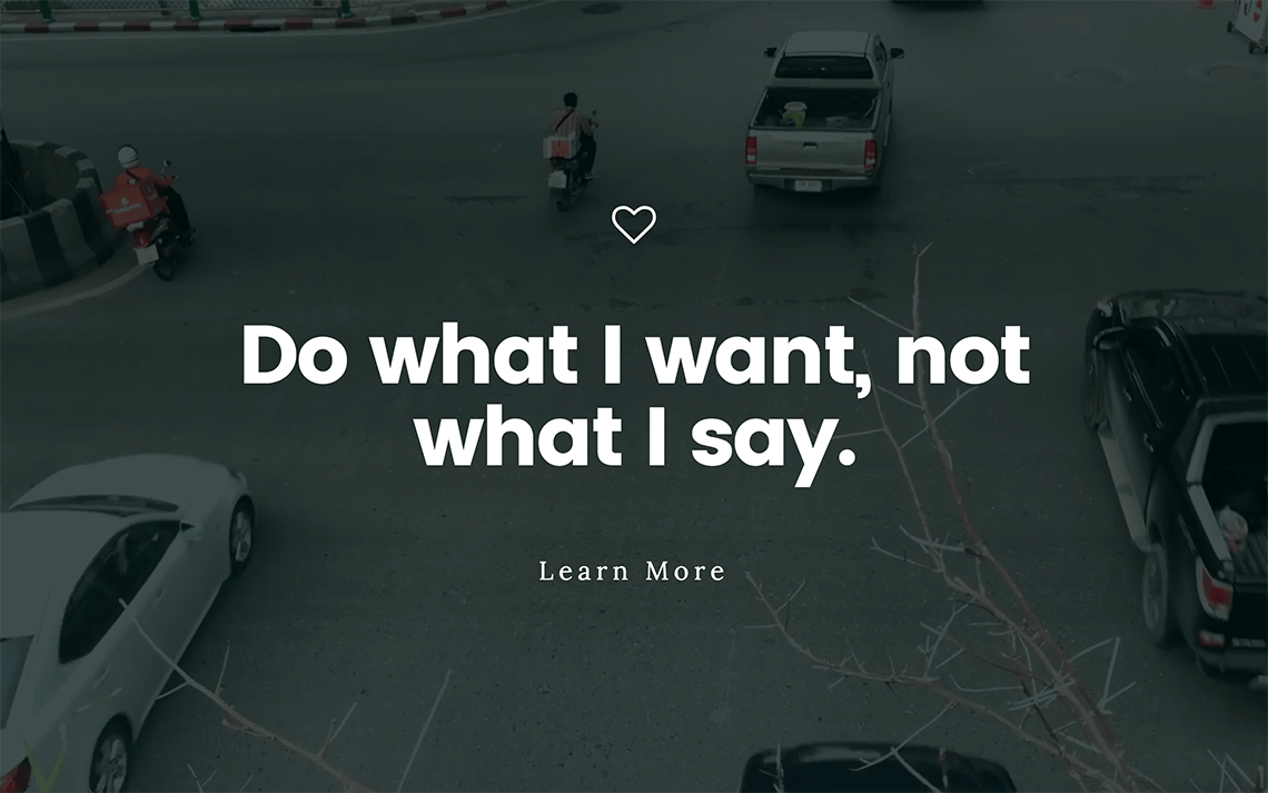
8. Background Fallback: Don't Leave Out Your Visitors on Mobile
We have been pumping our users to pay attention to responsive design, what with the release of Mobile Editing and all. Another important mobile issue we haven’t discussed is setting an image fallback option on mobile for videos. Because video backgrounds are not visible for mobile, we have made an option to add a fallback image, that will be used in any case the video doesn’t load. You can create a screenshot of the video, or use any other image to display for your visitors as an alternative to the video.
How to do it: Go to Section > Style > Background Fallback
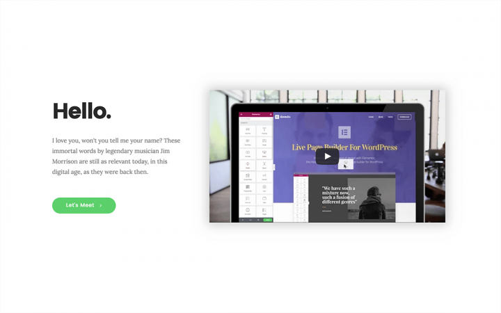
9. Drop Shadow: A Great Looking Hero Image With a Simple Shadow
Sometimes, the best looking designs are the simplest. Here, we see the simplest and most common section, that includes a video, heading, text and button. What makes all the difference is the soft shadow that was added to the video.
How to do it: Go to the Video Widget > Advanced > Background & Border > Box Shadow > Yes, and set the color, blur, spread and other settings.
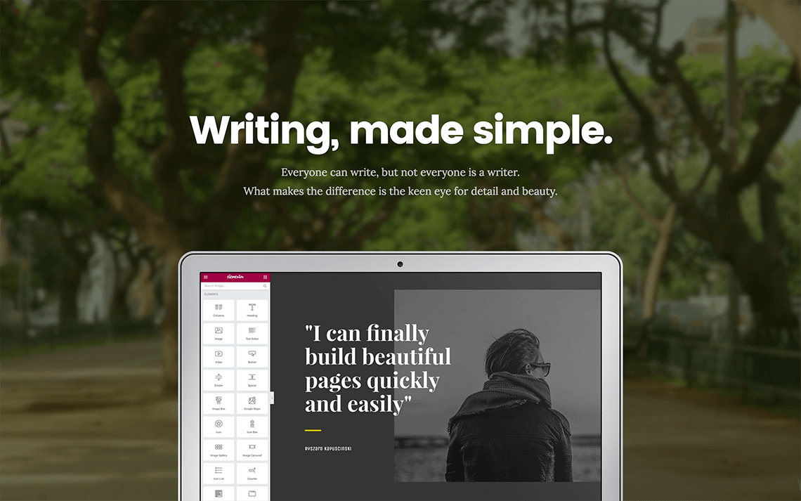
10. Background & Image: Use a Background and an Image That Relate
In this hero image, we have created a cool connection between the mockup and the video background, so it looks like someone sat down in the park and opened up their laptop. You can connect the background and the image in various ways, and get inspiration for backgrounds from the free background videos offered on Coverr.
How to do it: For this hero header, we have added a background overlay to darken the background, and have stuck the image to the bottom of the section with no gap, as I described in point 5.
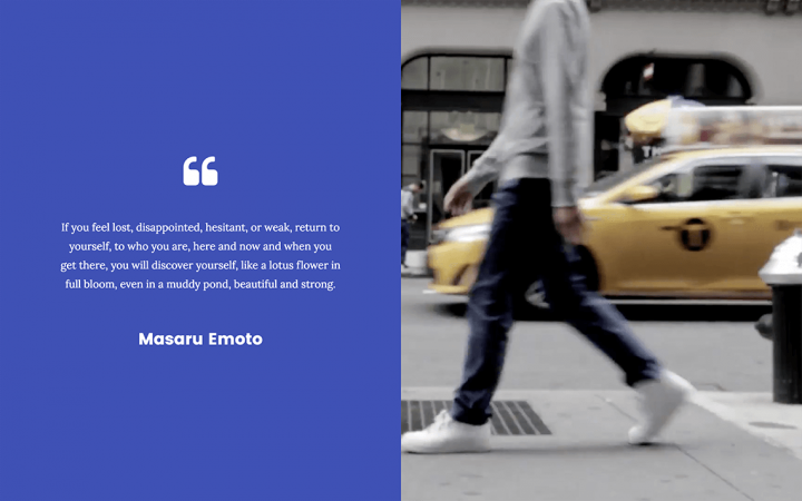
11. Colored Column: A Split Screen of Beauty
By creating a split screen, one side with a video and the other with a strong background color, we can create a bold statement for our hero header, and present the hero image in an original way. The column’s color stretches to the full height of the section.
How to do it: Go to Column Position > Stretch
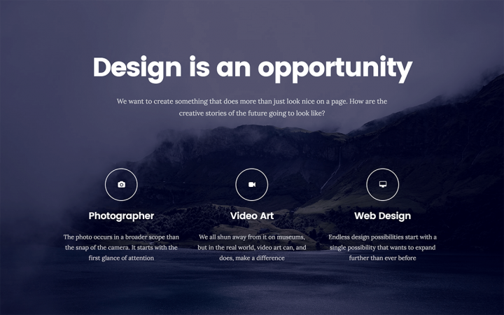
12. Fit to Screen: Make Sure the Hero Looks Great Across Screens
iMacs, laptops, tablets, smartphones… There are so many screens your visitors use, so many resolutions. Setting the hero header to fit to screen is certainly an important best practice, in order to make sure the entire above the fold section stays visible for all screens. It also displays the background image in the best way possible. This is a good chance to recommend using images from Unsplash, that over the years have remained on top of the charts with regards to free CC0 stock images.
How to do it: Go to Section > Layout > Height > Fit To Screen
Conclusion
This is your chance to get one of the best introductions to designing in Elementor. Create a new page, insert the hero image template, and start going over the sections.
By understanding how we set up each hero image, you’ll be able to get a better grasp of using Elementor to create your own beautiful and original hero headers.
* Update – I also suggest you check out our recently published background image tutorial.
Looking for fresh content?
By entering your email, you agree to receive Elementor emails, including marketing emails,
and agree to our Terms & Conditions and Privacy Policy.
