There are many reasons why you might feel stuck on a project. Perhaps your recent client is exceptionally vague about what they want and you’ve got no idea where to start. Or, perhaps, you feel burned out and uninspired after having worked non-stop for a long period of time. Or, maybe, you’ve been designing websites for the same type of clients with no opportunity to exercise your creative muscles.
Whatever the reason is, feeling stuck is quite common when it’s your job to be creative. But, as long as you have a process to help you generate new web design ideas, you’ll be able to chip away at the roadblocks in front of you.
In this article, we’re going to look at 10 things you can do to give your creativity a boost along with some resources you can bookmark for the next time you need it.
Table Of Contents
- 10 Actionable Web Design Ideas
- 1. Put Together a Step-by-Step Process
- 2. Reacquaint Yourself With the Principles of Web Design
- 3. Research the Most Recent Design Trends
- 4. Zero In on One Tiny Element
- 5. Switch From Desktop to Mobile
- 6. Experiment With Extremes
- 7. Work on a Website in a Different Niche
- 8. Take a Course or Read a Tutorial
- 9. Look at Other Creative Works
- 10. Go for a Walk
10 Actionable Web Design Ideas
When you’re feeling unmotivated, uninspired, or just plain stuck, here’s what you can do to get those fresh web design ideas flowing again:
1. Put Together a Step-by-Step Process
Working without a process can be extremely detrimental to a web designer’s flow — especially when you’re in the weeds, feeling overwhelmed and struggling to come up with something new.
Rather than force your brain to work in overdrive all the time, create a step-by-step process that removes this unnecessary clutter from your brain.
Better yet, create your plan and templatize it in your task management software so you can repurpose it for all your jobs.
Trello, for example, is a free platform that makes documenting and organizing website projects super easy:
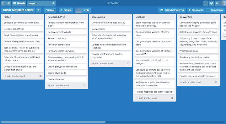
By laying out the details for each job into a framework like this, you’ll free your brain from having to worry about or recall them. This should give you some space to start thinking creatively again.
2. Reacquaint Yourself With the Principles of Web Design
When you’re trying to come up with creative web design ideas, it’s easy to get hung up on their newness. But no one ever said that in order for a website to be good it needs to be completely new.
In fact, there’s a web design principle that deals with this subject. Jakob’s Law explains that: “Users spend most of their time on other sites. This means that users prefer your site to work the same way as all the other sites they already know.”
If you find yourself obsessing over the newness or experimental nature of a website you’re working on, it’s a good idea to stop what you’re doing and go review the basics of good UX. By taking it back to the fundamentals, you’ll recenter your focus on what’s needed and then you can add creative touches later on if they make sense.
3. Research the Most Recent Design Trends
If you’re having the opposite problem and struggling to take the next step after building out a solid foundation for your website, then spend some time researching recent design trends.
The face of the web is always changing, so much so that it can be hard to keep up with all of the trends floating around. You never know what might happen if you start exploring them.
You can start with Elementor’s roundup of the latest web design trends:
- Elegant serif fonts
- Playful typography effects
- Emojis
- Light colors
- Negative colors
- Black-and-white textured illustrations
- Black outlines
- Simple shapes
- Creative and atypical product photos
- Collage art
- Seamless surrealism
- Hover gallery menus
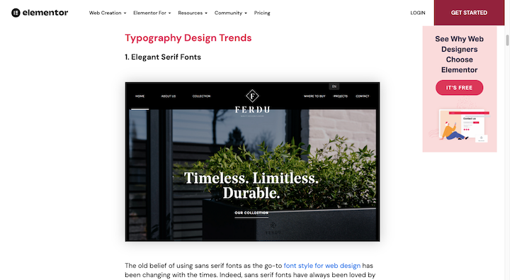
In addition to getting explanations of what these trends are and why they work so well, you’ll find examples of websites that currently use them. Take some time to explore these sites and see what sort of inspiration unfolds.
4. Zero In on One Tiny Element
Are you familiar with Hick’s Law? This is another web design principle that can help you out. It states that: “The time it takes to make a decision increases with the number and complexity of choices.”
While this is certainly applicable to how you present options on a website, it’s just as relevant to what you’re dealing with now. Sometimes it’s hard to come up with new web design ideas when there are just too many things to consider at once.
Creating a web design process will help with this. However, you can get even more granular with your focus. For example, rather than try to fill in all of the details at once on the Contact page:
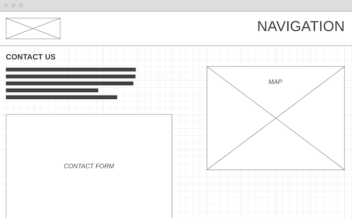
Start by zeroing in on the most important element on the page: The contact form.
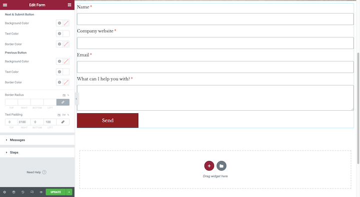
It’s much easier to get started when you narrow your focus to just the contact form. As you begin to hash out the unique details of its design — typography and color choices, spacing, labels and placeholders, button design, and so on — you’ll find it easy to expand your attention to the rest of the page when you’re done with it.
5. Switch From Desktop to Mobile
There’s something else you can try if you’re feeling restricted creatively by how much (or little) space you have to work with.
If you normally start designing from the desktop view, switch to a tablet or smartphone. Or if you’ve grown accustomed to starting with one of the smaller screens, scale up to desktop.
Switching to a different size canvas might be all you need to create the perfect vision for your website.
This would also be useful if you’re having a hard time deciding how you want to format the text on the page. With desktop, it’s often hard to tell how long a header or paragraph really is. But once you scale it down the size of a smartphone screen, you’ll realize that more can be done to improve the readability and flow of a page.
6. Experiment With Extremes
One reason you might be stuck on a particular website is that you haven’t found the perfect style for it. But rather than try to tweak the same idea you or your client started with, go to the extreme and see if that jogs something loose.
The opposite style might not be the exact solution needed, but it could inspire you to repurpose something that does work and apply it to what you have so far.
Here are some things you might experiment with:
- One-page vs. multi-page site
- Photos vs. illustrations
- Retro vs. modern typography
- Text-only vs. image-heavy design
- Monochromatic vs. analogous color palette
- Animation vs. no animation
This could also be a really useful troubleshooting tactic if you’re tackling a website redesign and aren’t quite sure what kind of alternative design to try next.
7. Work on a Website in a Different Niche
There are a ton of benefits to niching down as a web designer. For starters, it’s much easier to make a name for yourself as a great designer if you build websites for a targeted group of people. It can also make your job easier as you’re not having to keep up with best practices and trends for every type of website you might be asked to build.
That said, because you work on the same types of sites over and over again, it’s normal to feel nervous about running out of creative approaches for them. If you’re experiencing this, one way to get unstuck is by taking on a project outside of your niche.
For example, if you build websites for financial services companies, you’re probably used to creating very buttoned-up designs that look like the one on the Popular Bank website:
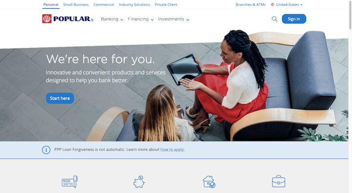
There’s nothing wrong with designing websites that look like this for this niche. After all, when you’re looking for someone to protect your money, the last thing you want is a website that suggests they might not be that serious about it.
Now, let’s say you were to take on a website for a restaurant like Zuma:
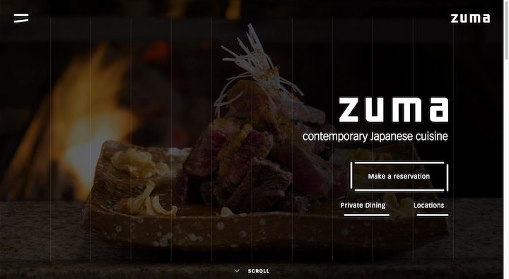
This kind of project would provide you with a nice change of pace. You’d have to come up with ways to nicely integrate menus, reservation systems, and lots of media into the design. You’d also get a chance to play around with more dramatic color palettes and fonts.
There’s no need to completely pivot your business to a new niche if you’ve been feeling burned out. Just take on a different project or two to challenge yourself. Giving yourself that outside experience might be all you need to bring the spark of creativity back into your regular work.
8. Take a Course or Read a Tutorial
Getting stuck on something because it’s too hard to build out or you’re unsure how to do it is always stressful. But rather than keep attempting the same painful or ineffective method you’ve used before, hit the “Pause” button and find out if someone has a better solution.
You’ll find answers to a lot of design issues and hurdles on the web — even ones you might not have expected anyone else encountered.
You can certainly use Google to see what’s out there. Places like StackOverflow and even Reddit might be helpful. However, more in-depth resources like courses and tutorials are going to be more helpful. Elementor has a couple of resources you might find useful as well.
In this roundup of 17 online courses, you’ll find recommendations for web design and development courses that cover a wide range of topics — responsive web design, A/B testing, visual hierarchy and spacing, and more.
If you’re struggling with typography, this collection of 20 typography tutorials will help. From the psychology of fonts to pairing them, most of the big questions related to font design have been answered here.
9. Look at Other Creative Works
There are a lot of places where you can find design ideas these days. Your email inbox. Your social media feed. The ads littering the sidebars of the websites and blogs you visit.
But rather than run all over the place trying to find something that helps you out of a creative fog, find some bookmark-worthy design collection sites instead. You’ll spend less time hunting around for web design ideas and you’ll always have access to the latest and greatest in good, creative design. Here are some sites to start with:
Dribbble
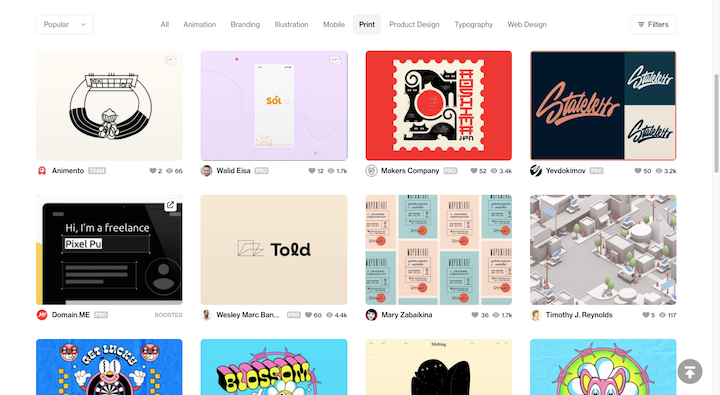
You’ll find all kinds of creative work examples on Dribbble. Just don’t relegate yourself strictly to the “Web Design” section. Take a look at other works uploaded to the site and see what sort of unique designs you can find.
Behance
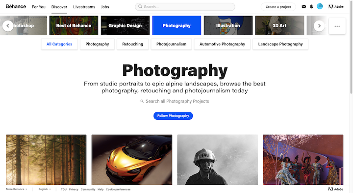
Behance is another site that’ll give you the chance to explore work in other areas, like photography, architecture, and fashion. What’s more, you’ll find video, audio, and animation here, so it’s not just static imagery you can draw inspiration from.
Awwwards
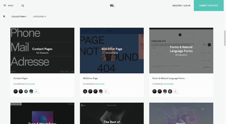
If you’d prefer to get your inspiration from real websites, Awwwards.com is a good place to find them. Go to the menu and you’ll find a variety of collections of award-winning sites, pages, and components to inspire you.
Daily Design Inspiration Sites
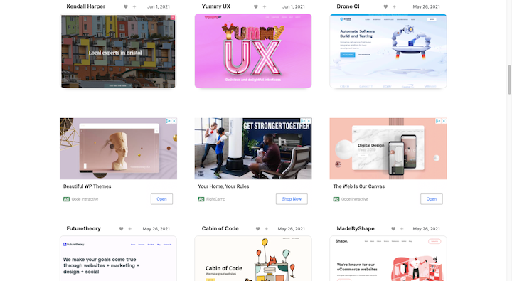
There are a number of sites dedicated 100% to providing you with design inspiration, like Web Design Inspiration in the screenshot above. Siteinspire is another good one to bookmark specifically for web design ideas while Designspiration has inspiring works across a variety of genres.
Really Good Emails
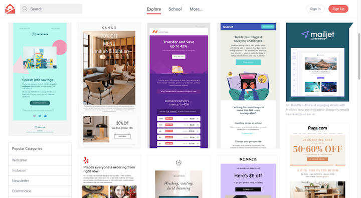
Although Really Good Emails only rounds up the best of the best in email marketing design, these designs aren’t all that different from what you’d design for a site. And because they’re built for a slimmer space, you might get some ideas on how to be more concise with your designs.
10. Go for a Walk
Sometimes sitting in front of your computer is only going to make things worse when you’re feeling stuck or uncreative. According to a Stanford University study done in 2014, walking boosts creative thinking.
The study compared participants in both seated settings as well as a number of walking situations (e.g. on a treadmill, outdoors, etc.). It found that creative output increased by 60% when someone was walking.
While this particular study found that it doesn’t matter whether you stay indoors or go outdoors to reap the benefits of walking, detaching from your technologies and heading outside is a good idea.
A 2020 study out of Cornell University found that nature on its own has mind healing benefits as well. All that’s needed is 10 to 50 minutes of time spent in natural spaces to improve one’s focus, mood, blood pressure, and heart rate.
If you don’t have easy access to nature, that’s okay. You can still get inspired by your surroundings — building signage, vehicles passing you by, other people walking about, and so on.
Overcome That Designer’s Block With Great Web Design Ideas
When you design websites for a living, it’s only natural to get stuck from time to time. But rather than keep your head down and try to force the ideas to come, try something different.
With the 10 brainstorming tips above, you’re sure to come up with some fresh and creative web design ideas that are perfect for your client’s website.
Looking for fresh content?
By entering your email, you agree to receive Elementor emails, including marketing emails,
and agree to our Terms & Conditions and Privacy Policy.
