Knowing how to create high converting popups is crucial for anyone looking to use this technology to build an email list, drive sales, promote products and more. Popups are well established, hard to miss, versatile and have decent conversion rates if used right.
However, that is a big if. Yet, what’s the use of bugging your visitors with an interstitial if you don’t make sure a good chunk actually likes them enough to convert? Aren’t you just wasting your time and theirs? Thankfully, you’ve got us.
In this article, you will learn some vital popup best practices that will help you get subscribers, sales and make your marketing measures more effective.
11 Best Practices for High-Converting Popups
If you are wondering how to use popups correctly, the list of tips below will help you figure it out.
Table of Contents
- 1. Use the Right Format
- 2. Serve Them up at the Appropriate Time
- 3. Integrate Popups Well With the Rest of Your Site
- 4. Create a Clear Path
- 5. Include a Distinct Call-to-Action
- 6. Make Use of Visuals
- 7. Use Contrast
- 8. Offer an Incentive
- 9. Make Popups Easy to Close
- 10. Have Mobile-Specific Design
- 11. Test Thoroughly
1. Use the Right Format
The word popup is actually an umbrella term for a number of different techniques to grab your visitors’ attention. Among other things, these can be:
- Classic, middle-of-the-screen, lightbox popups
- Popups that move in from the side
- Full-screen popups
- Top and bottom bars
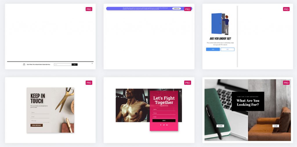
All of these come with different pros and cons, levels of intrusiveness and are appropriate for different use cases.
For example, smaller types are more appropriate for smaller screens and larger interstitials are better suited for advertising promotions. While, in the end, it’s best to test what works in which circumstance (more on that below), it’s important to keep in mind that you have more than one tool in the box.
2. Serve Them up at the Appropriate Time
Timing is an important topic for creating high converting popups. If one appears right after visitors enter your site, this can really interrupt their experience, especially if they didn’t even have a chance to look at your content yet. Practices like this are what have given popups a bad name
Usually, visitors sign up because they like what you have to offer and want more of it. However, if you don’t give them time to find out what that is, you are not gonna get very far.
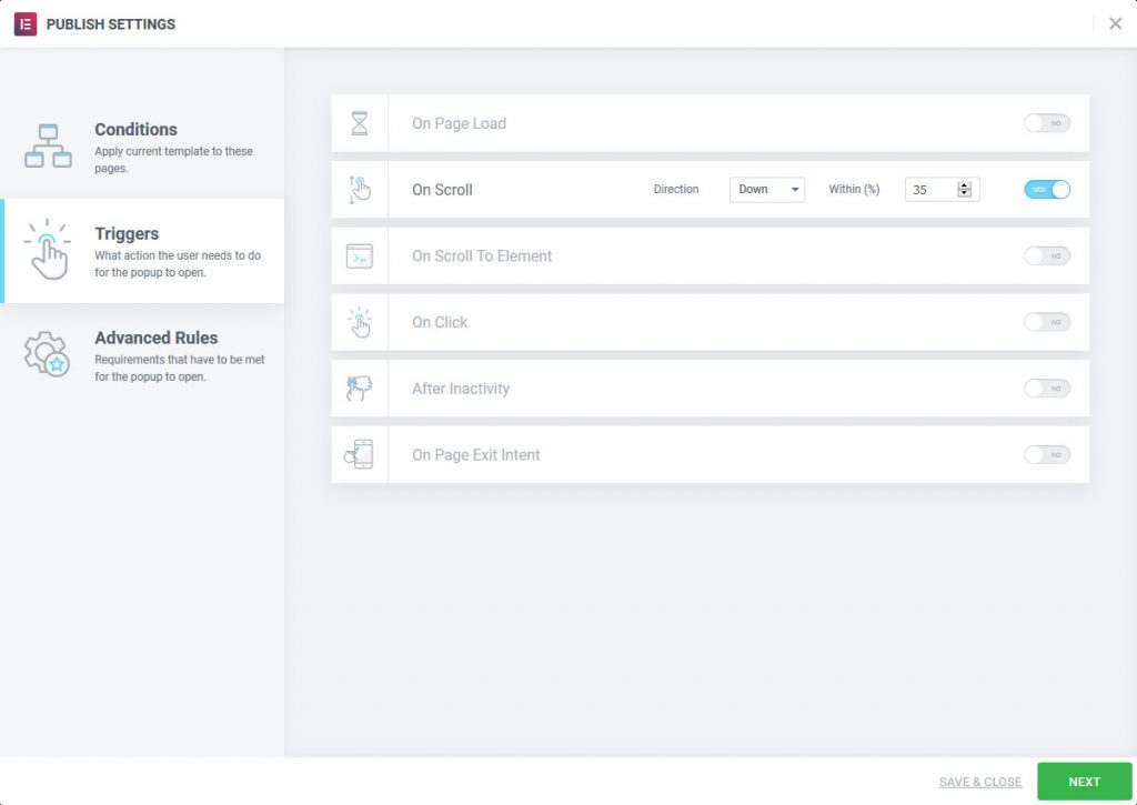
To get the timing right and make sure your popups are relevant, here are a few things you can play around with:
Time until a popup appears
- After how many pages a user will see it
- Percentage of the page they need to scroll
- Showing popups only when someone is about to leave the site
- Offering them only on a specific page
- Revealing them after a certain time of inactivity
You can control all of this and more under Conditions, Triggers and Advanced Rules inside the Elementor Publish Settings.
In general, the more invested a visitor is in your site, the more likely they are to sign up to your newsletter or take advantage of your offering. So, the later a popup appears, usually the higher the conversion rate.
However, at the same time, you need to find a balance so that the total number of people who see your popup isn’t too few either. In the end, it’s about testing what generates the most signups.
A great time to work with is your average time on site, which you can find in your web analytics. If you trigger popups shortly before that, you might be able to grab a bunch of people right before they leave.
3. Integrate Popups Well With the Rest of Your Site
Let’s talk about the elephant in the room: Popups can be kind of annoying. If you surf the Internet a lot, you are likely to see many of them and after a while, they can get on your nerves (unlike cookie notices, those never get old). For that reason, your job is to make the user experience with popups as pleasant as possible.
How do you do that?
One of the first steps is to ensure that your popups integrate well with the rest of your site. You can do so by including branding elements such as your site or company logo, colors, fonts and tone.
If you do, it will make your interstitials look less like some unrelated advertisement and more like an organic part of the site.
Thankfully, in Elementor popups are as easy to customize as the rest of your website. You can easily drag and drop widgets such as Site Logo into your popups and control what they look like.
4. Create a Clear Path
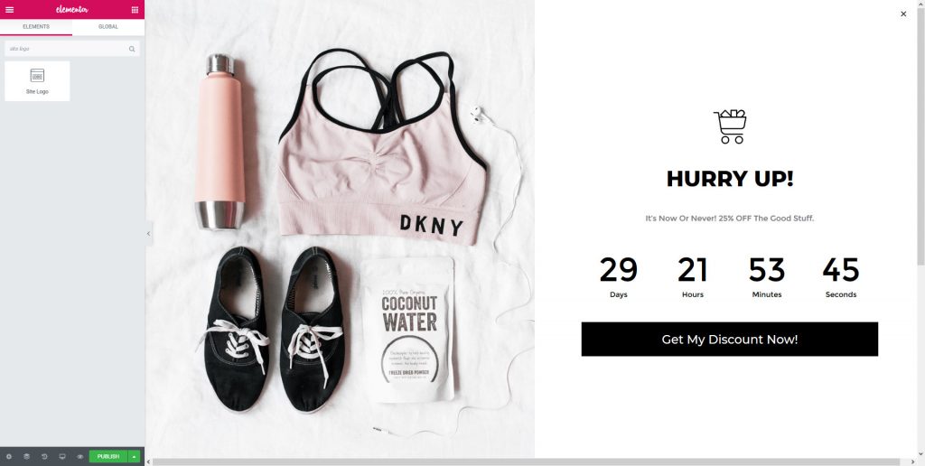
You should regard popups as mini landing pages. After all, they have the same function: move the user along a given path to a specific goal. To achieve this it makes sense to create steps they can follow.
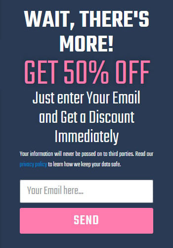
In the above, you see this in practice:
- Grab attention
- Clearly state the user benefits
- (Optionally) offer assurance
- Prompt action
As with other landing pages, it’s important not to overwhelm visitors. For that reason, reduce the popup content to a minimum. This means, for example, that you avoid asking for too much information in your sign-up forms and concentrate only on first name and email or just email.
5. Include a Distinct Call-to-Action
Speaking of clarity, the one, single goal of any popup is to get users to take action. It’s not a place to start a conversation, introduce yourself or otherwise dillydally. You need to get to the point fast.
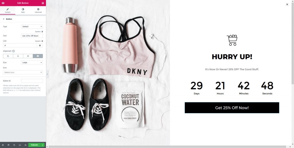
For that reason, your Call-to-Action also needs to be crystal clear and, more importantly, singular. Users should only have to perform one single task and not have to think about different choices. Otherwise, you might create confusion and a confused visitor does not take action.
This, too, is very easy to control within Elementor as you can change your button copy to your heart’s content.
6. Make Use of Visuals
Images and other visual elements are an important part of online content in general. Plenty of research on the topic shows that they make web pages more appealing, especially if they include people.
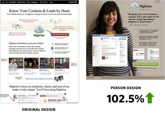
In addition, images are also an effective way to guide user attention to where you want it to be.

This extends to popups. To make yours more effective, definitely be sure to include some visual elements. It makes your marketing measures more interesting, exciting and attention-grabbing.
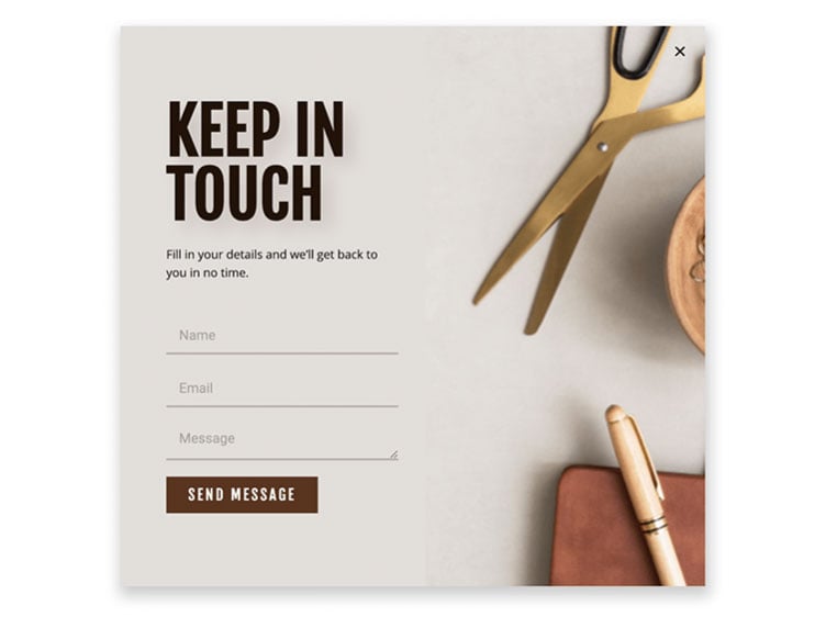
However, this doesn’t always have to mean full-scale images. Sometimes including a more exciting background pattern or just sprucing up your design with colors can do the trick.
The latter is especially appropriate for mobile devices, which often have slower Internet connections. Avoiding image files here cuts down on loading time.
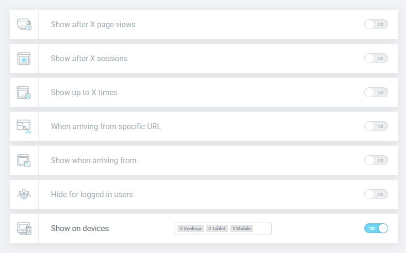
To create mobile-specific popups, under Publish Settings > Advanced Rules, there’s the option to hide popups depending on the type of device.
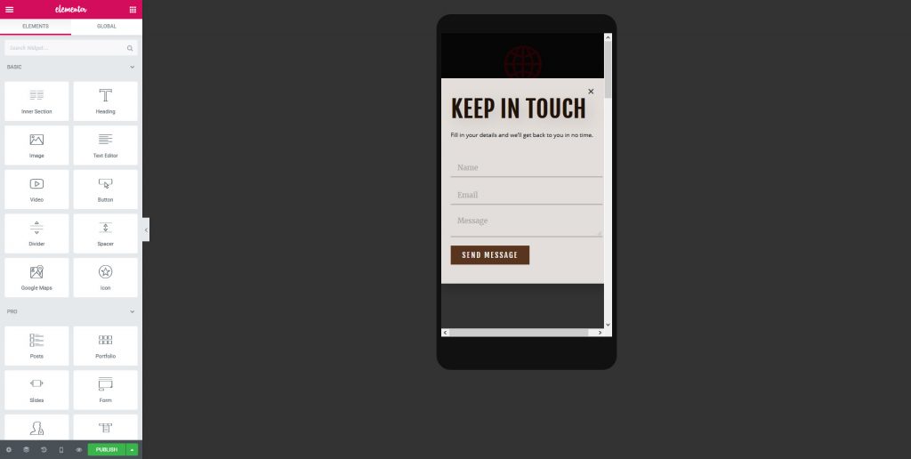
You can then use Elementor’s responsive mode to create a different popup design for smaller screens.
7. Use Contrast
Speaking of Calls-to-Action, one of the best ways to make them stand out is to use plenty of contrast.
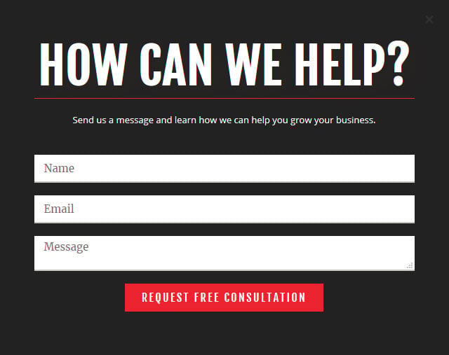
This way, you can clearly show where users are supposed to click.
In general, using bold design is a good idea to grab visitor attention. While you should still make sure that your popups fit the rest of the design (see tip #3), using a vibrant color scheme is a good way to make key elements stand out.
With Elementor, the colors of all popup elements are fully under your control. Via the Style section, you can create as much contrast as you need to guide attention to your main buttons and CTAs.
8. Offer an Incentive
It’s much easier to get someone to take action if they immediately get something out of it. Not just the promise to stay in the loop or receive great offers later, no, something that they can immediately get value out of.
This used to be known as “the bribe”. Today we call it “lead magnet” and it can take the form of a coupon code, additional useful content such as an ebook, checklist or a cheat sheet or anything else you can think of.
You can easily create this, for example, by integrating your Elementor forms with an email marketing service such as MailChimp and automatically sending the promised lead magnet to new subscribers.
By the way, an incentive can also simply be to create a sense of urgency. By using language like “Only today!”, “Limited Time Offer” or “Don’t Miss Out!” you can motivate users to take action without necessarily giving them something tangible.
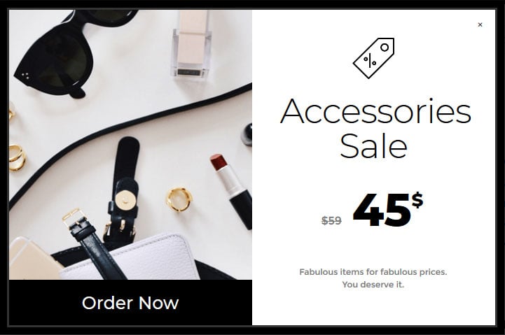
9. Make Popups Easy to Close
We have already established that, if used incorrectly, popups can be plenty annoying. However, you know what makes it a hundred times worse? If they are hard to close.
Personally, I have left websites where I just couldn’t close the popup on my phone. Great content be damned, I just didn’t want to read an entire article with part of my screen permanently blocked.
For that reason, avoid closing elements that are excessively small, close to the side of the screen or otherwise hard to use. While you might think you are making it more compelling for users to sign up, you are really just driving them mad.
In Elementor, you find the necessary controls for this under Settings > Style > Close Button in your popup template.
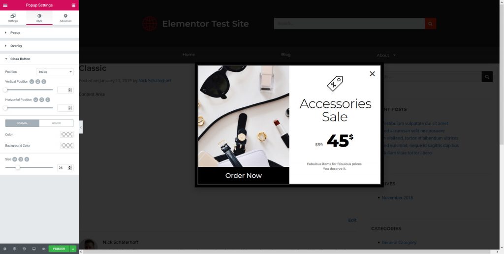
Pay special attention to the Size setting in different screen sizes!
10. Have Mobile-Specific Design
I probably don’t have to tell you about the importance of mobile visitors anymore. In this day and age, if your site is not mobile optimized, you are doing a major portion of your audience a disservice.
What goes for your site in general, also goes for popups. Just like in web design, here, too, it’s important that you have different options for your visitors on desktop and on mobile.
Some of these points have already come up over the course of this post. Because of the smaller screens, popups can be more intrusive and harder to operate by touch.
That’s part of the reason why Google’s punishes you for certain kinds of popups that seriously interfere with the user experience, especially by blocking access to the main content.
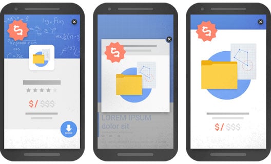
Therefore, it’s a good idea to avoid those. In addition, in order to make sure that your mobile users have a good time:
- Reduce form fields to a minimum
- Shorten copy and Calls-to-Action
- Avoid loading-intensive images
Use the responsive mode to make the necessary changes. The Advanced Rules under Publish Settings also let you disable popups completely for certain devices.
11. Test Thoroughly
All that you have learned so far is just a guideline. Popups are one of those site elements for which the smallest change can make a big difference. Therefore, one of the most important best practices for high converting popups is to test – a lot.
By trying out different versions, you can find out what type, timing, design, wording, call-to-action, visuals etc. will produce the best results. First versions are always just hypotheses. It’s important to create variations, serve them up to visitors and see which ones perform the best.
Luckily for you, we have an entire post on split testing with Elementor and there is also a dedicated plugin.
Creating High Converting Popups in a Nutshell
Popups are a very useful tool to interact with site visitors. They help you populate your email list, increase sales, recover abandoned shopping carts and a lot more. However, interstitials and modals are also an element that can easily ruin the user experience.
Above, you have learned a number of important ground rules for making your popups a success. Let’s summarize them again quickly:
- Employ the right popup format
- Time them right
- Make sure they fit the rest of your site
- Create a clear user path
- State a compelling CTA
- Include visual elements
- Use sufficient contrast
- Offer extra incentives
- Allow users to easily close popups
- Make sure to create separate mobile versions
- Test everything thoroughly
With these tips, you are now ready to start using popups on your own site. Thankfully, with the new Elementor feature, this has never been easier.
What do you consider the most important practice when creating popups? Let us know in the comments section below!
Looking for fresh content?
By entering your email, you agree to receive Elementor emails, including marketing emails,
and agree to our Terms & Conditions and Privacy Policy.
