When it comes to online success, content really is king. However, if that content is difficult to find and navigate, no one is going to stick around long enough to discover just how much it has to offer.
Thankfully, there are ways to make your site easier to navigate. By implementing breadcrumb trails, you can enable visitors to navigate to your site’s top-level pages with a single click. Breadcrumbs can also help visitors find exactly the content they’re looking for, even if your site spans hundreds of different pages.
In this article, we’ll explore why breadcrumbs are an essential part of web design, and the three types of breadcrumb trails you can add to your WordPress website. We’ll then share four best practices for creating breadcrumbs that look great, and that help visitors navigate your website with ease. Let’s get started!
Table of Contents
- What Are Breadcrumbs in Web Design?
- Why You Should Consider Using Breadcrumb Navigation
- 3 Types of Breadcrumb Navigation
- 1. Location-Based Breadcrumbs
- 2. Path-Based Breadcrumbs
- 3. Attribute-Based Breadcrumbs
- 4 Best Design Practices for Breadcrumbs
- 1. Don’t Replace Your Primary Navigation Menus
- 2. Keep Your Titles Consistent
- 3. Follow Breadcrumbs in Web Design Best Practices
- 4. Use Consistent Breadcrumb Placing
What Are Breadcrumbs in Web Design?
Breadcrumbs are a type of secondary navigation element that reveals the user’s location on a website. They usually take the form of horizontally-arranged links, separated by the greater than (>) symbol. This symbol indicates the level of each page, relative to all the other links that appear within the breadcrumb trail:
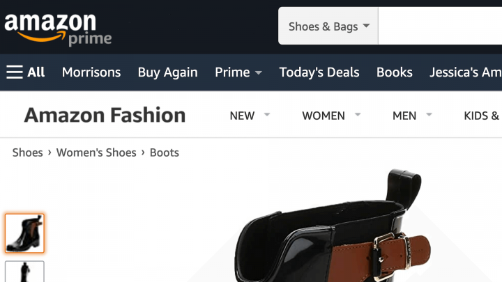
Breadcrumbs in web design provide a visual representation of how a website is structured. The term ‘breadcrumbs’ originates from the Hansel and Gretel fairytale, where the protagonists leave a trail of breadcrumbs to help them find their way home. Just like in the fairytale, your website’s breadcrumb trail can help visitors retrace their steps!
There are several ways that you can add breadcrumbs to your website. For example, if you’re using the Yoast SEO plugin, you can add breadcrumbs to any page using the Elementor breadcrumbs widget. You can enable Yoast’s breadcrumbs settings by navigating to SEO > Search Appearance > Breadcrumbs:
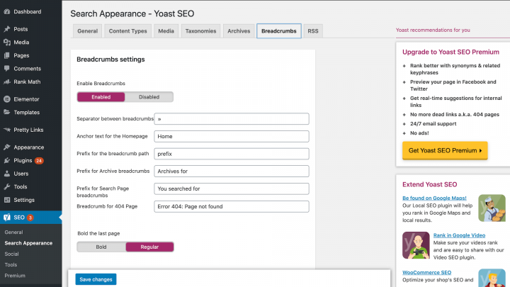
After enabling this feature, a new breadcrumbs widget will appear in the Elementor editor. You can drag and drop this widget onto any area of your canvas:
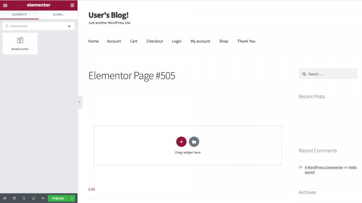
Elementor will render your breadcrumbs automatically. You can then customize them to complement your website’s design, including changing the text and link colors as well as the typography.
Why You Should Consider Using Breadcrumb Navigation
Unlike primary navigation menus, breadcrumbs help keep visitors orientated by displaying their current location within the site’s hierarchy. Breadcrumbs can be a useful addition to most websites. However, they’re particularly well-suited to sites with a complex hierarchy or a large number of pages.
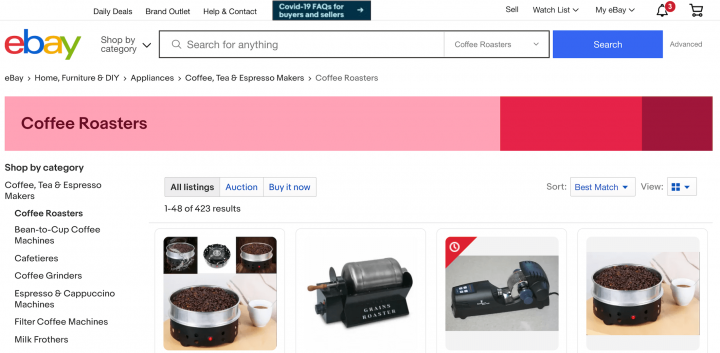
The classic example is e-commerce sites, where breadcrumbs can help visitors navigate between product categories with ease:
Since they display the visitor’s location, you can also use breadcrumbs as a progress bar. Some common examples include online quizzes and multi-page forms such as job applications:
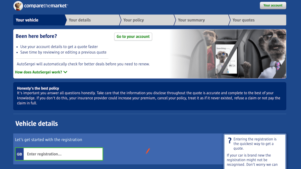
When used in this way, breadcrumbs provide a visual representation of the steps the visitor has already completed successfully, and the steps remaining. This can motivate visitors to complete the task at hand.
As a website owner, you want visitors to spend as much time on your site as possible. Breadcrumbs can encourage browsing by displaying all the relevant navigational options. For example, a customer may navigate to a product page and then decide against purchasing that particular product. Breadcrumbs can encourage the visitor to explore categories related to the product and hopefully make a purchase.
Breadcrumbs are also a compact navigation mechanism. When it comes to using breadcrumbs in web design, it may help to sketch out your navigation architecture. If your site has a logical hierarchy or grouping, it may be a good candidate for breadcrumbs. However, breadcrumbs generally don’t add much value to single-level sites such as personal blogs.
Last but not least, breadcrumbs also help search engine crawlers understand how your site is structured. This is good news for your Search Engine Optimization (SEO).
3 Types of Breadcrumb Navigation
Breadcrumb trails can generally be divided into three categories: location or hierarchical, path, and attribute. Each type has its own strengths and weaknesses, so let’s explore them in detail.
1. Location-Based Breadcrumbs
Location-based or hierarchical breadcrumbs represent a site’s structure. If your site has two or more hierarchical levels, it can help to include location-based breadcrumbs in your web design.
You can also use location-based breadcrumbs if visitors regularly enter your site at a deeper level. For example, a consumer might search for a specific product on Google, and then enter your site at that product page. For this new customer, location-based breadcrumbs can provide useful insight into how your site is structured.
2. Path-Based Breadcrumbs
Path-based breadcrumbs are dynamically generated. This means they display the path the visitor has traveled in order to reach the current web page.
When it comes to breadcrumbs in web design, we recommend approaching this variety with caution. Visitors tend to jump from one page to another, which can result in a chaotic and unhelpful breadcrumb trail. Most web browsers also provide a Back button, so your path-based breadcrumbs may contribute little to the visitor experience.
3. Attribute-Based Breadcrumbs
Attribute-based breadcrumbs display all the attributes the consumer has selected. E-commerce sites often use attribute-based breadcrumbs to help visitors understand how they arrived at the current product:
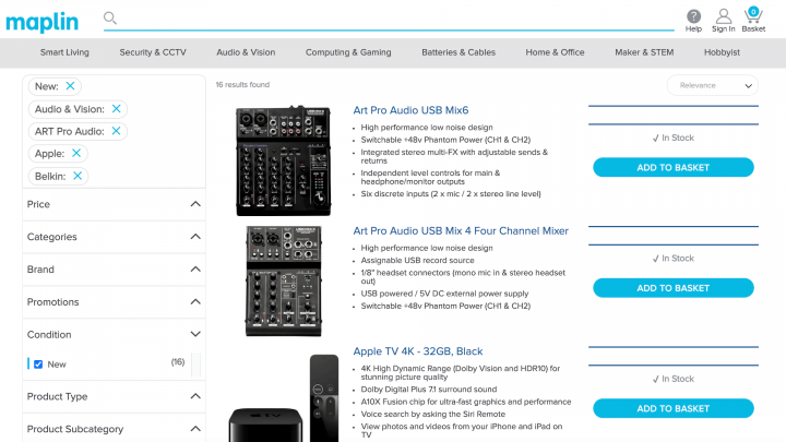
Attribute-based breadcrumbs can also help the visitor explore alternative content that aligns with their chosen attributes. For example, the customer might explore products that match the attribute “boots”, or “size 5” (or both). This can help drive conversions and maximize your revenue.
4 Best Design Practices for Breadcrumbs
No matter what type of breadcrumb trails you decide to use, there are some best practices that you can implement to ensure that they’re effective. Here are four best practices to keep in mind when creating your breadcrumbs.
1. Don’t Replace Your Primary Navigation Menus
Breadcrumbs are a type of secondary navigation scheme. While every website is different, it’s generally a bad idea to replace all of your primary navigation menus with breadcrumbs.
It’s important to remember that not all visitor journeys are ordered – or logical! If you replace all your primary navigation menus with breadcrumbs, your visitors might struggle to move between unrelated content.
Visitors may also arrive at a page without navigating the expected hierarchy, for example via Google search results. For visitors with no context, breadcrumbs may offer little value and can even be confusing.
When it comes to breadcrumbs in web design, you should view them as an extra feature that aids navigation. By providing both primary and secondary navigation schemes, you can give visitors the freedom to explore your site hierarchically or in a non-hierarchical manner.
2. Keep Your Titles Consistent
To avoid confusion, it’s a good idea to remain consistent with your page and breadcrumb titles. This is particularly important when you’re targeting specific keywords for SEO purposes.
The only exception is when a breadcrumb trail features repeating keywords or phrases. Search engines may interpret this repetition as over-optimization, and issue you with an SEO penalty. You may also choose to include the title of the current page in your breadcrumb trail. However, to avoid confusion it’s important to use plain text for the current page’s title, rather than a clickable link.
If you’re using Yoast SEO, you can customize the text that appears as part of your breadcrumbs. This includes adding anchor text, as well as a prefix for the breadcrumb path:
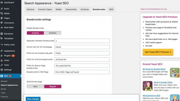
You can also change the taxonomy that’s used to create your breadcrumb trails. Any customizations you make will be reflected in Elementor’s breadcrumbs widget.
3. Follow Breadcrumbs in Web Design Best Practices
When it comes to styling your breadcrumbs, it’s important to follow design best practices. This will help visitors interact with your breadcrumbs successfully.
Typically, website owners will use the greater than symbol (>) to separate hyperlinks in a breadcrumb trail. However, this symbol suggests a parent-child relationship, and path-based breadcrumbs, in particular, don’t necessarily work that way. When it comes to breadcrumbs in web design, there’s also a chance that the > symbol may clash with your site’s visuals.
Yoast SEO users can change the separator character by navigating to SEO > Search Appearance > Breadcrumbs menu. There you can enter any character you want, although common choices include arrows pointing to the right (→), right angle quotation marks (»), and slashes (/).
Sizing and padding are other important design considerations. From a usability perspective, it’s crucial that there’s enough space between the links in your breadcrumb trails. However, as a secondary navigation mechanism, it’s also important that your breadcrumb trails don’t distract from the primary navigation menu:
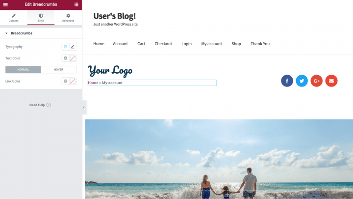
You can use Elementor to strike this delicate balancing act. To change the size and styling of any onscreen element, simply select it in the canvas and then spend some time exploring Elementor’s Style tab.
4. Use Consistent Breadcrumb Placing
Typically, breadcrumb trails are displayed in the top half of the page. If you’re using a horizontal navigation menu, breadcrumbs are usually positioned directly beneath it.
If you follow these design conventions, visitors should have no problems locating your breadcrumbs. When your breadcrumb trail is displayed prominently at the top of the page, it also helps the visitor get orientated straight away. If you’re using Elementor’s breadcrumbs widget, you can position this widget anywhere onscreen using the drag-and-drop builder.
When positioning your breadcrumbs, consistency is key. Displaying breadcrumbs in different locations across your site is only going to confuse and frustrate visitors, having a negative impact on their experience.
Improve User Experience With Breadcrumbs
Publishing lots of great content is essential for running a successful website. However, as your website grows it can become difficult to navigate. This is particularly true for e-commerce sites, which often have complex hierarchies consisting of multiple product categories.
Breadcrumbs can help visitors navigate your site more successfully. They can also encourage customers to browse, and can deliver a Search Engine Optimization (SEO) boost. If you’re using Elementor and Yoast SEO, you can add breadcrumbs to any page or post, and style them to perfectly match your site’s design.
Do you have any questions about how to enhance your site’s navigation with breadcrumbs? Leave us a comment below!
Looking for fresh content?
By entering your email, you agree to receive Elementor emails, including marketing emails,
and agree to our Terms & Conditions and Privacy Policy.
