Improving WordPress website accessibility does not mean making a website usable for visually impaired people. That’s a small picture. Here are the disabilities that W3C recommends to consider for making the internet more accessible:
- auditory disabilities
- cognitive disabilities
- neurological disabilities
- physical disabilities
- speech disabilities
- visual disabilities
Moreover, a website following the standard accessibility guidelines not only improves usability for people with disabilities, it also benefits people without disabilities. Here are some examples from the same W3C document:
- people using mobile phones, smart watches, smart TVs, and other devices with small screens, different input modes, etc.
- older people with changing abilities due to aging
- people with “temporary disabilities” such as a broken arm or lost glasses
- people with “situational limitations” such as in bright sunlight or in an environment where they cannot listen to audio
- people using a slow Internet connection, or who have limited or expensive bandwidth
So, making your website more accessible means designing your website in such a way that even people with various disabilities can easily use your website’s content.
Why Think about WordPress Accessibility?
Because it's our responsibility
More accessible Website gets more Audience
Better Accessibility Increases your SEO rankings
There are a bunch of best practices that you have to follow to make your website more accessible, and there are a bunch of practices that you have to follow to get higher ranking in Search engines. The good news is, a lot of these best practices are common.
So, increasing your website’s accessibility automatically increases your website’s ranking in Search engines. Technically, this makes sense. The search engines use a specialized software called “crawler” to crawl all the websites on the internet.
However, the Crawlers crawl the text-only version of your website. They can’t understand images and videos. If your website follows accessibility standards, then your website already has an optimized text-only version of it. Therefore, search engines easily understand what your website is about.
How to make your WordPress Website more Accessible
Now that you know the benefits of improving the accessibility of your Website, let’s see how you can make your WordPress website more accessible.
Changes you can do inside WordPress Customizer
Font Size
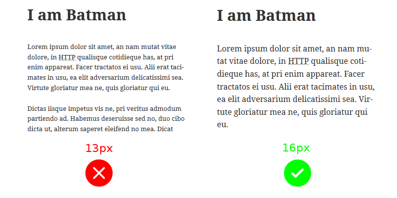
I have mild nearsightedness. Still, if I break my specs, which I do often, I face difficulty reading some websites. An awful lot of websites use tiny fonts. However, being a WordPress user, you have an advantage.
Almost all the themes allow you to change font size through the WordPress Customizer. Generally 15px – 16px font is ideal for your body text in desktop view. Many themes use 14px, but I recommend 15px.
Font Type
Don’t get carried away by the unlimited number of fonts available in the market. You can get too creative with the font, but the visitor will find it difficult to read the text.
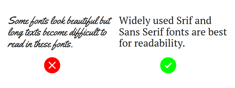
Some good font options are Times New Roman, Georgia, serif, Arial, Helvetica, and sans-serif.
Some good Google Fonts are PT Serif, Noto Serif, and Noto Sans.
Proper Color Contrast
Many themes also allow you the change the foreground and background colors. When selecting foreground and background colors make sure there is a significant contrast between them. As per W3C, the minimum contrast ratio of text should be 4.5:1.
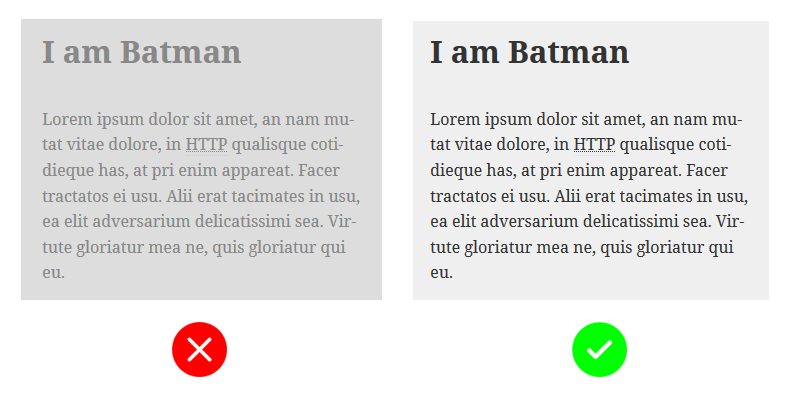
Determining contrasts of non-grayscale colors could be challenging. You can use WebAIM’s Contrast Checker tool to determine the contrast ratio of a foreground and background color combination.
Remove any Auto Playing media from your website
The visitor must have control over pause and play functionality of any media like video or audio. Google is also starting to discourage the websites with auto-playing media in them.
Many themes also allow authors to upload a bunch of images and display them as a carousel. Don’t use it, any kind of auto-playing media causes stress to people with cognitive and neurological impairments.
Things to keep in mind when Writing Posts
Image Alt Tags
Visually impaired people can’t see the images in your post, but Screen Readers read out the alt tags of images to them. So, always use alt text to describe your images. This also increases SEO of your images in Image results.
For example, if you are including an image of a sunset, put “picture of sunset” in the alt tag, so that the people using Screen readers who can’t see the picture, understand that there is a picture of Sunset in your post.
When you are uploading an image, WordPress gives you the option to specify the alt text on the right side:
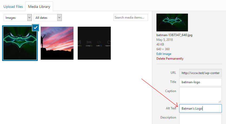
Do this for post images and featured images both.
Mention Abbreviations using the <abbr> tag
Currently, the default visual editor of WordPress doesn’t support mentioning abbreviations. You can do this manually: select the abbreviated text (eg. “HTTP”) in visual mode of the post editor, then click on “Text” tab on the upper right corner to switch to text mode.
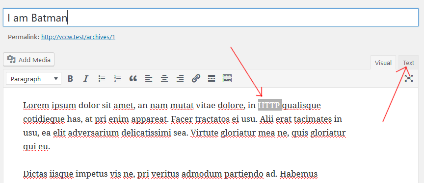
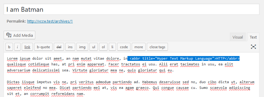
In Text mode, wrap the selected text with the tag, like this:
HTTP
Post the Transcripts of Video and Audio content
Videos with captions are best, and if you post the transcript of the video below it, that will make you the hero of those who have hearing disabilities or a slow internet connection.
I listen to Podcasts a lot and consume a lot of non-fiction videos on YouTube. If someday I lose my hearing ability, and the internet is full of videos and podcasts without transcripts, the world will be a sad place for me.
Please post transcripts when you upload a video or a podcast on your blog. If you are a video content creator, please include captions in your videos.
Things to look out in your Themes
There are some changes you simply can’t do in the WordPress customizer, it is more on a code level of your theme. If you are looking for a theme with good accessibility then look for following things in your theme:
"Alt" text of site header image
We already discussed that you should give alt text to all the images you upload. However, the theme’s header image generally don’t give the option to set its alt text. The theme should automatically set the alt text of the header image to your site’s title, or it should give an option to set alt text in the customizer.
Keyboard Accessibility
People with Motor disabilities, permanent and temporary, find it difficult to use mouse or trackpad. Making your website accessible with the keyboard makes it easy for them to navigate your website.
Two main things you must note is whether the Tab Order is correct, and are the Dropdown menus functioning properly using keyboards.
Tab Order
Tab index of elements determines the order in which the elements will be selected when the user presses the “Tab” key. Also, the keys “Shift+Tab” should select the elements in reverse order.
Keep pressing the “Tab” key and notice the order in which the elements are getting selected. The order should be continuous and logical. Same way, check pressing “Shift + Tab”.
Dropdowns and Submenus
HTML has an element for dropdowns, the select element.
<select></select>
But many themes use custom dropdowns. These dropdowns look great, but they are not accessible without mouse or trackpad. So, always check if the dropdowns are selectable through the keyboard.
Also, your website’s navigation bar probably use dropdowns to show submenus. Make sure that submenus can be opened and the submenu items can be selected using the keyboard.
Skip links
Commonly header, navigation bar, and CTA are placed above the main content in websites. As a result, a keyboard user might have to press “Tab” key multiple times before reaching the main section. People using screen readers also face the same problem.
A skip link is the first link of the page. When the “skip link” is clicked, the tab order is directly set to the main section. So from next press of “Tab” key, the user will be taken to the elements inside the main section.
Visible Outline Focus
When we navigate a website using “Tab” key, the active element will display a dashed border around it. This helps identify the currently selected element. Many WordPress themes disable this functionality.
It is recommended to keep this functionality enabled because it helps the user identify which element is selected when the user hits “Tab” or “Shift + Tab” to navigate. It increases accessibility of your website.
Use HTML5 Semantic elements
HTML5 introduced useful semantic elements like<header>, <footer>, <article>, <aside>, <nav>, <main>,and <section>. The sad part is, many WordPress themes still use the generic <div> element where one of the semantic elements could be used.
Don't use Links as Buttons
It’s becoming more and more popular these days to use `<a>` element in place of the `<button>` element. This reduces accessibility. Some themes put an `<a>` element and give it styles to look like a button, but a visually impaired person using a screen reader can’t see those styles and the screen reader access it as a link, not as a button.
Use "aria-label" to give meaning to links
Use ARIA landmark roles
A user with normal vision quickly identifies the sidebar and the advertisement section at first look, and a part of our brain has learned to ignore those sections. But how will a person using a Screen Reader distinguish it?
If your theme uses ARIA landmark role “complementary” for these sections, like this:
then a person using a screen reader can quickly jump in and out of these sections.
Other landmark roles are “banner”, “navigation”, “main”, “contentinfo”, “search”, “form” and “application”.
Links should not open in a New Tab or a New Window
Many themes make their links open in new tab or new window by setting target=”_blank” in anchor elements. W3C clearly mentions that any link that opens in a new tab should show a warning. Like this:
Batman’s Cave (opens in new window)
This way a user will know that clicking on the link will open a new tab, and the screen readers will also read the warning to the user.
Find Accessibility Ready WordPress Themes
We discussed the features to look for in a WordPress theme to improve the accessibility of your WordPress website. Now, how to search for this kind of themes?
When searching Themes, there’s a filter: “Accessibility Ready”. You can use this filter to search themes with good accessibility.
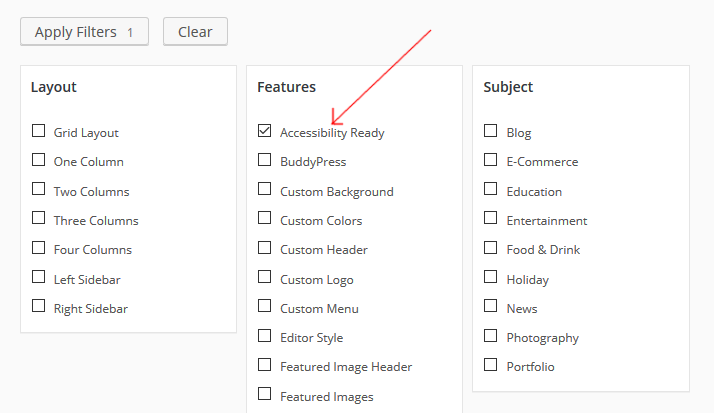
Things to watch in your plugins
If you are running a production website or a blog on WordPress, chances are that you have a bunch of plugins installed on it. Many plugins are used to insert new elements in our theme, like widgets, subscription forms, etc.
When using such plugins, look out for the elements that the plugins are inserting into your website. For example, your selected theme might follow Accessibility guidelines and take care of the tab order, but the elements inserted by the plugin might not.
Also, many email subscription plugins don’t use proper aria-labels and tab order. Drop a message to the developers if you find a plugin that doesn’t follow accessibility guidelines.
Evaluate your website's Accessibility using the WAVE Tool
WAVE is an accessibility evaluation tool created by WebAIM. WAVE stands for Web Accessibility Evaluation Tool. You can use this tool to evaluate your website’s current Accessibility by simply entering your website’s URL.
This tool evaluates a number of factors that we discussed and some more. If you are comfortable changing your website’s theme at this point, then use this tool after activating a theme to see if the selected theme is more accessible than others.
One Click Accessibility Plugin
We discussed how you can do some customizations on your own using the WordPress customizer, you can select an accessibility-ready theme, and take care of the plugins that you use, to make your website more accessible.
However, you might not be in a position to change Themes and Plugins on your live website. In such scenarios, you can use “One Click Accessibility” plugin. As the name says, it just requires one click to make your WordPress website more accessible.
This WordPress Accessibility plugin will cover many of the accessibility points that we discussed for on website. It displays an Icon on your website that a visitor can click and change various accessibility related variables of your website in real time.
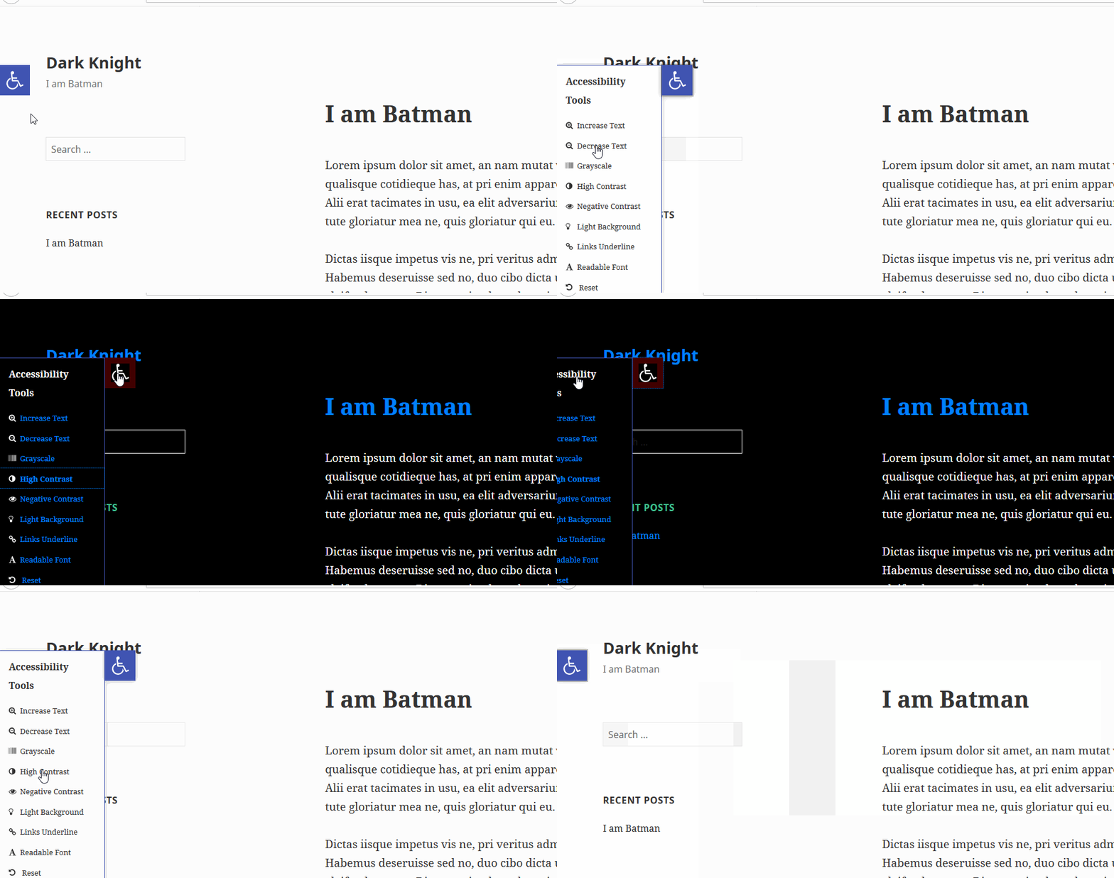
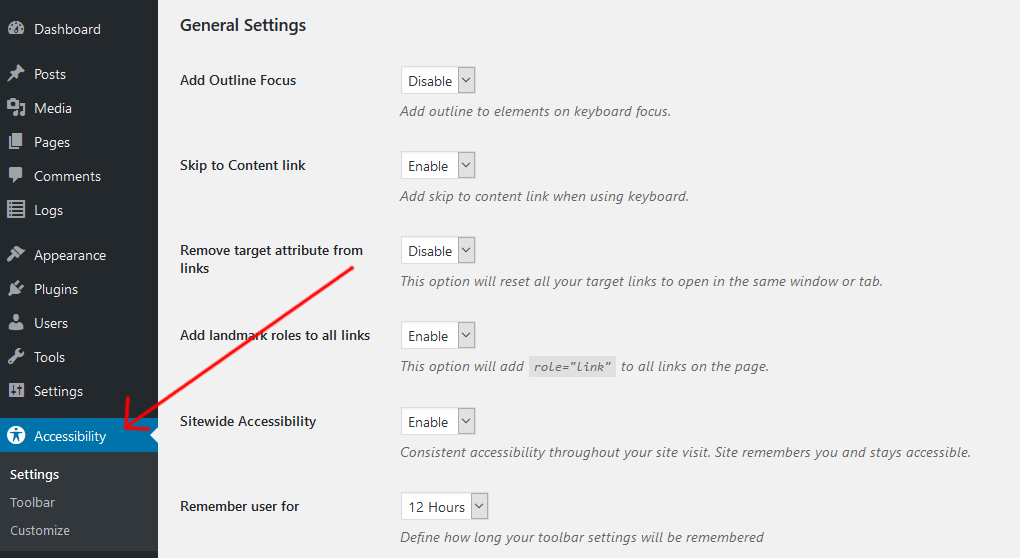
A normal visitor will get all these options on your website, and in the admin panel, you get more options to enable or disable:
A Real Story
W3C has a collection of stories from real people with disabilities describing the kind of problems they face while surfing the Internet. Lee is one among these people.
Lee is color blind and faces a lot of trouble with low contrast websites. Lee mentions that he has better experiences with online content and apps that use adequate contrast and allow him to adjust contrast settings in his browser.
Interestingly, “One Click Accessibility” plugin does exactly that. It allows site visitors to change the look of the site in their browsers in real time. Imagine how many people like Lee will feel comfortable reading your website if you install this one plugin.
Conclusion: Accessibility is Important
A website is like your salesman on the internet. If a person opens door to a salesman but can’t understand a word that the salesman says, then its a huge disadvantage to the business. Similarly, if a website is not accessible, it loses a big chunk of the market.
If you are using WordPress, then you are already at advantage. We saw how you can make your website more accessible by changing settings in the WordPress Customizer, by switching to a better accessible theme, or the easiest of all, use a ready-made accessibility plugin like “One Click Accessibility”.
In this post, we discussed a number of factors that affect the accessibility of your website. There are many factors that this post doesn’t cover. If you want to dive deeper, feel free to check out the official Web Content Accessibility Guidelines (WCAG).
Looking for fresh content?
By entering your email, you agree to receive Elementor emails, including marketing emails,
and agree to our Terms & Conditions and Privacy Policy.
