In digital design, portfolios matter more than degrees. Experienced designers know that nothing sells design work quite like a striking portfolio. However, if you’re new to design you may be reluctant about building a portfolio – after all, creating a solid portfolio requires a lot of time and effort. In this article, I will demonstrate how building your portfolio is a lucrative investment and provide a few practical tips that will help you produce a stellar portfolio (and don’t miss these beautiful examples of web design portfolios if you need inspiration).
4 Advantages of Crafting Your Own Portfolio
Present Your Talents
When it comes to presenting creative talent, nothing can beat a portfolio. At first glance, a CV may look like a good alternative. But, it’s impossible to replace a portfolio with a CV because it provides only a dull summary of where you have worked and what you’ve done. Portfolios, on the other hand, allow you to show and not just tell. You can showcase your work to potential clients, and they will use your portfolio to determine your experience, taste, and, most importantly, your ability to solve real-world business problems.
Improve Your Organizational Skills
A portfolio will help you to stay organized. A portfolio is dynamic and everchanging, tracing your creative evolution. Since you need to update your portfolio regularly, you’ll learn how to structure and prioritize all your projects.
Boost Your Self-Confidence
A portfolio will help you advance your design process and become more confident using your skills. When you continually review your previous works, you’ll notice areas that you can improve.
Learn New Things
A portfolio will encourage you to learn new things. Spending time on it is a great way to flex your creative muscles. Working on a portfolio will help you jot down your thoughts about your design process, as well as experiment and try different techniques without taking too much risk. This creative freedom will make you a better designer.
A 12-Step Guide to Create a Stellar Portfolio
Creating your first portfolio might seem like a daunting task, especially if you have never done so before. I’ve put together a quick guide that will help you create a portfolio that will tell your story.
1. Make Sure Your Portfolio Is User-Centered
As with any other products you design, your portfolio should start with your target audience. Know your clients and tailor your portfolios to them – figure out what your audience seeks and show them how your skills fit their needs.
2. Put a Heavy Emphasis on the Writing
Many portfolio websites start with a list of projects – designers simply display their works to their visitors. While it’s perfectly fine to let your work sell itself, it’s always interesting to read about the person or team who created it. Remember, people hire people, not portfolios. That’s why it’s recommended to put your writing front and center, even before your visual work.
Thomas Williams’ portfolio is an excellent example of giving visitors the relevant information right off the bat. By introducing himself, Thomas creates an initial connection with visitors.

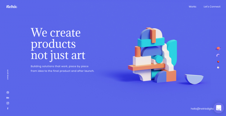
When it comes to selecting a way to introduce yourself, you can be very creative. Netrix pairs the text message with imagery that looks like building blocks. By doing that they cement the concept “Building solutions that work, piece by piece” in visitors mind.
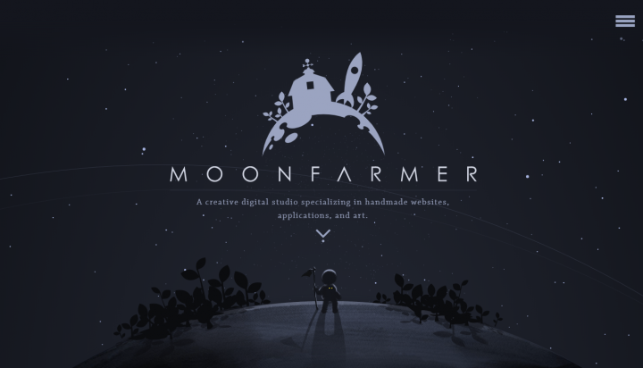
But if you want to create a truly memorable experience, you need to follow the storytelling approach. Moonfarmer is a sweet and simple portfolio that uses strong story-telling on its home page.
3. Don’t Put All Your Projects in a Portfolio
When you create a portfolio, you’re probably thinking that your visitors will spend at least 10 minutes reading it. No, they won’t. Troy Park and Patrick Neeman claim that people spend an average of 10-15 seconds looking at portfolios. Having too many items in your portfolio that compete for a visitor’s attention harms more than helps.
That’s why when it comes to selecting projects for your portfolio follow the ‘less is more‘ rule. Your portfolio should not feel like a CV. Emphasize quality over quantity – list only the most relevant projects and think about how to present those projects in order to maximize their value. Also, keep in mind that your portfolio should demonstrate not only past work but also future directions. Thus, make sure you’re including only the type of work you’re looking to do more of.
A quick tip: Use the 60-second test to make sure your most essential information is communicated clearly.
It’s better to demonstrate your projects in a format of case studies that read (and look) like presentations. By doing that you’ll have better chances to engage your visitors.
4. Trim All the Fat
When you’re crafting a design for your portfolio website, it’s vital to consider what you are conveying, as well as how you lay out this information on the page. The design should not get in the way. Learn more about building your site in our recently released online course.
Usually, simple and clean design works best. Lots of white space and simple typeface can be a good foundation for your design. Thus, try to remove all unnecessary information and decorative elements to focus visitors’ attention on your message. Every time you want to introduce a new text section, ask yourself ‘Can I say it more succinctly’? Could a concept be displayed as an image or as a diagram instead of as a paragraph of text?’
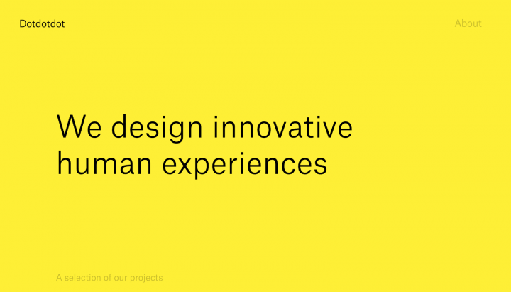
Below is an example of Dotdotdot creative agency. Their portfolio was created using a bright yellow and large type. This strong emphasis on color shakes things up and helps the team create a truly eye-catching experience.
Check out the Portfolio Templates list we gathered to see examples of finely built designs.
5. Make Your Navigation Crystal-Clear
The visitors should be able to navigate with ease. In many cases, it’s better to use a one-page layout. A one-page layout is excellent for visitors because they will be able to rely on smooth scrolling to consume the information. If you decide to distribute your content across a few pages, make sure your design is consistent – different pages must be part of a whole website (hint: our WordPress Portfolio Gallery widget makes this really easy).
Also, some visitors will want to read more information about you, so make sure they know exactly where to find this info. Create an About me and Contacts sections (or pages).
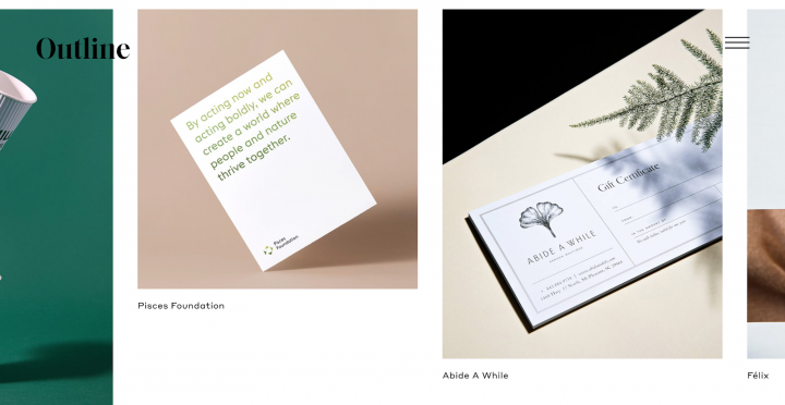
The website uses a high fashion aesthetic that makes you scroll for more information.

6. Create ‘About Me’ Page or Section
People hire people, not portfolios. That’s why your portfolio should not only provide an impactful description of what kind of job you’re looking for but also who you are. The “About me” section/page is ideal for in-depth information about your passions and interests as well as your current level of expertise. Adding the “About Me” page/section is also a great way to humanize your portfolio. However, don’t try to write your entire autobiography on that page. Your “About Me’ page should be concise and to the point, similar to other parts of your portfolio.
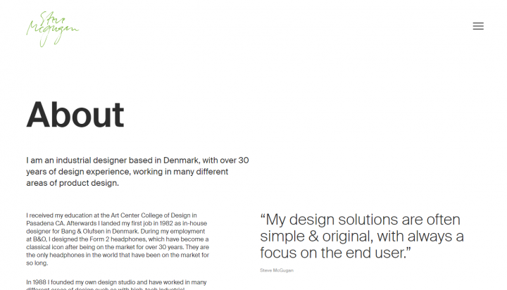
Steve Mcgugan includes detailed information about his professional experience and pairs it with his quotes.
7. Provide Testimonials
Social proof is an excellent way to build trust on any site, but it’s especially apt for portfolios. It’s easy to collect testimonials if you have good relationships with your clients.
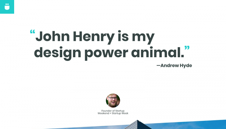
Check out John Henry Müller’s portfolio. He found a nice way to add testimonials – instead of having a dedicated section with only testimonials, he spreads testimonials throughout the home page, sprinkling them among other items.
8. Bake Your Personality Into Design
When you design a portfolio, your ultimate goal is to create a design that feels both professional, and deeply personal. Your portfolio should spark emotions in visitor’s hearts. There are a lot of things you can do to achieve this goal. For example, you can use animated effects triggered on-scroll.

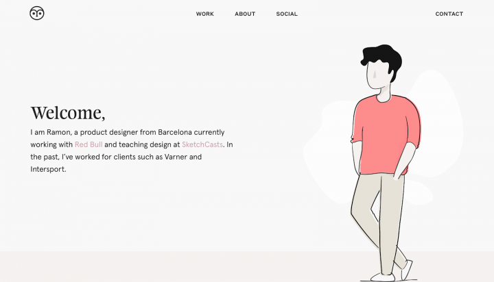
If you have decent illustration skills, you can impress your visitors by adding remarkable illustrations.
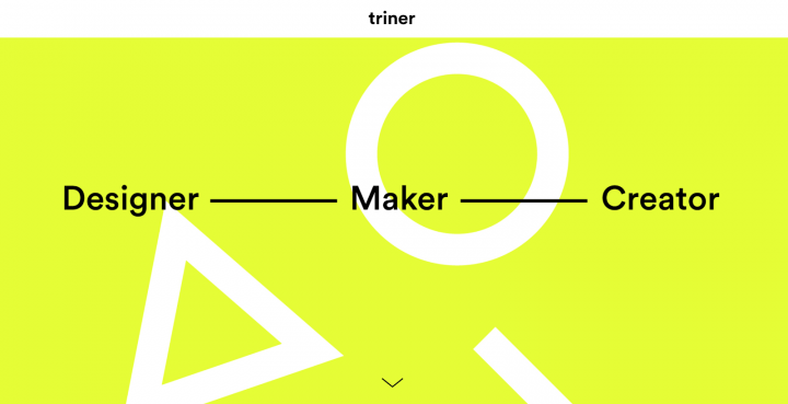
Last but not least, you can add abstract geometric shapes to make your design feel special.
9. Make Your Contact Information Prominent
Your contact information is one of the most critical elements of your design. It’s vital to make sure that it’s easy for visitors to get in touch with you. You may also want to add a navigation option specifically for contact information.
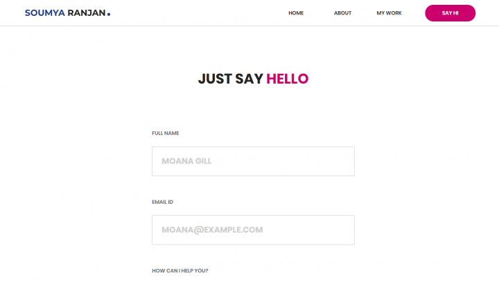
It’s recommended not only to provide your contact email/phone number on the ‘Contact me’ page but also introduce a contact form. Soumya Ranjan’s portfolio has a nice ‘Just say hello’ contact form. The question ‘How can I help you’ in this form helps to frame the conversation.
10. Include Your CV
While CV cannot be a replacement for your portfolio, it can be an additional helpful document that your visitors can download and print. “About me” is an ideal place for adding a link to your CV. It’s recommended to provide a CV in PDF – this format works well both for desktop and mobile users.
11. Start a Blog
Blogging is a great way to show off your expertise within the industry. It’s also a great way to show your visitors and search engines that your portfolio is updated regularly.
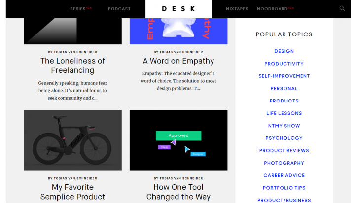
The most successful bloggers like Tobias van Schneider become an inspiration for other designers.
12. Check How Your Portfolio Appears on Mobile
In a world of mobile-first products, your portfolio should look equally good on desktop as well as on mobile screens.
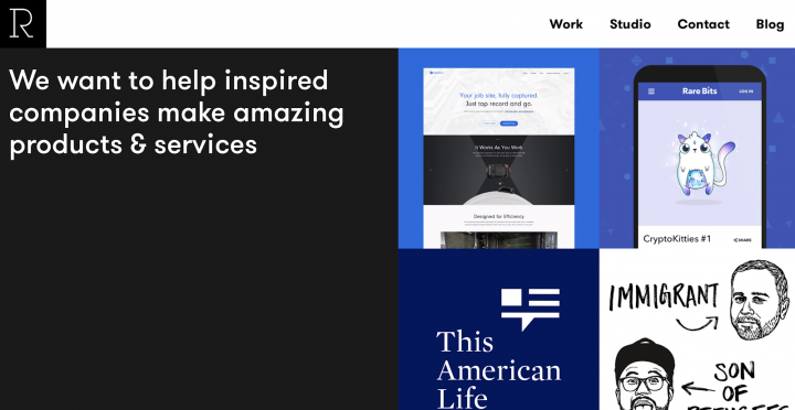
Studio Rodrigo’s site is one of those portfolios that adapt well to large desktop screen sizes as well as to small mobile screens.
Don't Stall – Start Building Your Portfolio Website Today
Creating a great portfolio is a journey involving a lot of time and effort, but it’s definitely worth it. A well-designed portfolio is a key to unlocking your door to great opportunities – it’s something that can help you stand out among thousands of competitors. The best portfolios not only demonstrate the depth of a designer’s abilities but they also will serve as inspiration for the design community.
Looking for fresh content?
By entering your email, you agree to receive Elementor emails, including marketing emails,
and agree to our Terms & Conditions and Privacy Policy.
