The Many Faces of the Web
When we first started pulling together the competition, we quickly realized that there was more than one expression of website perfection. Since every type of website has its own goal and purpose, we decided to narrow down the competition to 5 categories: Portfolio, Experimental, E-Commerce, Landing page and Content.
Portfolio
These websites are very important for business owners and individuals alike. If you want people to know who you are and what you offer to the world, having a killer portfolio is necessary to connect with your audience across the huge vastness of the web.
Experimental
Experimental websites were born out of the need to express one’s inner artistic self in a way that visitors could relate to. By tweaking and perfecting these sites, our participants got one step closer to giving life to their unique ideas. We were truly impressed by the ingenious ways web creators used Elementor to build these phenomenal sites.
E-Commerce
This category has received much attention over the last 2 years. Transitioning from brick-and-mortar to online selling is an ever-growing trend. With the need to branch out and sell products on the web, the growth in online storefronts is exploding.
Landing Page
Landing pages are generally made for marketing or advertising campaigns. These pages are designed with a single focus in mind. They lead to a specific call to action and constitute an integral part of the marketing funnel. When done correctly, Landing Pages can be an incredibly cost-efficient way to increase conversion rates.
Content
Landing pages are generally made for marketing or advertising campaigns. These pages are designed with a single focus in mind. They lead to a specific call to action and constitute an integral part of the marketing funnel. When done correctly, Landing Pages can be an incredibly cost-efficient way to increase conversion rates.
The Quest for the Best
We opened our virtual gates for your submissions on Nov. 8th and received thousands of websites for all the different categories. We were awe-struck by the creativity and ingenuity of them all. We worked around the clock spending hours upon hours reviewing websites until we finally picked the top 10 websites for each category – and OMG – it wasn’t easy!
Luckily, for the next step of the competition, we got some help with the judging process. We had web creators from our community who represented the voice of the community, a team of well-known professionals and of course – you!
And the Winners Are….
December 21st was the moment of truth where we finally revealed the winners of each category. We prepared a really cool and colorful studio set and dressed ourselves up to celebrate the moment. Not every day do we hand out “the Oscar” of web creation!
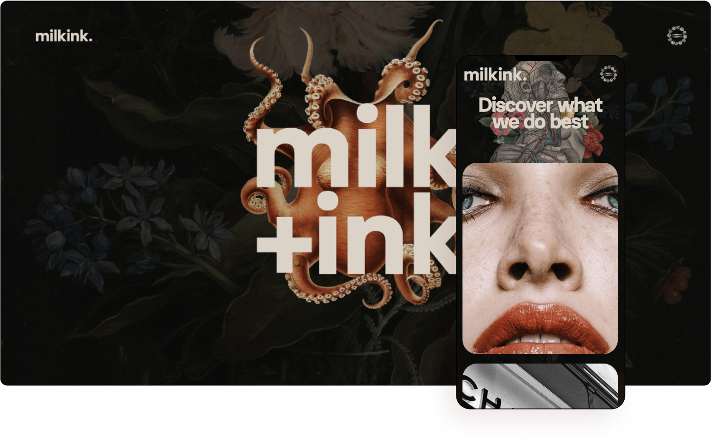
We started with our first category – Portfolio. Stefan Kokovic from Austria was the winner with his website Milk Ink Studio. This is a creative studio that offers unique experiences with a strong visual design. Their style infuses a combination of classical art with a touch of modernism. This was clear by their choice of fonts, images and effects used throughout the site.
One of our judges wrote this: “This website shows that you can be very creative using only Elementor’s built-in features. Another example of a great art direction!”
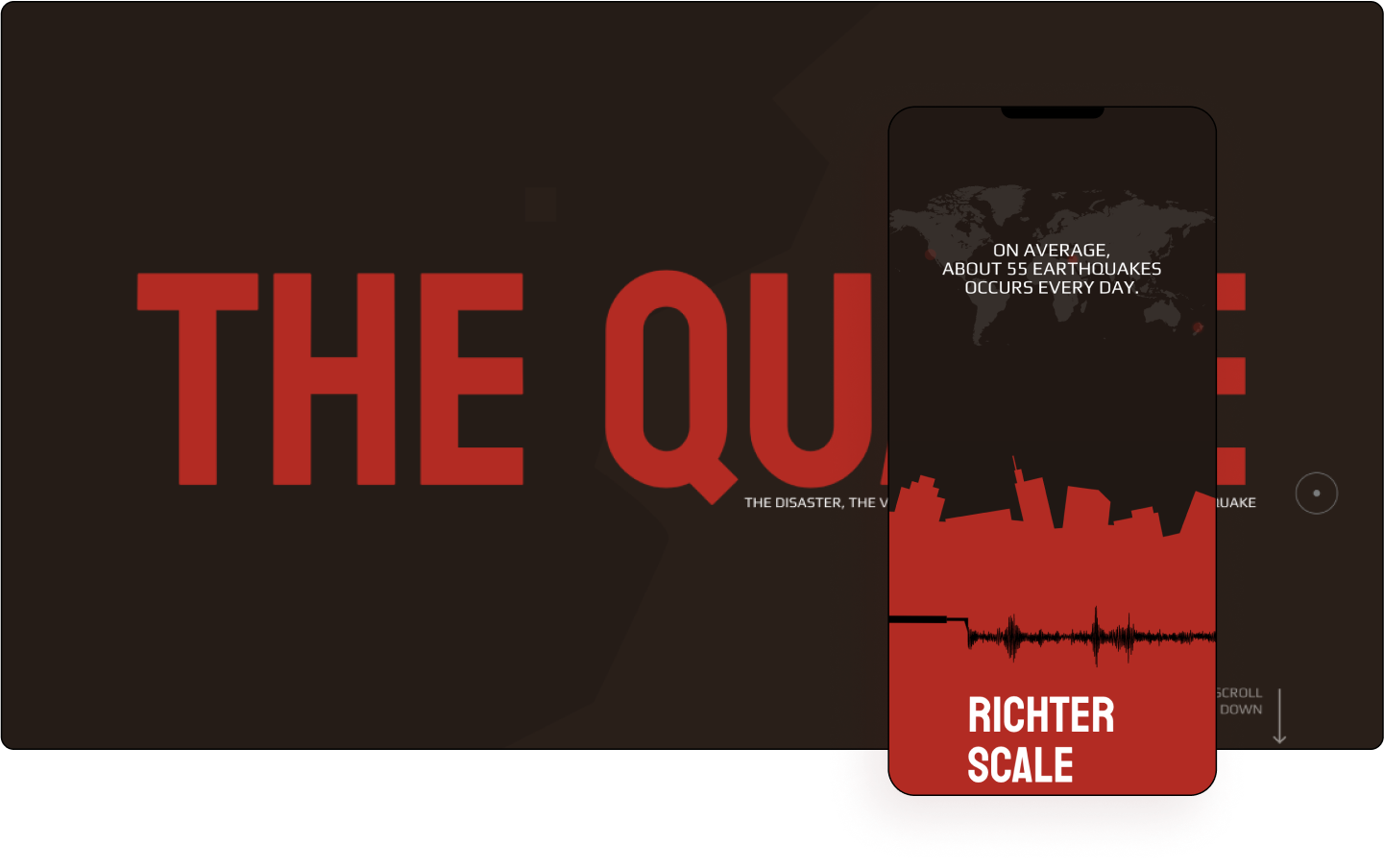
The next category was the Experimental one. Here, Yoni Kessler & Yehuda Bruck from Israel were the winners with their exceptional website The Quake. The website explains in an engaging and visual way what steps to take when (and if) an earthquake strikes. The combination of earth colors with the choice of a clean “digital” san serif font in white – create the awareness that they were trying to achieve in a highly effective way.The motion effects, while scrolling down, wraps it all into one interesting story that lures us to read on.
One of the judges wrote this: “The website has a great message. I love the introduction of the color scheme, such as the brown that represents Earth; red for urgency and the white text to deliver the message. The website helps people understand the dangers of earthquakes, how they happen, the history, and what causes them.”
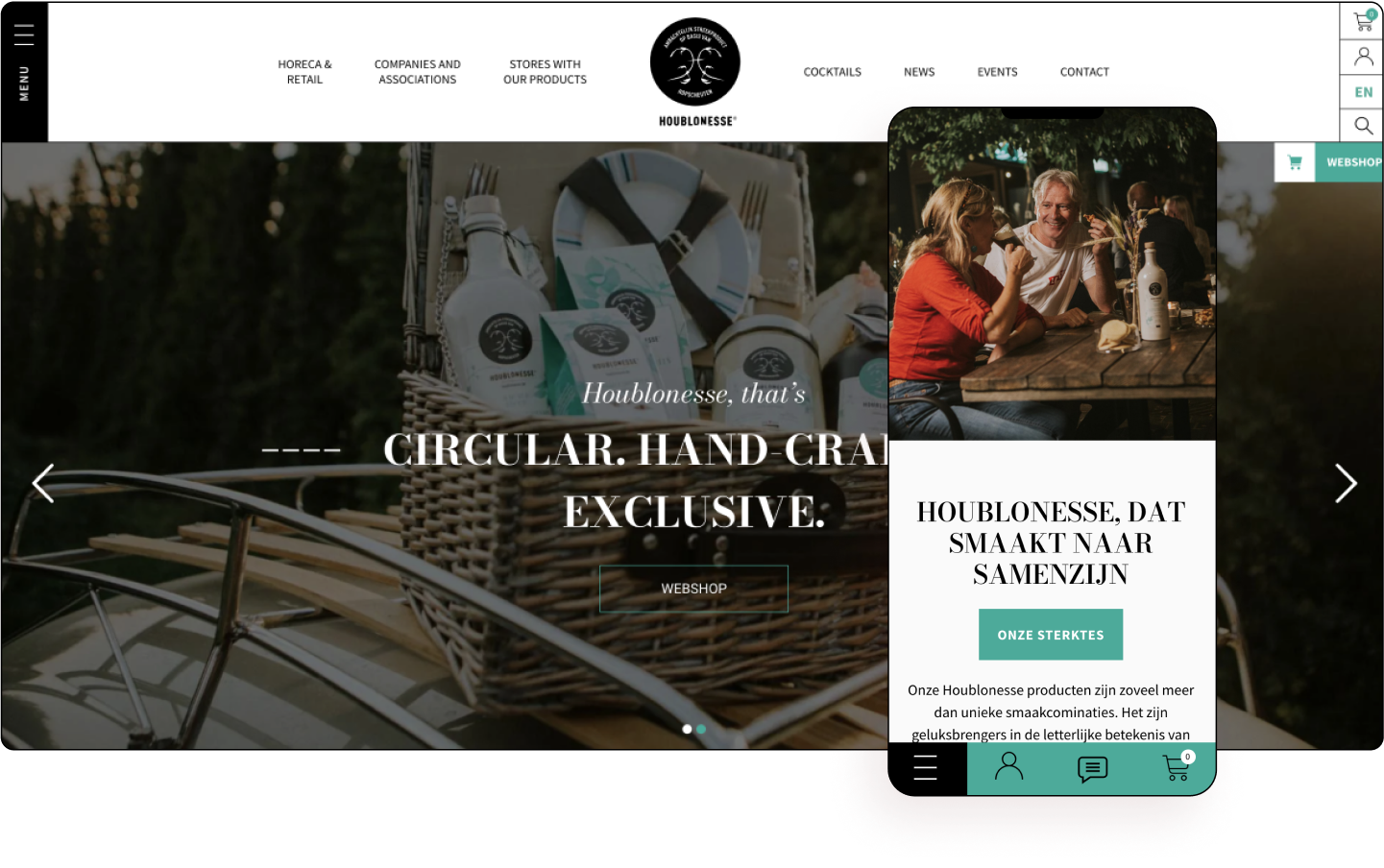
For the E-Commerce category Glenn Rabby Paulin from Belgium took the top prize with the website Houblonesse. As an online shop that sells beverages and snacks, this site has a modern, geometric, clean design with a fresh color scheme. Its well organized pages and unified look & feel treat visitors to a first-rate user experience, from first page encounter to the final cart checkout.
One of our judges wrote this about the website: “Perfect balance between content & creative”.
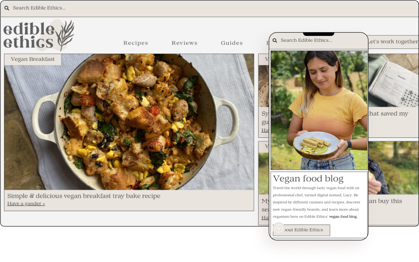
Our next category was Content. Lucy Johnson from the UK was the winner of this category with Edible Ethics website. As a vegan chef in London, Lucy created this blog to share her recipes and thoughts. Neutral colors and professional-looking photos make this website warm and welcoming. The dishes looked delicious, enticing visitors to try the recipes for themselves. Clever use of black borders organizes the entire website in a subtle and contemporary way. Visitors can easily navigate throughout the website by filtering for ingredients, brands, dietary restrictions, etc. The overall experience of the website is very inviting, cozy and personal.
One of our judges wrote this about it: “This web is all about content and design, serves very well to organise and present it to the visitor, well done!”
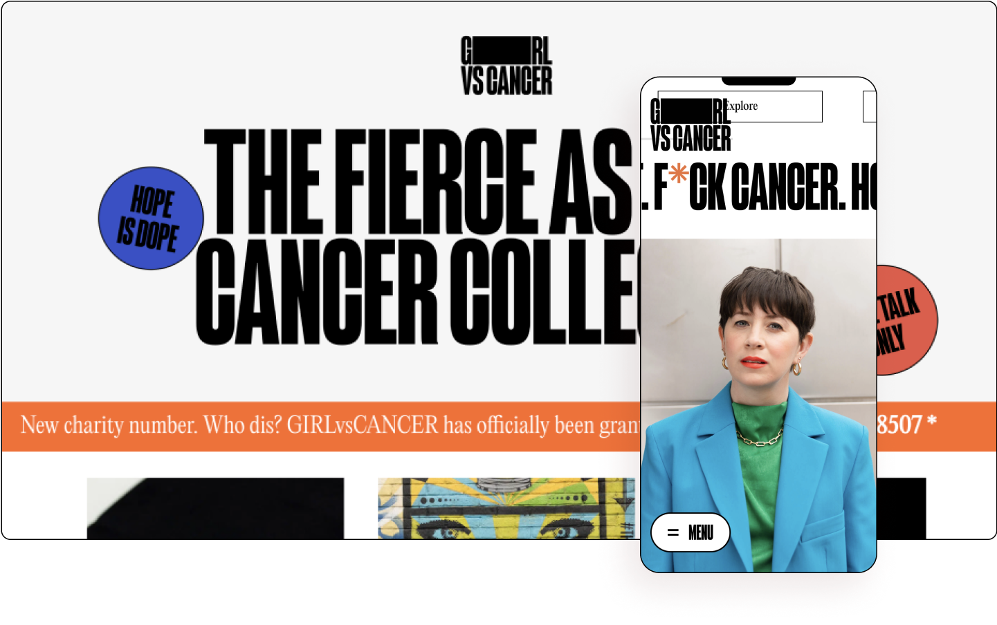
We also had an Honorable Mention website. In this category, Will Hopkinson from the UK won with the website GIRLvsCANCER and received the honorable mention not only because it caught the attention of our judges, but also because of its mission to empower people dealing with difficult diagnoses. The design of this website is very cool and bold with big black san serif headlines, studio images, stickers and hover effects using colors that give a vibe of a virtual graffiti wall.
One of our judges wrote: “Every aspect of this site was just about perfectly executed! The typography was aces! The positioning was on point and connected the audience with emotion and purpose. The creativity and animations were done just right. Every detail on this site has a special touch without missing a beat.”
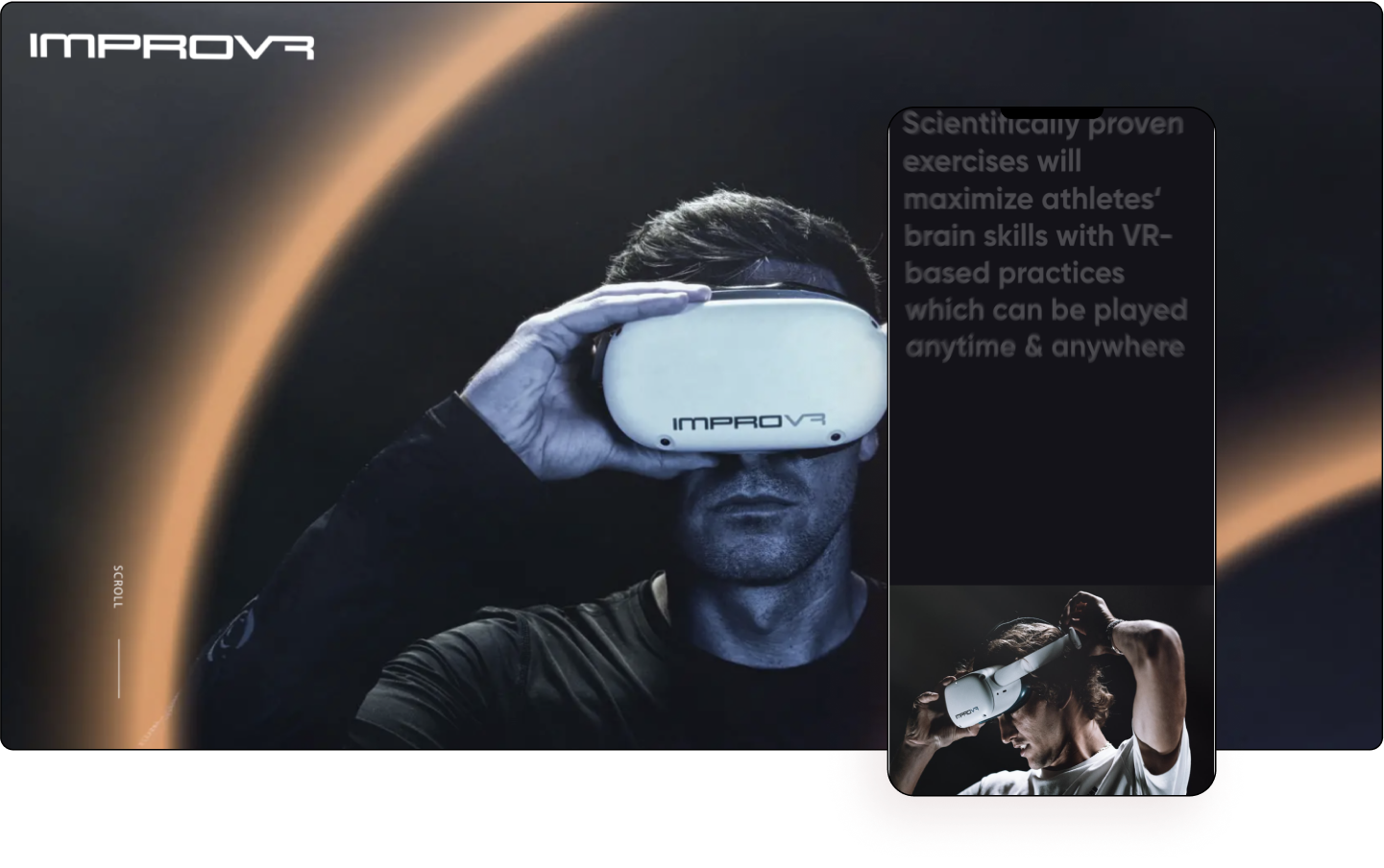
Landing page was the last category of the Showoff ‘22 event. In this category Den Sabrov from the USA took the prize with his website ImproVR. The company offers brain-based exercises to improve an athlete’s skills using mobile VR devices and gamification. As we scroll through the landing page, we are immersed into the story of what it’s like to wear a VR device. Every section of the website captures the visitor’s attention and gets them engaged. The best part is towards the end when we, the visitors, can try (virtually) the goggles ourselves and experience the product without really using it. It’s a really cool way to show off the product online.
One of our judges wrote about it: “Super interactive, using scroll sequence to animate every section. Great adaptation to mobile, and excellent art direction.”
This website also won the grand prize and was crowned “The best website of the Elementor Showoff competition of 2022”. Kudos to Den Sabrov and his excellent work!
Den’s reaction for winning: “It’s just unbelievable! I find that Elementor is one of the best tools for web design, for web development, and I’m really so proud that my work won this competition. I’m really speechless and so excited.”
Submit Your Websites Today!
Creating Showoff 2022 was an amazing and inspiring experience. We were really blown away by the creativity and professionalism in the websites that were submitted to the competition. But this is far from the end of the competition!
Actually, this is the very beginning of the Elementor Showoff competition 2023. From January 2023 until November 2023 you can submit your websites as well and you might be featured on our shiny new Instagram channel as ‘Website of the Week’ or ‘Website of the Month.’
So, enter your best work here and perhaps you’ll also be crowned as the best website of the Elementor Showoff ‘23 competition. May the best web creator win!
Looking for more content?
By entering your email, you agree to our Terms of Service and Privacy Policy.