Don’t want the party to end? Make the celebrations last longer with the birthday gift of dreams. Just like our diverse, colorful community of web creators, birthday celebrators of all backgrounds each have their own idea of what they consider to be the gift of dreams. This is what can make buying a birthday gift so stressful, which is why we’ve used our 5th Birthday Showcase as an opportunity to provide a helpful shortlist of birthday gift ideas.
Each of these five Elementor e-commerce sites created websites that present their gift offerings in an engaging, informative way. As we slowly come to the close of our fifth birthday extravaganzas, here are some fine ideas made by Elementor users of how to find the gift that’s absolutely just right.
05
Vixi Gifting: Birthday in a Box
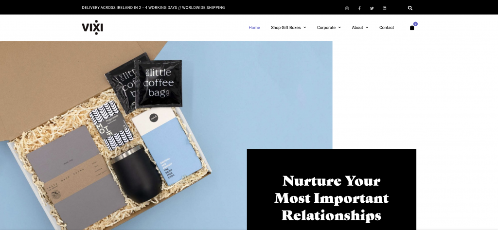
Imagine waking up to a surprise gift box sent to you by your bestie, which includes an array of items like perfume, a funky mug, a face mask, a scented candle, and some chocolate. To us, that sounds like a fine way to get pampered on your birthday. Or what about a customized gift box that’s full of stuff chosen especially for you? That’s a sweet touch.
What we’ve described above is a service provided by Vixi Gifting, an Irish gift agency that curates and creates custom gift arrangements to be purchased online. Vixi Gifting was designed and developed with Elementor by Melodie Fox, an ex-graphic designer who took a career pivot to start Vixi Gifting.
Did you notice the site’s product pages? We love the way Melodie uses the WooCommerce Product Image Widget to showcase every detail of each package. Showing the details of seven individual items, as well as how they all fit together in one box — can be challenging. Melodie found the perfect way to show visitors each and every detail of the boxes’ contents, without overwhelming them or leaving out important information.
Theme: Storefront
Plugins: Essential Addons for Elementor, Premium Addons for Elementor, GDPR Cookie Consent, Smash Balloon Instagram Feed, WPC Fly Cart for WooCommerce
Design & Development: Melodie Fox
04
Mannenbox: For the Birthday Boy
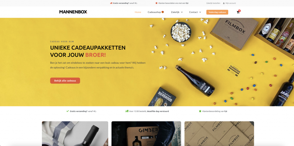
This ones for the boys. Mannenbox was started explicitly to give people an option for buying handmade gift boxes for the men in their life. Based in the Netherlands, Mannenbox founder Nick Beijer shared that he saw an opportunity “to help people surprise their friends, fathers, and/or husbands … to create “a unique giving experience””. Every gift box assortment has a theme and is catered to different audiences.
One of our most profound takeaways from Mannenbox’s website and business offering is that the product is based on understanding how every individual has their own personal interests and taste. This is crucial to keep in mind when celebrating someone’s birthday, as the day is about them, and you’ll always want to find the key to their heart with a gift you’re confident that they’ll love.
In terms of finding your way around the website and spotting the right gift, Mannenbox’s site makes it easy to navigate through their different gift boxes. What’s more is that the Product Archive photographs of the gift content are clear, three-dimensional, and give shoppers a true understanding of the items they’re considering for purchase.
Theme: Astra
Plugins: Ultimate Addons for Elementor
Design & Development: Nick and Mike from Mannenbox
03
Bastard Mug: The Gift of Humor
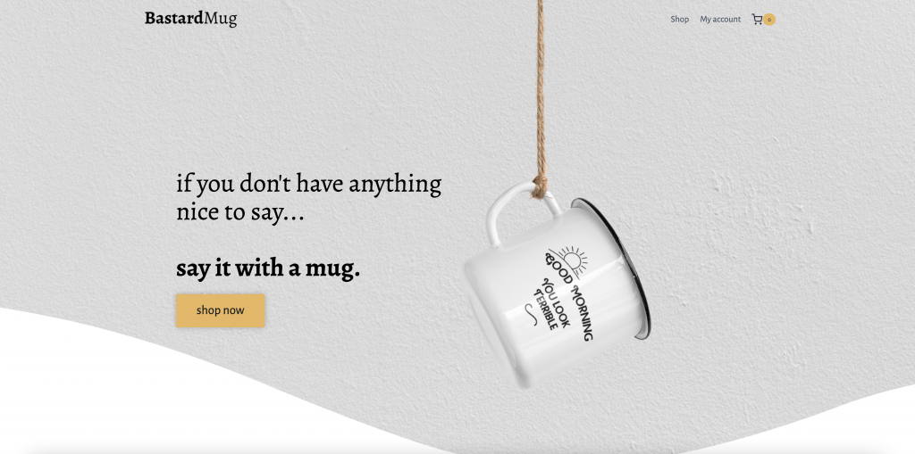
Who doesn’t love a good laugh on their birthday? A great way to start off your special day (it only comes once a year, after all) is to make sure the morning starts on the right foot. That’s where Bastard Mugs come in. Glossy or enamel, cynical, sarcastic, or just plain old funny — as long as you know your audience (or that they know yours), Bastard Mugs does the trick. Coffee quality could easily be improved by the right mug — because, why not?
But so much of what appealed to us about Bastard Mugs merchandise is how the brand positions itself on their website. The black and white color scheme and its accents match the merchandise colors perfectly, with a straightforward yet inviting vibe.
Make sure to take a look at their Orders page, where the Accordion Widget fits in like a glove. There is a lot of information architecture to work with when it comes to FAQ and policy pages, which is why expandable tabs are a game-changer. Clarifying questions like “When will I get my order?” and “What’s your return policy?” are must-knows when buying a birthday gift. The clearer the information is to shoppers, the more likely they are to proceed to Checkout.
Theme: Kadence
Plugins: OoohBoi Steroids for Elementor, WooCommerce
Design & Development: Ches
02
Jo to the World Creations: The Gift of Crochet
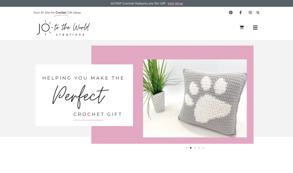
Jo to the World Creations is a website dedicated to helping you make the perfect crochet gift. In addition to ordering crochet patterns, this site provides a wealth of resources for crafty individuals looking to “make the perfect crochet gifts”. With a feminine flair that’s right up the alleys of children, grandchildren, and grandparents, this unique crochet-focused site introduces gift-givers to a new niche that will go a long way in the tricky quest of finding the perfect gift.
Jo to the World Creations was started by Canadian web designer Jo, and it’s no surprise that her website is so professional and polished. The logo is engaging, the font pairing is well thought-out (serif and sans-serif come together), and the pink accents throughout the site add a refined touch. Even the smallest details like the Hello Bar announcing a 15% off discount and the animated headline in the nav menu — have a meaningful impact on the site design and credibility.
Theme: Hello
Plugins: WooCommerce, Advanced Custom Fields
Design & Development: Jo to the Web Solutions
01
Balance Box: The Gift of Tranquility
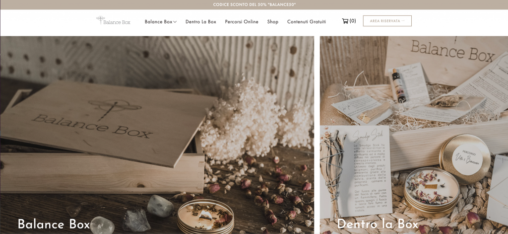
Another wonderful part of birthdays is the excuse to get pampered and feel nothing but blissful. After dancing the night away and wearing out your dancing shoes, putting your feet up is often the winning ticket. Italian gift box brand Balance Box sells essences, herbal teas, and candles that customers buy for their friends and family on special occasions.
Balance Box’s website uses subtle design details to convey the delicateness of its products and experiences. This applies to the color scheme’s neutral colors, the imagery showing relaxed individuals taking care of their well-being, and so on. The use of slow-motion entrance animations also conveys the notion that when you receive a Balance Box, you’re putting a pause on the high-paced stresses of life by taking care of your very own self.
Theme: Anon
Plugins: WooCommerce, CookieYes, Facebook Login
Think your Elementor-based website or landing page should be featured in our next Top 10 Websites column? Give it a shot!
