Our final showcase of 2021 brings together a gorgeous collection of websites reflecting the beautiful diversity we’ve seen throughout the year. Whether it’s a Space Invader-themed Australian web agency, a rainbow-colored Mexican cake shop, an Italian movement website with universal undertones, or a UK digital web agency uniquely blending micro animations, our November showcase has it all.
There are plenty of unique ideas to take away, from creative text paths to beautiful juxtaposed gradient, neon-colored, and pastel-colored text on both pitch black and bright white backgrounds, to intricate uses of scrolling effects that bring messages to life, this month’s showcase is one for the ages. So, without further ado, let’s take a peek at the final showcase of the year.
Let’s take one last trip before we close out another revolution around the sun!
10
21 Minutes Coaching
by Barbora Hengstova – Lenus
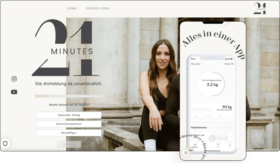
21 Minutes Coaching concentrates on building physical health through individual training and nutrition plans and also takes care of building mental health through targeted motivational videos and weekly mini-challenges.
The German online coaching business employs a one-page website format. Using a popular font pairing, along with nice dark gray lettering, the website evokes a polished yet relaxed vibe. Text paths appear can also be seen right below the hero on either side maintaining viewers’ attention.
A distinctive feature of the website is the form being present and fully functional within the hero itself. There’s also a gentle and elegant use of animations with sections beautifully and seamlessly transitioning. Scroll effects offer the website some nice movement, underscoring its active vibe.
Pay special attention to the images that utilize the same colors as the website’s theme colors. This is a nice and well-thought aesthetic touch that gels well with the whole modern feel of the business.
21 Minutes Coaching is action-packed from header to footer giving visitors an active atmosphere to match its services.
Design & Development: Barbora Hengstova – Lenus
Theme: Page Builder Framework
Plugins: WP Super Cache, Yoast SEO, Insert Headers and Footers
09
Urban Jungle Blog
by Giuseppe Cangiano
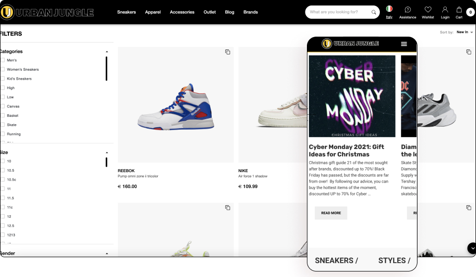
Urban Jungle is an international franchising project, in partnership with the best brands, which was founded with the goal of being the reference point for all consumers who are looking for the latest innovative and exclusive urban culture news and products.
Urban Jungle’s blog uses a simple modern design as it primarily acts as a place to showcase products from the store in order to promote sales. Using a thin font and linear motif with the help of line divisions help space out each section, the website is neatly organized.
Each article follows a simple, clear, image-heavy layout. In fact, images heavily dominate posts with fragments of black text lightly populated around images via caption titles or short introductions. There’s a nice use of the Latest Post column too on the right-hand side which nicely incorporates our Sticky Column widget.
As we progress to the bottom of a page, the footer follows us which encourages visits to the shop. This is a website that’s modern, minimalistic, and cozy — a blog that invites multiple page views due to the compact, short text in each post. It makes absorbing content easy since the primary focus is the visuals of the products on offer.
Urban Jungle states it sells limited editions, most-wanted products, trendy accessories, in collaboration with artists of major international brands. Its blog website perfectly presents all its strongest points in an easy simple format, maximizing product exposure.
Design & Development: Giuseppe Cangiano
Theme: Hello
Plugins: Dynamic Content for Elementor
08
ZAMMETH
by Zaima and Ethan Khandaker
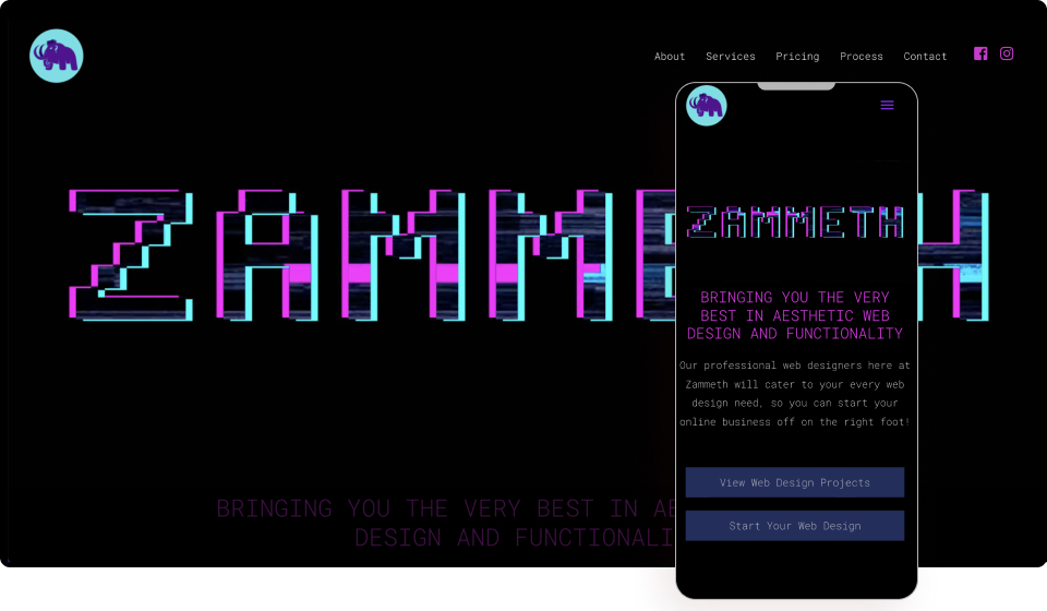
ZAMMETH was conceived from the founders’ shared love for website development and desires to become business owners. Their mission is to provide the greater Illawarra region and surrounding area of Australia with personally tailored, top-tier, attractive, and practical websites with the goal of becoming a household name within local web design.
The website has a retro 80s arcade look and feel to it, from its neon foreground colors to its space invader-like intergalactic background. Displaying a hero that flickers like a vintage VHS video on fast forward, a thin monospaced font, and subtle floating stars that never distract, this is a website that revels in nostalgia.
Hovering over the page’s icons reveals some smooth Lottie Widget animations. In fact, the entire website takes a minimalistic blend of super subtle animations, a colorful spacey font, all set on an active black galactic background that never steals your attention from the content.
The Process page, in particular, deserves special praise as it ingeniously uses an animated rocket to land on a moon as the user gradually scrolls down. The accompanying copy reads “ONE SMALL STEP… FOR YOUR BUSINESS” and “ONE GIANT LEAP”. The text is a nice iteration of Neil Armstrong’s famous words to highlight the company’s own services.
“A young couple on the grind!” is how ZAMMETH describes itself. Out of this world is how we’d describe their spaced-up website.
Design & Development: Zaima and Ethan Khandaker
Theme: Astra
Plugins: WP Forms, Astra Widgets, Elementor Addon Elements
07
Do WooW
by Gian Marco Tocco
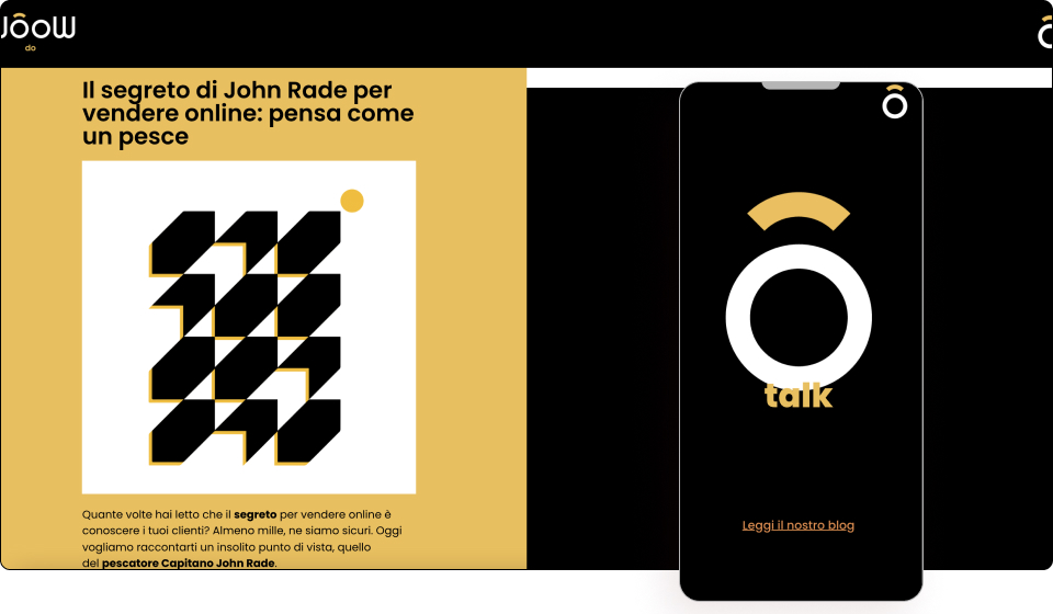
Do WooW understands their customers want to engage the public and capture their attention — to be known and to communicate better, increase their sales, give character to their brand by taking the first steps in the digital world and renew their image, giving their business a matching style to their online presence.
The Italian outfit uses gorgeous bright colors on a bed of black that gives it a strong textual impression. Gradient titles give it a “wow” effect, while animated headlines breathe life into it. The logo too is a motif that is incorporated into the website, such as the hamburger menu for example.
Using matching animated illustrated elements paired with scrolling effects, the communication and digital agency uniquely showcase each of its offerings. The white and yellow logo colors too are cleverly incorporated right throughout the website, reinforcing the company’s creative yet minimalistic image.
The modern Serif Montserrat Font nicely accentuates the beautiful contemporary vibe of the website. The integrated campaign page is a must-see as it is a perfect example of a subject and illustration complementing each other.
Not lost on us is the use of round shapes further utilizing the business’ logo as are other clever pieces of copy hinting at the brand name — “clap”, “woow”, “buum”, and “brum”. Simply put, Do WooW is so wow!
Design & Development: Gian Marco Tocco
Theme: Hello
Plugins: Premium Addons for Elementor
06
Studio Saban
by Noa Saban
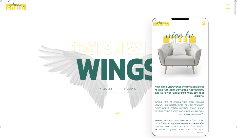
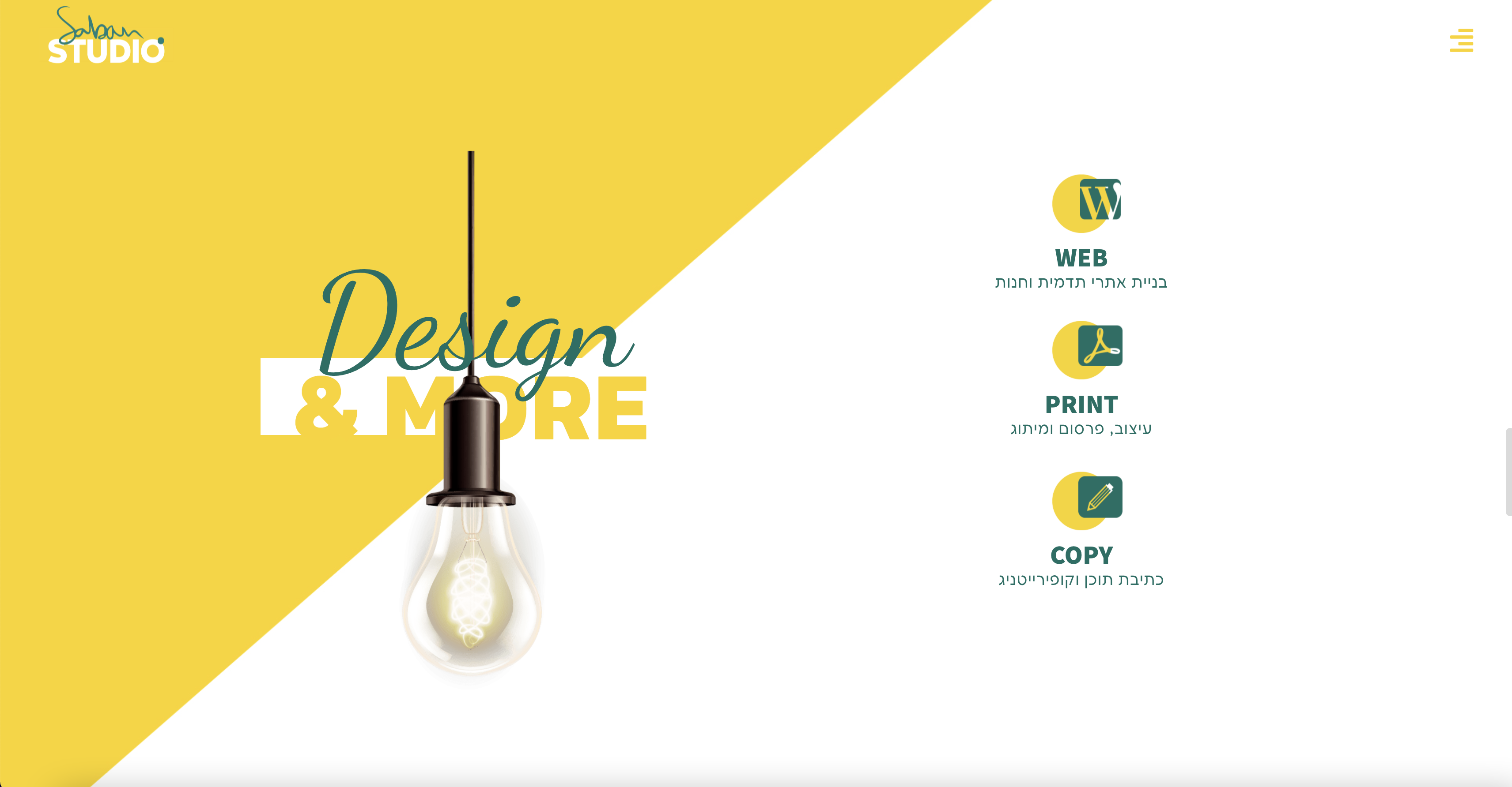
Studio Saban is an advertising studio for business clients from diverse fields. Providing a broad solution of targeted branding and advertising strategy, writing and copywriting, well as pixel-perfect design according to client business needs.
The business beautifully blends its logo’s green and yellow colors into the website’s design, along with a large tape combined with transparent titles. The Israeli company also utilizes subtle movements using scrolling effects. Gorgeously highlighting past projects, the studio zooms past its list of published materials via scrolling animations.
There’s also a nice personal angle with the founder, Noa Saban, using her signature for the logo’s design which is paired with a San Serif font. Likewise, near the bottom left-hand corner of the footer is a subtle use of a text path showing a personal quote that adds some genuine character.
The popup menu cleverly uses skew animations on hover and rather unconventionally appears at the bottom of the page rather than the top. The gallery is likewise a little off-center, following an asymmetrical style. Using a popup as the contact page is also a refreshing touch as it saves booth clicks and loading times.
Studio Saban offers a unique blend of styles all inspired by the company’s logo, highlighting both its creativity and freshness.
Design & Development: Noa Saban
Theme: Hello
Plugins: Google Analytics for WordPress by MonsterInsights, JetElements, JetBlog
05
Hatch Law
by Stella Guan
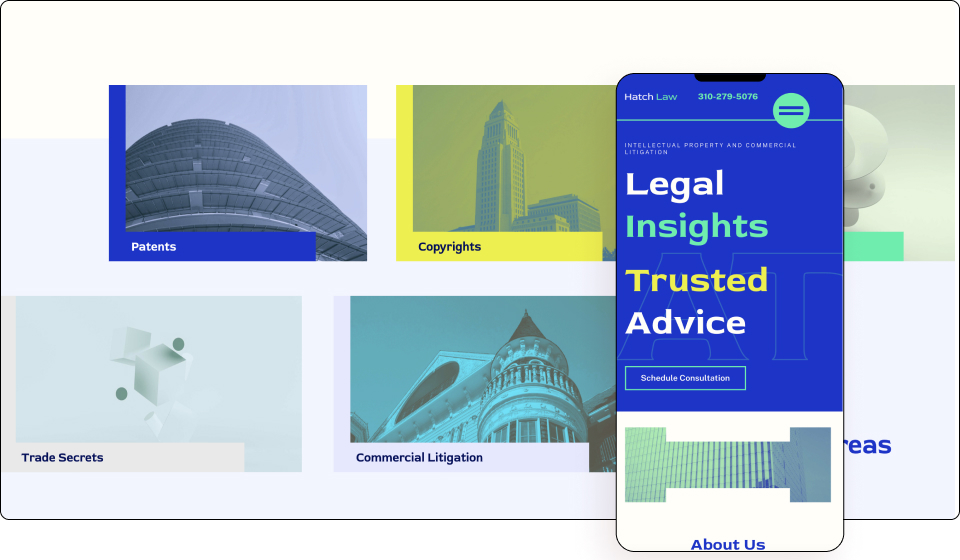
Hatch Law PC is a Los Angeles-based intellectual property law firm specializing in patent, copyright, trademark trade secret, and commercial litigation.
However, the website doesn’t follow the traditional website style of law firms but rather resembles the companies it represents. Crafted under the guise of a modern trendy web designer aesthetic, the company certainly sets itself apart from its competitors.
Clearly visible is the modern use of big type, with a noticeable “H” shape in the hero section along with the word “HATCH” covertly written as hollow text with a thin green outline. Blend modes, gradient colors, and bright fonts on the other hand bring the text into the foreground. In fact, the website nicely blends its theme colors of white, green, blue, and yellow together.
Using image masks to rather subtly display the “H” for Hatch is a brilliant touch as is the popup menu that’s minimalistic, linear and neatly organized. What’s interesting about the contrast is that the bright font colors are set against a neon white canvas rather than a black one.
A clever modern twist on an age-old niche that will make any prospective client take notice. Hatch Law signs, seals, and delivers a unique website for the legal industry.
Design & Development: Stella Guan
Theme: Astra Pro
Plugins: Yoast SEO, Ultimate Addon, Wordfence, Make Column Clickable
See Live Website
04
Dani Flowers Bakery
by Fernando Andrade – Andromeda
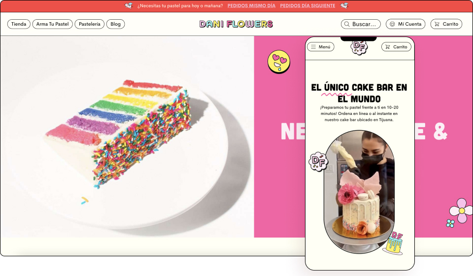
Dani Flowers offer their customers the ability to customize their cake from a selection of three different styles and a variety of flavors for the filling. They can then select the color of the sprinkles and the syrup to cover their cake. Finally, they can decorate it with toppings, candles, and a variety of cake toppers.
The website uses a vibrant color scheme that is both bright and festive. We can see how the logo inspired the website’s design due to its matching pastel multi colors theme. This creates a fun, happy vibe targeting its younger audience.
The use of emojis is also a nice shout-out to the youthful age group the business caters to. The copy intelligently creates an Instagram-style look and feel. While the video uses mask shapes almost like a social media GIF. Hovering over the menu options and CTAs gives a pink-colored skew effect. Pink is similarly used for its pricing, evoking a more positive reaction from visitors.
The Mexican company uses Elementor’s WooCommerce Builder for its yummy cake shop offerings. It also uses nice clear footer typography that gives it a clear dark contrast to its pink-tinged font.
This is a fun and unpretentious website that knows exactly what it is and never takes itself too seriously. Dani Flowers Bakery will have its visitors licking their lips in anticipation upon every visit.
Design & Development: Fernando Andrade – Andromeda
Theme: Hello
Plugins: Woocommerce, Yoast Seo, Order Delivery Date Pro for WooCommerce, Simple Custom CSS and JS, SiteGround Optimizer, WooCommerce Country Restrictions – Advanced Pro, WooCommerce Product Add-Ons Ultimate, WooCommerce Stripe Gateway, WP Mail SMTP.
03
BAAR Law Firm
by Jovan Lakić
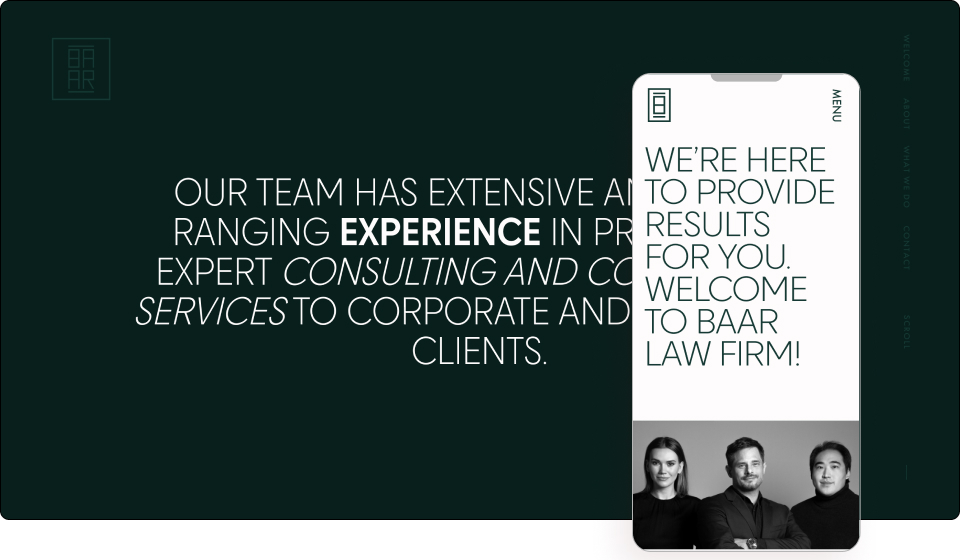
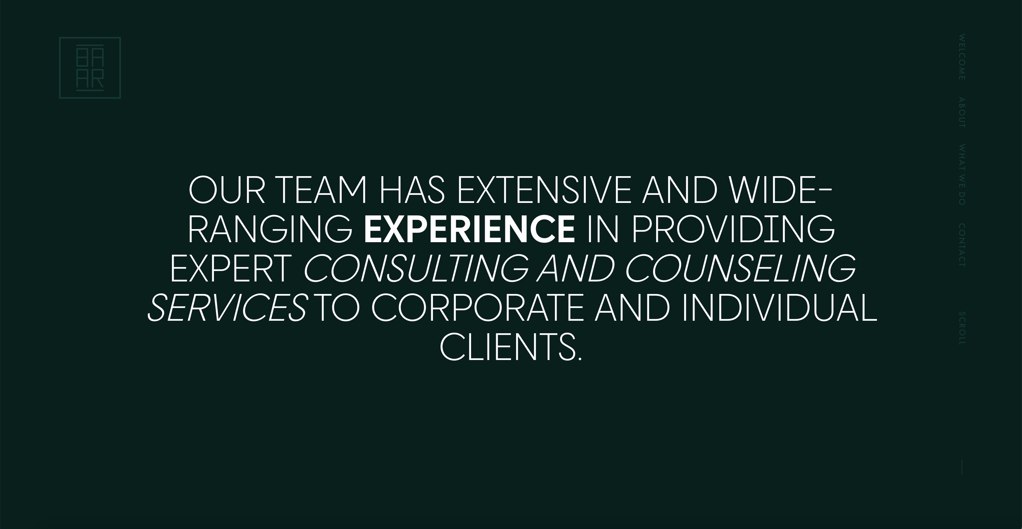
Baar Law Firm specializes in and has extensive experience in providing expert immigration and international business services across a large variety of areas. They provide expert consulting and counseling services to both corporate and individual clients.
A minimalist website that is highly formal and aptly fits the Austrian company’s legal services. Using just the colors of sage green and off-white, the website evokes authority and credibility. Fine san serif fonts further add a professional look and feel to its overall image.
The firm has clearly invested wisely in photography which uses a nice black and white tone that embodies power. They also incorporate their logo within the loading screen, while subtle scrolling effects maintain the overall professional atmosphere of the company by adding just enough spark to it.
This is overall a very clean and elegant website that is polished with corporate quality. Suffice is to say, turning visitors into prospective clients won’t be overruled here.
Design & Development: Jovan Lakić – General Condition
Theme: Hello
Plugins: The Plus Addons for Elementor
02
#STEREOTIPISONOVIOLENZA
by Limo Comunicazione
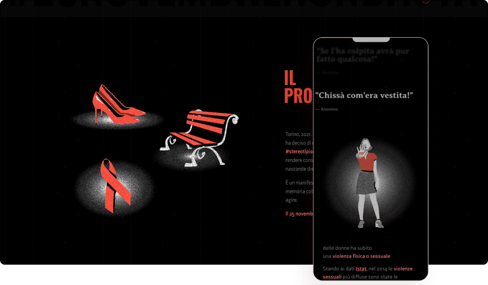
Limo Comunicazione decided to carry out the #stereotipisonoviolenza project to raise knowledge and bring awareness to the violence that lies behind stereotypes. The project is aimed at every generation by inviting them to reflect on what domestic violence is, particularly targeting stereotypes and prejudices against female victims.
Bringing clarity and attention to a topic that is often lost in the volume of information, the Italian website effectively employs combinations of background videos, overlay images, and custom fonts to bring the topic to the forefront.
The bold red color, in particular, is a notable choice given the sensitive subject matter as red universally signifies one or a combination of danger, sacrifice, blood, anger, warmth, and beauty. For a campaign bringing awareness to violence against women, this is an intelligent choice of color that evokes emotion, grabs people’s attention, and encourages them to take action
Scrolling effects are used throughout the website, bringing special focus to vital data. Custom illustrations accurately help convey the campaign’s underlying message along with matching copy to continue the story. We also see black, red, and large prominent typography populate the website which is perfectly suitable given the topic.
There’s even a unique cursor that acts as a pinpoint target. The circle seemingly follows the point. A red scroll bar is also used on the side. The big type, minimalist design, and mobile responsive nature of the website combine to articulate the subject matter in an accessible, digestible format.
The design envelope of the website very much works with the theme and contributes greatly to the atmosphere as it brings much-needed attention to this most important of topics.
Design & Development: Limo Comunicazione
Theme: Hello
Plugins: Catch Scroll Progress Bar, Preloader Plus
01
Passionate Digital Agency
by Karen Sardaryan & Billie Argent
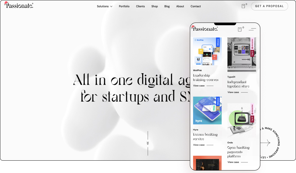
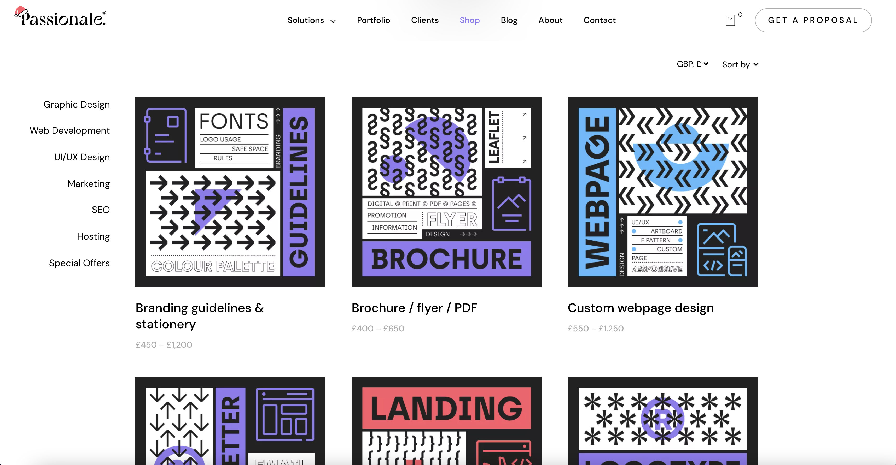
Passionate is a full-service digital agency specializing in providing design, development, marketing, and hosting solutions for startups, SMEs, as well as brick and mortar stores. Passionate pride themselves on meticulous attention to detail, speed of delivery, and the genuine advice they provide throughout the process.
An elegant and contemporary website, the UK creative agency smartly mixes both modern and unusual elements in its design. Using a beautiful and special serif font, in combination with several other fonts makes titles really pop while nicely dividing text.
Noticeable is the circular text path with a rotating arrow that almost resembles a compass on the right-hand side. The colors of the website come from the pictures set against the otherwise live white liquid background. Hover animations also bring some color to the font. In fact, hovering over the logo for example results in playful animation.
A nice touch is the use of GIFs on the photos of the employees which can be found on the Contact page. The form too is rather short and simple. They also sell designs on their website using our WooCommerce Builder which sets them apart from their competitors and hints at what they offer.
Passionates minimalist design wins out and wraps up this year’s showpiece in the top spot. This is a very high-level website that deserves its place among the best of 2021.
Design & Development: Karen Sardaryan & Billie Argent
Theme: Astra
Plugins: JetBlocks, JetEngine, JetMenu, JetSmartFilters, JetWooBuilder, WooCommerce, Preloader Plus
