Summer might be behind us, but the sun never sets on this month’s selection of websites that rise brightly from the US, move swiftly over the UK, reach their zenith through Serbia, South Africa, and India, before finding rest in Australia. Shining with large trendy semi-transparent typographies, investing in first-class videography, decorating with rich imagery, and polishing with sublime copy, our August showcase illustrates this season’s trendy style!
Our featured websites include grassroots soccer (football for purists) promotion, minimalist designer furniture, brand marketing, type-focused creative media, environmental education, custom water fittings, professional photography, two special creative studios, and an award-winning independent film.
Let’s discover them together!
Rising Ballers
by Passionate
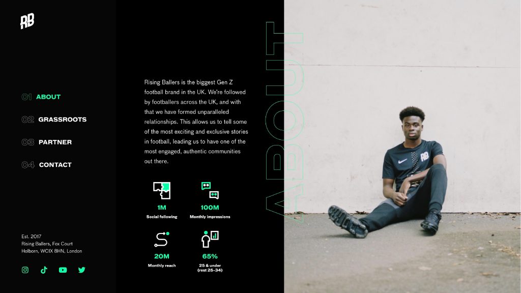
Rising Ballers is the biggest Gen Z soccer (football) brand in the UK. They’re followed by soccer players (or “ballers”) and formed unparalleled relationships across the continent. This allows them to tell some of the most exciting and exclusive stories in football, leading them to have one of the most engaged, authentic communities around.
They currently run four influential grassroots teams across the UK, comprised of 100+ male and female players. Their journey is followed by hundreds of thousands online via their ‘Unsigned’ and ‘Younger’ shows.
The one-page website uses viewport mode with active scrolling motion effects, making it easy on the eyes. This also gives the effect that the action is unfolding in front of you, just like a real game of soccer.
Given their target audience is aged 13-24, the website evokes a modern look and feel with its choice of large typography and color scheme. Set on a pitch-black canvas, neon green and white colors litter the page’s text and iconography, giving the website a very youthful, urban, grassroots vibe. Big transparent, hollow fonts with colored outlines give the website a trendy, modern mood.
Visitors will easily find what they’re looking for with the bold sticky menu on the left, written in a smooth san serif font. With its noticeable social media icons at its base, the website is clearly connected to its young crowd.
The website’s purpose is brand exposure and with its list of initiatives, credentials, beautifully shot, and edited videos, it leads to a winning goal.
Design & Development: Karen Sardaryan, Billie Argent – Passionate
Theme: Astra
Plugins: Premium Addons for Elementor Pro, Extras for Elementor
09
Luzzu (movie)
by Jovan Lakic
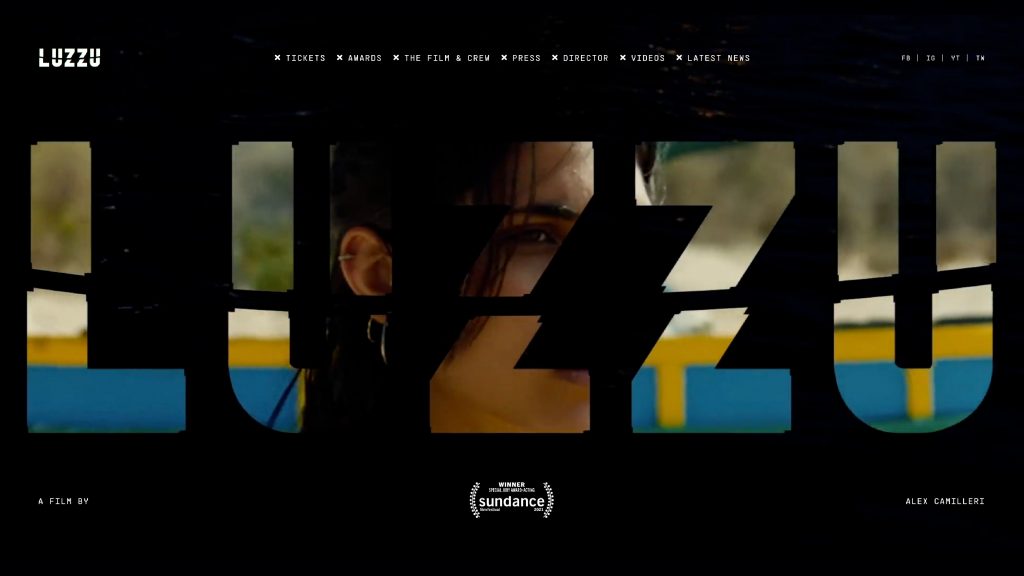
Luzzu tells the story of Jesmark, a Maltese fisherman, who contends with a newfound leak in his wooden luzzu boat. Barely getting by, he sees his livelihood—and a family tradition from generations before him—imperiled by diminishing harvests, a ruthless fishing industry, and a stagnating ecosystem. Desperate to provide for his wife and their newborn son, whose growth impediment requires treatment, Jesmark gradually slips into an illicit black-market fishing operation.
The film’s website creatively implements elements from the multi-award-winning film such as the protagonist’s boat. Winner of Sundance’s prestigious special jury award, Luzzu’s website has a few pages but looks like a one-page website, including a sticky menu with cool “x” icons and hover effects. Social media icons are also replaced with two-letter copy text
The film’s title written in transparent font evokes looking glass imagery as Luzzu’s trailer plays in the background. This creates intrigue and audience curiosity.
The images used are taken from dramatic moments in the film, with the section colors resembling that of the main character’s boat. Even the black shadow background is that of the open sea’s water at night.
The website sets sail and closes with trailers to the film using Elementor’s new custom video playlist widget.
Design & Development: Jovan Lakic – General Condition
Theme: Hello
Plugins: JetEngine, JetTricks
08
Type Department
by Passionate
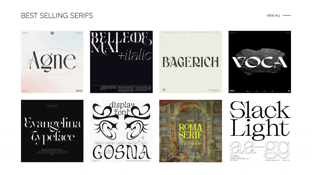
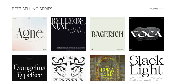
Chosen by creatives at Universal Music Group, WIRED, and Pentagram, UK-based Type Department is the independent marketplace of type-focused creative media company TYPE01. Type Department is an online platform where designers and people from all ends of the creative industry around the world can host their typefaces and sell them to the public.
Having previously built the Type Department on Shopify, the company required the website to have a multi-vendor and wanted it moved to WordPress using Elementor. A well-thought-out WooCommerce store to buy fonts, it carefully caters to its target audience.
Featuring multiple pages, typical of a large website store, it is evident that the designers put a lot of effort into the website’s layout. Type Department possesses a clear structure, and hierarchy despite its enormous level content.
The micro animation on the website adds a little bit of life to this otherwise niche market as does the hi-tech color theme of blue, white, and black. In fact, blue is predominantly used perhaps due to the fact it symbolizes trustworthy authority, power, and success.
The “try before you buy” option is a godsend to curious visitors who wish to dabble with their options before they’re ready to commit. This is a website that definitely knows its “type”.
Design & Development: Billie Argent – Passionate
Theme: Astra
Plugins: Fontsampler, JetElements, JetEngine, JetWoobuilder, JetBlocks, WooCommerce, WooCommerce addons
07
SJ Gonzaga
by WholeHeart Creative
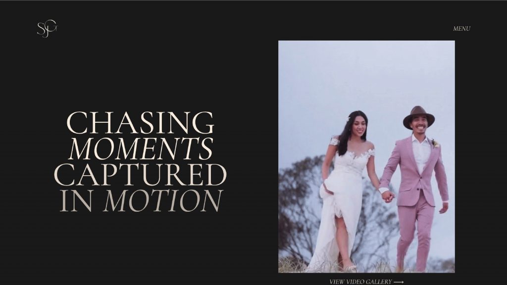
SJ Gonzaga is a professional photographer based in the quiet western suburbs of Sydney, Australia and works with people from all walks of life. He’s a health professional by trade and enticed by adventure. His inspirations come from his love for good coffee, Japanese whiskey, 90’s music, pianos, any sports, good conversations on life, lame jokes, and life hacks.
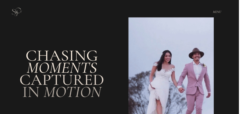
The word that best describes SJ’s website is elegant. Gorgeously layered with stop motion videos, still images, and cinematic videos. This small welcoming website feels cozy yet limitless.
Color is executed incredibly well against thick black canvas littered with classy off-white text. The clever use of italics is used sparingly and to good effect. The entire page moves gently like a breeze.
The website is fun to scroll down as it highlights SJ’s skills. Disappearing titles and clever copy create a beautiful, cohesive story fit for fairytale endings for those looking for someone to capture their best moments. Even the about page feels personal. This gives visitors an idea of who they’ll be working with on their big day. Based on his website, clients might say SJ is a professional worth snapping up!
Design & Development: Shelley Javier – WholeHeart Creative
Theme: Hello
Plugins: Jet Engine, Elementor Contact Form DB, Rank Math SEO, Really Simple SSL
06
Kasar Design
by Khayinso Kasar
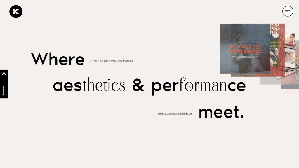
A creative studio with an eye for code, design, and aesthetics, Kasar Design is a small studio with over 5 years of knowledge in web development and branding. Based in New Delhi and Ukhrul, India, they have a simple goal: to create great digital experiences.
The website combines two types of typefaces—Nior and Chaostic—within sentences and even single words. The large sizes of the black font contrast beautifully against the off-white canvas shades. The title also employs a modern outline with transparent bodies.
Scrolling effects such as the sticky column feature reveal colorful images, giving visitors a sense of curiosity. The images also add gorgeous bits of color. In fact, moving the cursor anywhere on the hero section reveals slideshow-like images that appear and disappear like a stack of cards. Likewise, the hamburger icon is animated and wobbles as the cursor hovers over it.
It’s easy to see why Kasar Design has already been nominated for several awards such as the prestigious “Awwwards”. Visitors will all agree this website is definitely a winner!
Design & Development: Khaysino Kasar
Theme: Hello
Plugins: Unlimited Elements, Rankmath SEO
05
Clever Carbon
by Ryan Spence & Ben Wilde
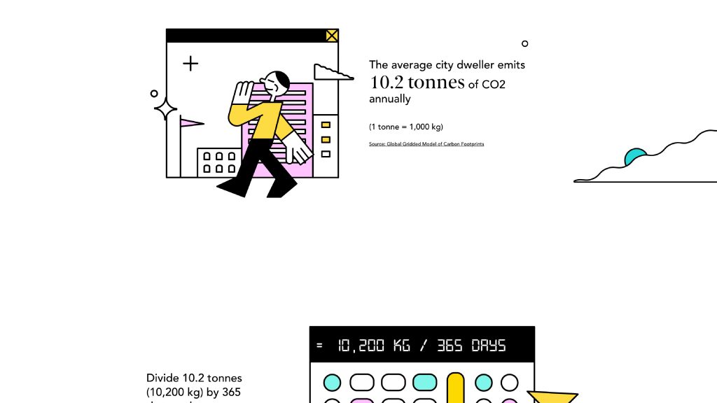
UK-based Clever Carbon’s mission is to teach people about their carbon footprint in a hip, modern, and relatable way. Ultimately, what they want is to enable #clevercarbondecisions for all. They believe, by teaching people about their carbon footprint and helping them realize they have one in the first place, carbon footprint data will actually be relatable and useful to consumers.
Their hope is that as consumers become increasingly #carboncurious, more brands will see the value in publishing their carbon footprint, leading to increased transparency and accountability by all.
Carbon, as we know, is a black, metallic-looking diamond color which is very much unlike this colorful playful website that hopes to inspire positive environmental change.
The website is set on a clear white canvas and surrounded by fun, pastel-colored imagery which produces a vibrant, unique website. The friendly illustrations create an accessible feel minus all the jargon. This creates a welcoming feeling, inviting visitors to take their detailed quiz results page.
Illustrations are paired with animations and are only matched by the website’s beautiful, no-nonsense storytelling. Animated headlines and a hover color address popup menu add to this fun visual experience.
Available in 7 different languages, Clever Carbon encourages positive environmental change in a fun, playful, personal way. Now that’s a message the world can all warm up to.
Design & Development: Ryan Spence, Ben Wilde
Theme: Neve
Plugins: Formidable, Dynamic Content
04
Grenade Studio
by Pixelshifter
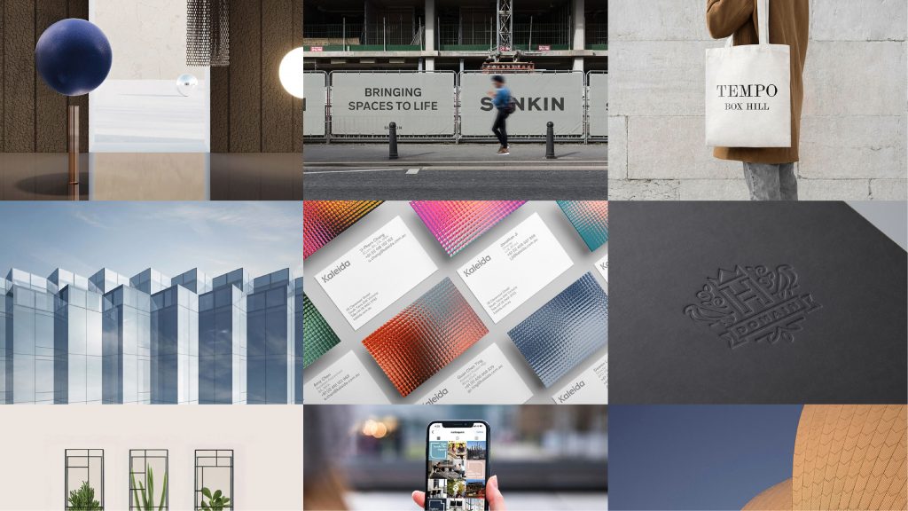
The Australian-based Grenade Studio takes a strategic and highly crafted approach to create distinguished brands and campaigns of every scale. For their clients, the studio’s work is also defined by strategic thinking that ensures our creative outcomes meet their commercial imperatives. Their purpose is to listen and learn, look beyond the obvious and work together to make a difference for their clients.
Welcoming is probably the most appropriate word to describe the hero section of this website. The full-screen, high-production video literally opens its doors to website visitors. Of course, this comes with a price as it leads to longer loading times and affects performance. Nevertheless, the end result is truly breathtaking.
The website’s design makes all the right moves with its clever combination of high-definition videos and images, paired with clever copy. There is a strong sense of authenticity throughout the website. Rich with personality, and decked out with heart-warming imagery, visitors will want to work with this studio.
The unique “Eina” font is used exclusively throughout the website, adding a sense of brand to the website itself.
Each project’s page offers an equally eye-catching hero section highlighting the essence of the project. This combines well with non-symmetrical project grids, different alignments, and adds fluidity.
The non-traditional hamburger menu uses a clickable trifecta “Strategic. Creative. Adaptive.” text. Each word links to a different area of the studio’s services. This is also a subtle bit of marketing as it associates these words with the brand itself.
An explosion of creativity is how you’d best sum up Grenade Studio’s website. It is an immaculate example of showcasing brand marketing by showing visitors what you do rather than telling them what could be done.
Design & Development: Grenade Studio, Scott Ritchie – Pixelshifter
Theme: Hello
Plugins: Emage hover effects, Fullpage for Elementor
03
SALT Design Store
by UNKNOWN Design Agency
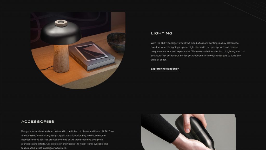
SALT is a South African store passionate about good design and devoted to curating the very best design-led furniture, lighting, and home accessories. Their handpicked collection reflects their philosophy and love for beautifully designed, well-made, and enduring products.
A design store deftly boasts its minimalist design using a responsive website littered with delicate, subtle animations. The design is in the details and this is most true when it comes to the images which are cleverly cut out into complementary shapes. This can be achieved with Elementor’s mask feature.
The store uses a dark color palette which produces a prestigious, high-quality vibe. As such, the images are what give it its vibrancy.
Clicking on “shop” opens a mega-menu for various products and categories, allowing the potential buyer to review all the products or even search for a particular product.
Unlike its namesake spice, there is nothing coarse about the SALT’s website. It seamlessly sifts through a myriad of details with just the right combination of elements.
Design & Development: Coenraad Sutton and Linel Louw – UNKNOWN Design
Theme: Astra Pro
Plugins: Additional Variation Images Gallery for WooCommerce, Back Button Widget, CartFlows, iThemes Security Pro, TI WooCommerce Wishlist, WooCommerce, Yoast SEO, WP-Optimize – Clean, Compress, Cache
02
The Watermark Collection
by Chris Lettner
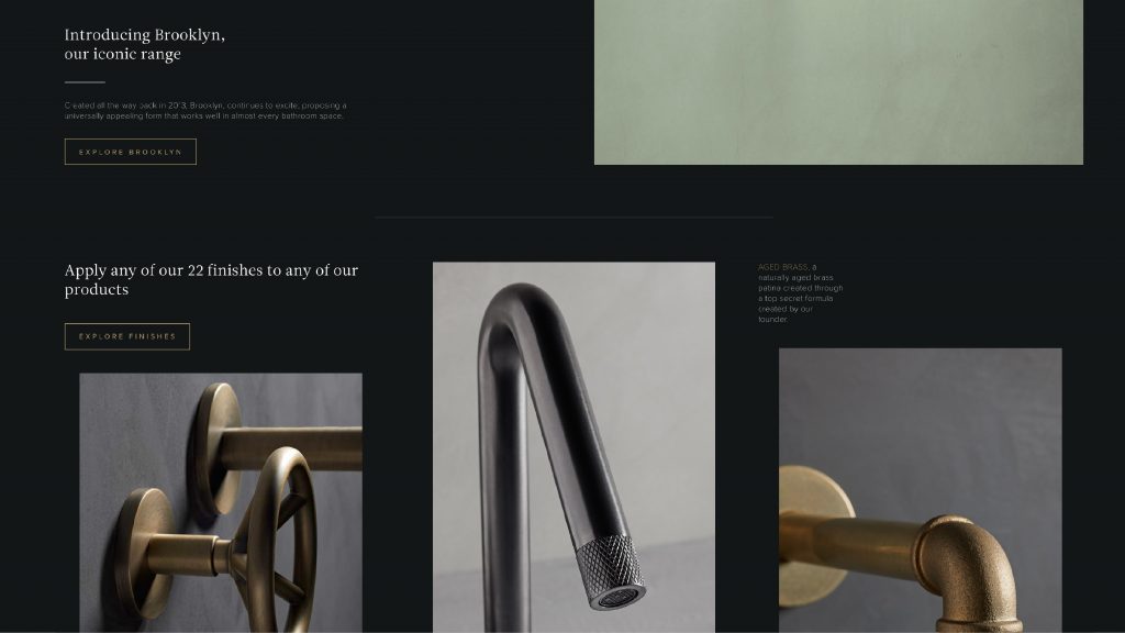
The Watermark Collection went from operating a small workshop in Brooklyn NYC to a purpose-built 90,000 sq ft factory in almost half a century. They’ve assembled a melting pot of over 100 craftspeople all dedicated to creating bold designs, applying unique finishes, and building unique products for its customers.
All of the company’s products are built from solid brass and this is evident in their choice of color scheme. Brass colors highlight main titles and CTAs, making them pop out. This is set against a luxurious black canvas and contrasting white text.
The hero section of the website is created using a clever combination of Serif titles and Sans Serif text. The quality of the images used is very high resolution making the look and feel of The Watermark Collection’s services almost tangible.
The company believes that finishing is a process that can only be learned through time and dedication, and this is equally true of the website’s polished design. The gallery’s asymmetrical masonry look gives it a special edge. While the background overlays and images offer splashes of color.
The text of the website uses a modern Sans Serif font. Structured very well using a variety of custom fields, all their components come together to create a polished design, encouraging visitors to become customers. The Watermark Collection is an all-around stream of class.
Design & Development: Chris Lettner – The Weather
Theme: OceanWP
Plugins: Dynamic Content for Elementor, Ele Custom Skin Pro, JetElements For Elementor, JetEngine, JetSmartFilters, The SEO Framework, Ajax Search Pro, Advanced Post Queries
01
Superglow
by Gary West Jr.
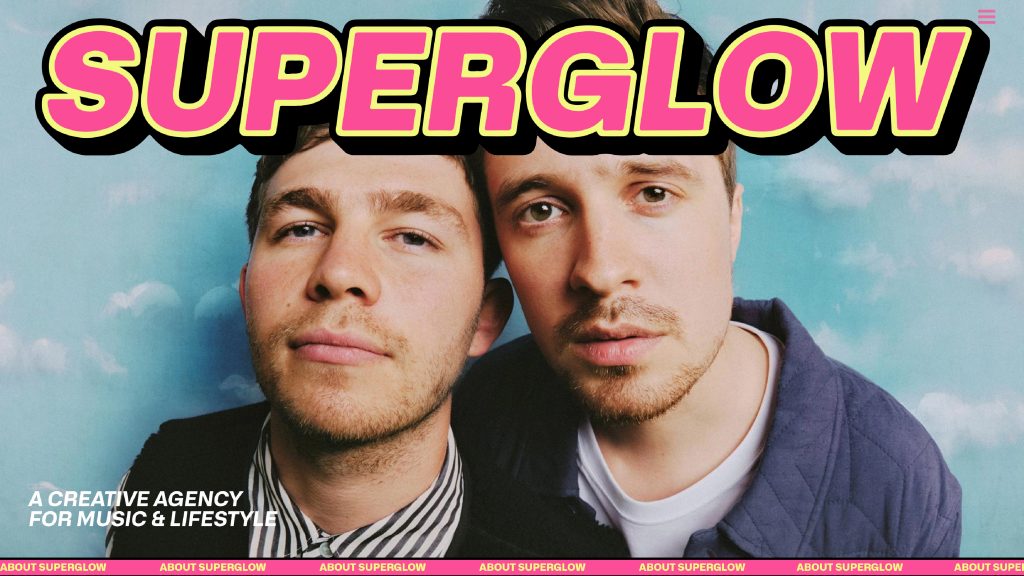
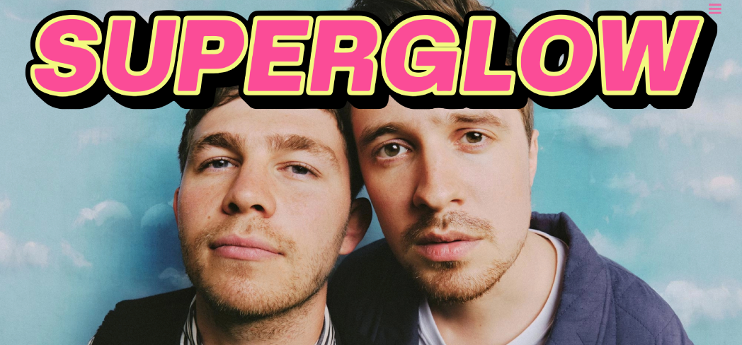
Superglow is a UK-based creative studio specializing in digital content. They work with artists, brands, and record labels to create visual branding, websites, social content, and video for releases, campaigns, and events. They’ve worked with some of the world’s best record labels such as Universal Music Group, Virgin EMI Records, Sony Music, Warner Music Group, Interscope Records, and more.
If you’re looking for an example of a theme that perfectly fits its purpose, this is it. The entire website gives off a vibrant music magazine vibe, from the bright pink and yellow colors to the oversized text. Images are likewise populated in an online magazine style, perfectly catering to its youthful audience.
Hovering over the text changes its color or pauses its movement such as the moving headline below the hero section. Hovering over the headline acts causes a photo of the artist to appear. Even the mouse carousel is noticeably vibrant and hard to miss with its pastel pink color.
The contact us button uses a lively emblem effect which introduces an energetic feeling from the get-go. Micro animations such as the hamburger menu, spinning “x” icons, and dynamic menu text which all activate on hover gives the feeling the website is current and happening right now just like its musical offerings. All that glitters is Superglow!
Design & Development: Gary West Jr.
Theme: Hello
Plugins: All In One WP Security, Simple Custom CSS & JS, SiteGround Optimizer, Yoast SEO
