It’s no secret that planning a wedding, as fun and exciting as it is, can also be plenty overwhelming and stressful. This is precisely why websites used by wedding service providers targeting brides and grooms themselves, or, alternatively, weddings built by the lucky couple to accommodate their wedding guests, must be as beautiful as the bride herself.
Wedding event professionals have tons to work with when it comes to design schemes and thematic concepts: flowers, wedding gowns, tuxedos, romantic vibes, feelings of elegance, and really, anything related to lovebirds. This month’s showcase choices show exactly that: just how far web creators can take their design skills when it comes to building websites that are meant to showcase and provide wedding resources that make that special day last a lifetime.
10
Dana Osborne: It’s Fun To Choose Wedding Invitations
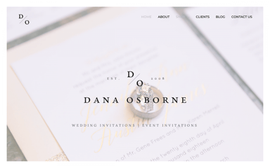
Dana Osborne is a wedding event invitation designer based in Omaha, Nebraska. Her website is very user-friendly, and provides elaborate explanations and avenues of communication for understanding what her services are and how she works with clients. This includes contact forms, a consultation booking form, real design samples of previous work, an order process for pre-designed invitations, a step-by-step explanation of how her custom design process works, and even a client portal to log into. It’s clear that a lot of work has gone into building her website, and she even has a blog that tells stories about her projects as well as insight and inspiration for those planning their wedding.
One of our favorite features of how Dana’s website was crafted is the way the Forms widget is used throughout the site. This is particularly true for the page that offers prospective clients to choose a pre-designed invitation. There is a clear, elaborate gallery showcasing different invitation options, followed by dropdown menus, selection buttons, selection boxes, and custom messages. It makes perfect sense to us that Dana, a specialist in visual communication and correspondence, provides such a clear and comprehensive forum for clients to communicate with her and get excited for their work together.
Theme: Astra
Plugins: Social Warfare, El Insta Stream, Ultimate Elementor, Contact Form 7, Header Footer Elementor, Instagram Feed
Design & Development: Dana Osborne
09
Luminary: Timeless Wedding Gown Design
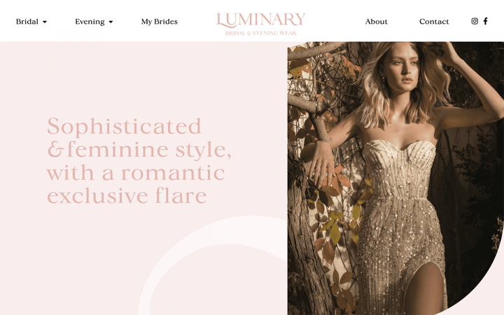
Luminary is a bridal and evening wear business owned by fashion designer Lihi Shamrich Cohen. Lihi’s design studio is in an urban district of Tel Aviv, which she describes as a “romantic dreamy bubble in the heart of the metropolis”. From a fashion perspective, Lihi’s design style features fine fabrics (lace, silk, satin and chiffon) — adorned with beads and delicate patterns. The website’s design mirrors this very fashion identity. The simplistic color palette contains a classy pink, surrounded by white backgrounds and black text elements.
Given the vast amount of photographs that each image gallery contains, and especially since the images appear in lazy load as you scroll down, it makes perfect sense to us that the sticky header at the top of the site accompanies the visitor wherever he navigates to. This is a fine design choice for the user experience, making sure the user doesn’t get lost among the photographs. The same is true for how the sticky header benefits the website’s user interface — as the sticky header’s white background meshes together perfectly with the page’s white margins as well as the white padding surrounding each photo in the gallery.
If you’ve ever found yourself looking for a good example of how to use sticky headers on your website, using Luminary’s site as inspiration is a great place to start.
Theme: WP Bootstrap
Plugins: JetElements, Lightbox with PhotoSwipe, Smart Slider 3 Pro
Design & Development: Wicked Brand and manta~web
08
Becca Kate: Photographing Weddings and Lifestyle
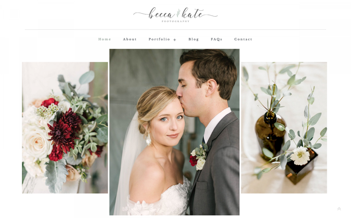
Becca Kate Carter is a photographer who specializes in wedding photography and lifestyle photoshoots, such as newborns, families, maternity, and the liking. As a professional photographer, Becca puts a strong focus on her photography brand as well as her own unique style. Her clean-looking portfolio features two main categories (Weddings and Lifestyle), which are then divided further into speciality categories — allowing her website to be clean, easy to navigate, and pleasant to browse.
On the whole, Becca’s site strives to embody a theme of minimalism, and most importantly a “simple and approachable brand.” The website’s minimalist design is evident in many features: the wide, white margins on each page — making the website content centered and focused, all with a clean look. One unique design choice which fits well into the minimalist theme is the Wedding page in Becca’s portfolio, which uses three call to action widgets (all with a narrow width and a tall height) — as the thumbnails for the photo categories. Each thumbnail image features a subtle, candid photo of brides and grooms, with a subtle, white background overlay that draws a uniform consistency between the three images.
A nice, final touch is the thin, 1px border placed at a strategic distance around the CTA — adding an additional layer of cohesiveness between the three individual images. Becca’s site is a prime example of how a website can be crafted with a simple, minimalistic design yet use design tactics that have a huge visual impact.
Theme: Hello Theme
Design & Development: The Digital Artisans
07
Ohana Films: Wedding Videographers of Joy
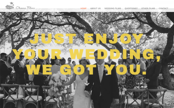
Ohana Films is a wedding filmmaking business run by Kent and Darlene, a husband and wife based in Maui, Hawaii — who are both professional filmmakers. In terms of the ideas involved in designing their website and what they “stand for” as video creators, Kent and Darlene share how their entire artistic and professional approach is based on the value of capturing authenticity, and in that a “documentary style of filmmaking”. This is evident in the fact that they show their own wedding video on the website.
A unique design touch that welcomes visitors upon entering the homepage is the way the purely gray logo in the top left corner is coordinated with the black and white background video overlay used for the hero text’s section (Heading widget). This is an out of the box, engaging design technique, which also represents a documentary-like feel and traditional, old-fashioned footage. Finally, what complements this theme of black, white and gray, making sure visual engagement is as prevalent as ever, is the bright yellow font choice for the heading. As design enthusiasts may know, the combination of yellow with black and white is a beautiful union — much like marriage!
Theme: Astra
Plugins: Autoptimize, Elementor – Header, Footer & Blocks, Extras for Elementor, Far Future Expiration, GA Google Analytics, The Plus Addons for Elementor Page Builder, UpdraftPlus, WP Mail SMTP, WP Super Cache, Yoast SEO, Yoast SEO: Video, Yoast Duplicate Post
Design & Development: Ohana Films
06
Herr Stellmach: Authentic Wedding Snapshots
Herr Stellmach is a wedding photographer (whose actual name is Marvin Stellmach), based in Bremen, Germany. Marvin describes wedding photography as “the most beautiful job in the world”, and shares how his photoshoots emphasize natural, undisputed emotions, and most of all, authentic moments.
Marvin’s site uses several visual design effects to accentuate the impact of the moments his photographs capture. The “My Pictures” section uses the Gallery widget to showcase his detailed yet varied collection of photo samples. The choice of Grid layout for the small squared pictures and no gaps between them, brings a rich presence to each bride and groom. Marvin’s true talent is evident in his ability to present a combination of color and black and white photographs that isn’t overwhelming or messy-looking to visitors scrolling down.
Finally, using lazy load to create an added engagement effect as more and more photos appear also achieves another priority that Marvin shared with us as a key component of his website-building process: optimizing his image-heavy website. The website speed is indeed fast, especially considering how many images it features. As a matter of fact, the optimized speed of the website can also be attributed to the Gallery widget, as one of its highest priorities is to prevent images from slowing down any site.
Theme: Hello
Plugins: CPT UI, Piotnet Addons for Elementor Pro, Rank Math SEO, Yoast Duplicate Post
Design & Development: Marvin Stellmach
05
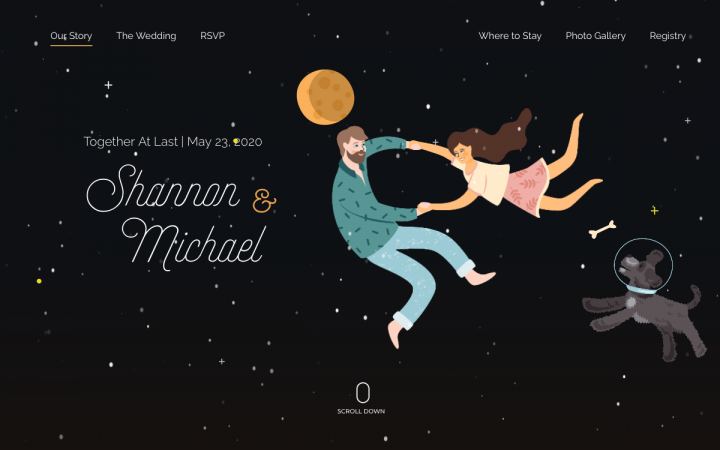
Shannon & Michael: Wedding Invitation for the Stars
Michael Earley built this online wedding invitation and website during the preparations for him and his fiancée Shannon’s wedding day. Michael is a web designer and a creative director for New Tricks Web Design, a small web design agency in Atlanta, Georgia.
Because of COVID-19, the bride and groom were limited to a short guest list and ended up having a small “Zoom wedding” in their backyard. As a result, Michael built upon the online wedding invitation and used it as an online wedding website – so that him and Shannon were still “very happy to have the website as a reminder to the event we planned and a good time capsule into our life as we were celebrating our engagement.”
There are many things about this online wedding invitation site that caught our attention right away — such as the creative use of illustration graphics, and an old-time favorite, parallax effects. The best trait (among others) is that although our first thought that an advanced, game-changing feature such as parallax would be hard work to create — the opposite is true. Parallax backgrounds are a simple and confusion-free way to beautify your website.
Theme: Astra
Plugins: Mapplic, Premium Addons for Elementor, Premium Addons Pro, Ultimate Addons for Elementor
Design & Development: Michael Earley
04
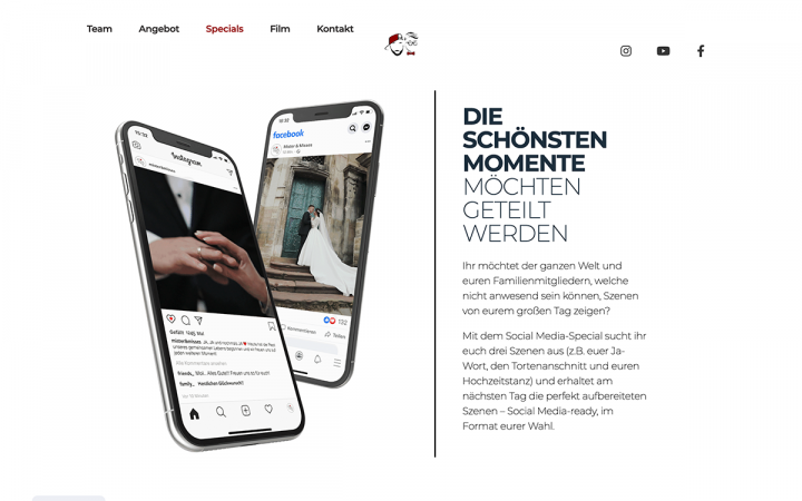
Wedding Guys: Adventures in Wedding Videography
Wedding Guys is an Austria-based wedding filmmaking business run by Jonas, Natalie and Stefan. Their focus as film professionals is using modern technology, with innovative techniques for their film production. Their website is a one-page website, but this doesn’t imply in any way that it’s missing any information that prospective clients are looking to know.
The website uses an Elementor Single Page template to create a customized, minimalistic yet dynamic layout as you scroll down the single page — as column-layout transitions and alternates between one, two, and three-column layouts. This unique, engaging multi-column experience is enhanced by the entrance animations used by the elements that form the columns, which emphasize the precision and well-aligned layout of each column’s content.
There are many advantages of creating a one-page website, and Wedding Guys shows us how to get the job done by adding unique, never-before-seen layout variations that feel anything but monotonous.
Theme: Twenty Twenty
Plugins: Contact Form 7, Rank Math SEO
Design & Development: Natalie, Steve and Jonas
03
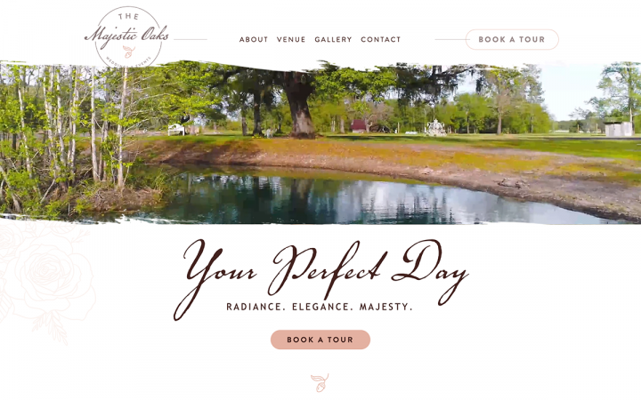
The Majestic Oaks: A Wedding Venue of Elegance
The Majestic Oaks is a wedding venue located in Vernon, Florida — their goal as a venue is to enable the bride and groom to have “the wedding experience of their dreams”. What is so remarkable to us about The Majestic Oaks’s site is how well it showcases the different areas within their venue: the outdoor space, the pond, the ceremony room, everything is pictured with great detail and crisp clarity.
We noticed a holistic element of balance throughout the website: on the one hand, there are a wide variety of videos shown on the homepage, each one giving a different perspective on the wedding experiences at The Majestic Oaks. In parallel, the color scheme is rich and consistent throughout the entire site, and so too the typography choices. The color choices of faded peach/dark pink with a black-ish brown represent scenes of nature coupled with pink and white, hinting to femininity and elegance as the bride will always personify.
Using Elementor’s new Design System features — which enables users to choose Global Colors and Global Fonts that allow color selection and updates all from one place, as well as all typography choices and updates. This technique allows website color palettes and typography schemes to be uniform, consistent, and most of all exceptionally professional looking, as exemplified by The Majestic Oaks’s polished website.
Theme: Genesis
Plugins: ACF, Essential Addons for Elementor
Design & Development: Design Extensions
02
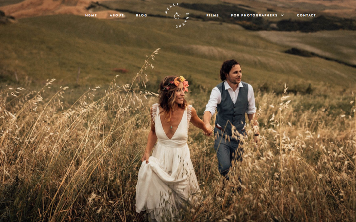
Melli & Shayne: Wedding Photography Around the World
Melli & Shayne is a wedding film and photography business run by a husband and wife (both photographers) based in Germany — specializing in destination weddings all around the world. The talented couple characterize themselves as offering “authentic, unstated photography and heartfelt films to our couples…documenting their day telling their story. We have travelled all over the world for some incredible weddings; from Italy to Tanzania, Mauritius to Canada. We love what we do, and we love teaching all what we know.”
In terms of their website, Melli and Shayne sought to rebrand their website so that it would match their current style and vision of wedding photography: adventurous, spirited and bold. The way this is expressed in the site’s design choices is through dark colors and an “off white” canvas – representing an alternative, out of the box, artistic presence. This color scheme is not only meant to mirror their personality as professionals, but also to attract the type of clients who are interested in unique, atypical weddings in bold destinations such as the Serengeti or Italy.
It made perfect sense to us that photographers who are so dedicated to international destinations and travel on the whole would choose a full-width background slideshow for their hero section. The virtue of this choice of visual content is that it welcomes the website visitor into a wide, borderless landscape of exciting scenery and destinations. The photoshoot locations are epic, and it’s evident that working with Melli & Shayne as your wedding photographers will be a unique, “one for the books” type of affair.
Theme: Hello Elementor
Plugins: ACF Pro, All-in-One Migration, Anywhere Elementor, Autoptimize, Classic Editor, Complianz, Custom Post Type, Elementor Pro, Flying Pages, Make column Clickable, QuForm, Rank Math, Smart Slider, Smoother, Wordfence, WP Mail SMTP, WP real media library, WP Rocket
Design & Development: Shayne Thomas
01
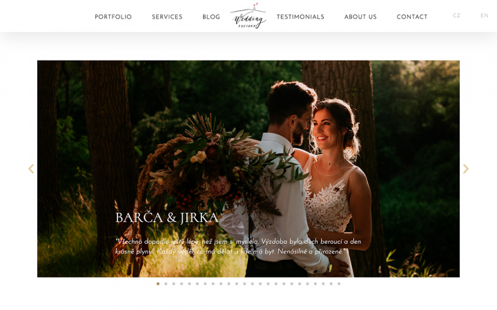
Wedding Factory: Wedding Planning Agency for Dreamers
Wedding Factory is a wedding planning agency based in the Czech Republic. Their agency provides assistance with all stages of wedding preparations and planning: budget planning, event schedule, hiring suppliers and professionals, and so on. Agency owners Lucie and Martina share why they started their agency and what their goals are as service providers, which they describe as “breaking from tradition.” The meaning behind this is they seek to plan weddings that are customized exactly according to the couples’ wishes, and not dictated by traditional culture.
Wedding Factory’s website design scheme is a direct expression of their business persona: they stand for something “totally different”, which is translated into large, hand-written headings, made unique by Photoshop adjustments. When designing the content, the designers chose to reduce the text as much as possible and show wedding photos (as well as other graphics) instead — to engage website visitors as much as possible.
One technique that the website uses in order to minimize the amount of website text is by using the animated headline widget. Using this feature enables the website content to be both simplistic and engaging, reducing the amount of words on the text but still conveying an interesting, dynamic story. Another design choice which enhances the beauty of the website is the selection of font pairings, as the combination of the sans-serif font Cormorant as used for subheadings, coupled with Josefin Sans (a geometric sans-serif) that’s used for and menu items – creates a harmonious visual experience of an old-fashioned, classy ambiance with a modern, simplistic counterpart.
Theme: Hello Elementor
Plugins: Classic Editor, Duplicate Page, Google Analytics for WordPress by monsterinsights, ManageWP, Photo Gallery by Supsystic, Smash Balloon Instagram feed, Translatepress, Web Stories, WP Super cache, WPS Hide login, Yoast SEO
Design & Development: Petr Hervy
Think your Elementor-based website or landing page should be featured in our next Top 10 Websites column? Give it a shot!
